Abhi Jouhal
Posts
1
Likes
5
Liked Posts
5
Given Feedback
2
Feedback
I like the photo but the tea cup bothers the word "cafeteria". If possible, try moving the photo down a bit, maybe zoom out. That'll give the text some space to breathe. Also try different colors with the text.

4 years ago by Abhi Jouhal
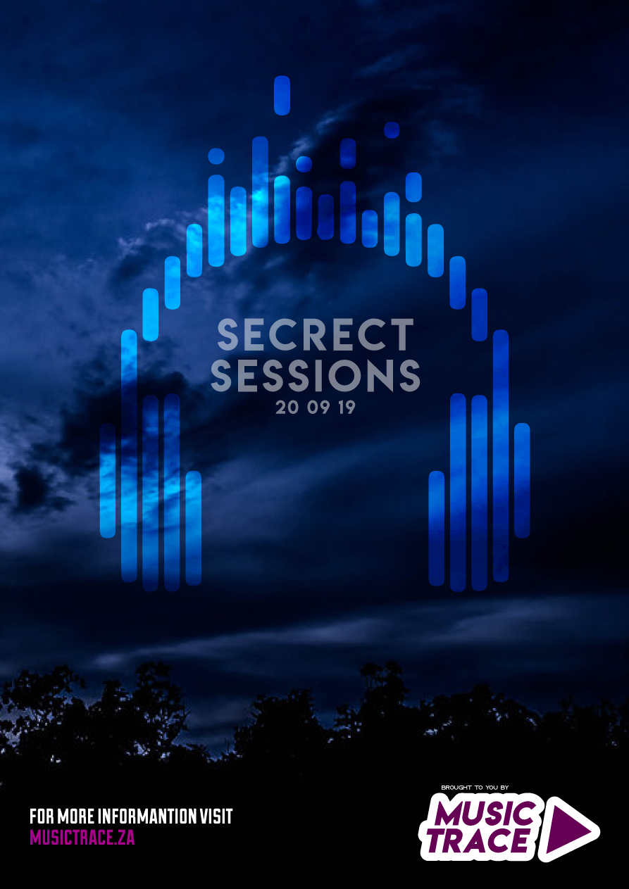
I like the overall aesthetic of the design. The "music trace" and the more info part stands out more than the rest of the poster, it being brighter. Maybe make the white stroke and bit more dull?
4 years ago by Abhi Jouhal
Posts
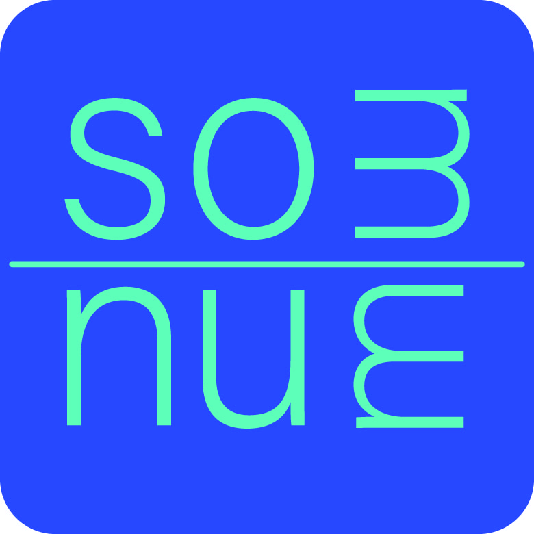
SomNum
- Report
4 years ago by Abhi Jouhal
It's a logo for a mattress company "Som-Num". They wanted something like Casper, Helix Sleep and Tuft & Needle. Those companies' logos are usually a creative use of the fonts.
Som-Num also wanted a logo that goes well with an app. So here's my take on it.
Som-Num also wanted a logo that goes well with an app. So here's my take on it.
Som-Numlogo
 5 Likes
 0
0