Jorge
Graphic Designer/Illustrator/freelancer
Posts
10
Likes
19
Liked Posts
15
Given Feedback
3
Feedback
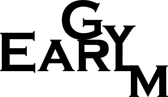
Don't get me wrong, I like the general look of the logo, but because the Y and L is connected, my brain is telling me it says "Early" and not "earl's". Also looking at the brief, it does say "Earl's Gym", but the Logo says "Earl Gym". Missing the " 's " in Earl.
3 years ago by Jorge
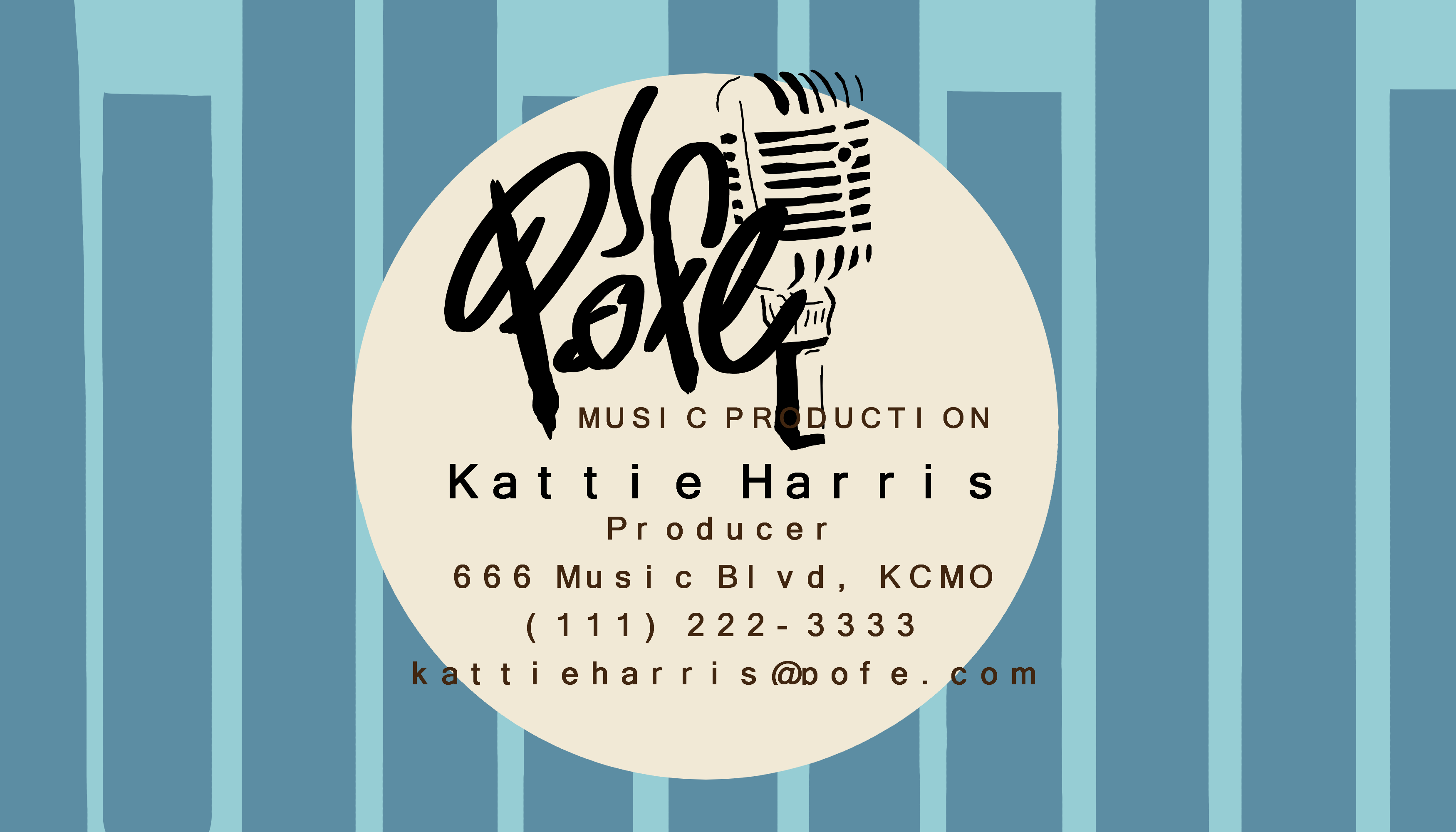
Looks nice, but need to either put the 'music production' text below the logo or change to some other fitting color, the "o" in production is not visible. Also think the letters are separated from each other, in the 'producer' and info texts.
4 years ago by Jorge
Looks nice, but need to either put the 'music production' text below the logo or change to some other fitting color, the "o" in production is not visible. Also think the letters are separated from each other, in the 'producer' and info texts.
4 years ago by Jorge
Posts
RRR Fish Market
- Report
Jorge • 3 years ago
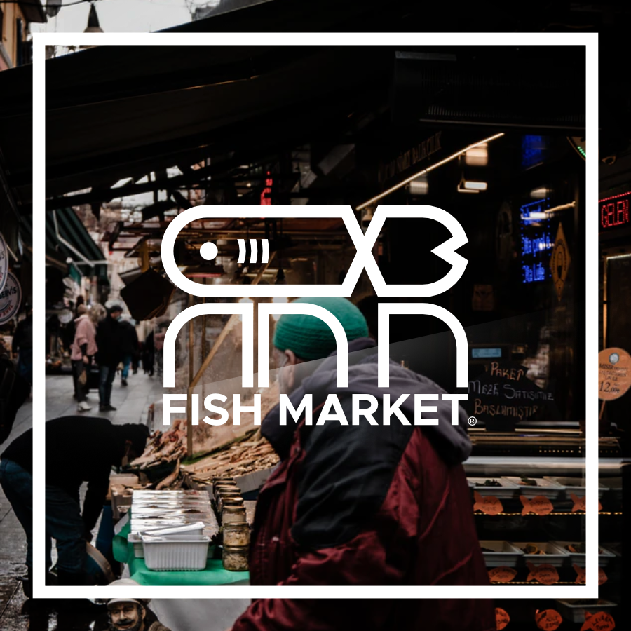
Brief: "Hi, I am Jina, creator of RRR Fish market. We are looking for someone that can design a professional logo for our Fish market. I think a lettermark will fit best. Would you be interested?"
I wasn't too satisfied with the result, but it'll do. I think the "fish market" text is too bland of a spot to place it, but not sure how else to place it. :/
I wasn't too satisfied with the result, but it'll do. I think the "fish market" text is too bland of a spot to place it, but not sure how else to place it. :/


p
7 months ago by mohamed mansour - Reply
Zara Airlines
- Report
Jorge • 3 years ago
Unfortunately I refreshed the page and lost the brief, but basically this client was the founder of Zara and asked for a combination mark, didn't' describe the type of business or company he/she is running so I chose an airline company.
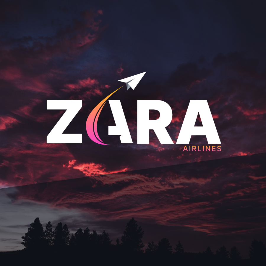

Beautiful. I think this is just personal preference, but I tend to go for lighter colors so maybe try making this one a little lighter and testing it to see if you like it? Great job though! (:
3 years ago by Lila Walter - Reply
Nani.net Logo Design
- Report
Jorge • 3 years ago
Hey!
I'm Melisa, I recently started a new business called nani.org. For a while now, we've been looking for a good logo for our business. I think a lettermark will fit best. Can you help us out?
I'm Melisa, I recently started a new business called nani.org. For a while now, we've been looking for a good logo for our business. I think a lettermark will fit best. Can you help us out?
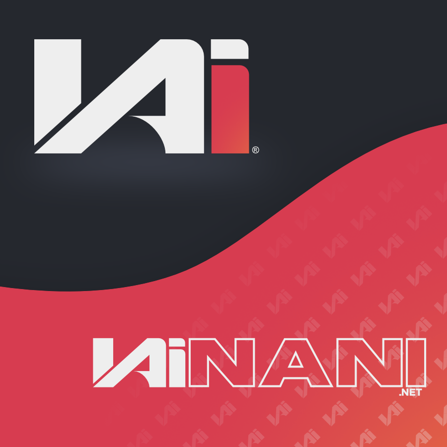

This is amazing. I can't believe you did this it's absolutely incredible.
3 years ago by Lila Walter - Reply
Wal.com Logo
- Report
Jorge • 3 years ago
Can't remember the whole brief that was given since my browser crashed on me :/, but basically Was looking for a wordmark logo with the business name "Wal.com", nothing was said about the type of business.
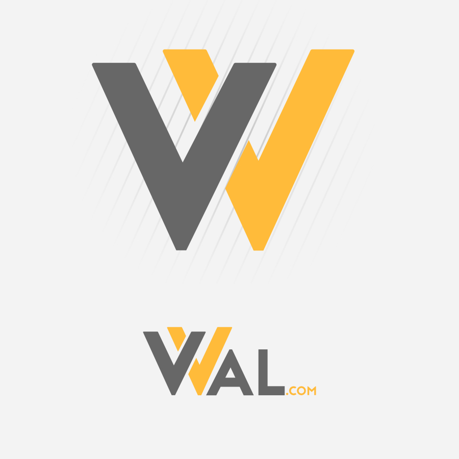

Nice work
4 months ago by Pratita - Reply
Fredricka's Catering Logo
- Report
Jorge • 4 years ago
Hello!
I'm Fredricka, founder of Fredricka's Catering. For a while now, we've been looking for a good logo for our business. I think a wordmark would look cool. Can you do that?
I'm Fredricka, founder of Fredricka's Catering. For a while now, we've been looking for a good logo for our business. I think a wordmark would look cool. Can you do that?
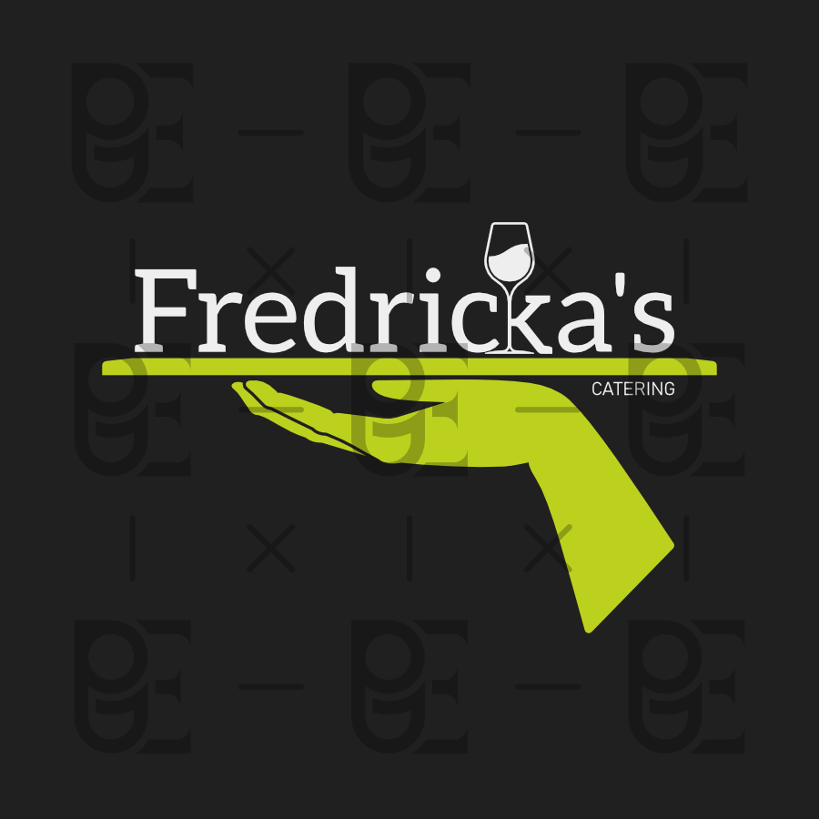

good logo
3 months ago by Lucas - Reply