suhana
Posts
2
Likes
2
Liked Posts
5
Given Feedback
8
Feedback
something off with the 3 borderline line color.

3 months ago by suhana
nice

3 months ago by suhana
awesome
3 months ago by suhana
really liked how you hung the piece of cloth in that 0.
3 months ago by suhana
background is very basic try to have fun with the background.

3 months ago by suhana
looks bold and attractive.
3 months ago by suhana
pretty basic but really liked the z design.

3 months ago by suhana
Everything's fine but I think the shadow is a bit bigger due to which I focus more on its shadow.

3 months ago by suhana
Posts
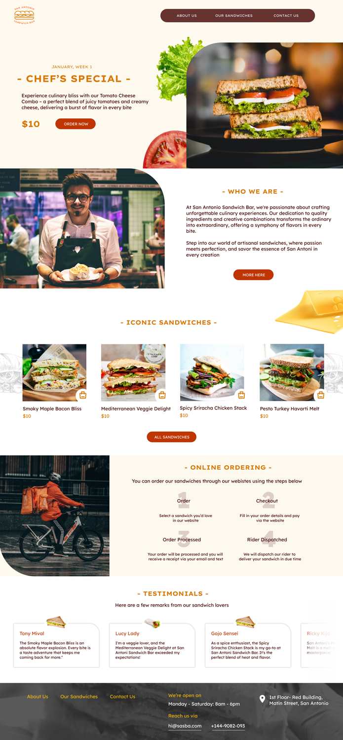
summer place logo!! let me know how can I improve to make this logo more attractive and more appealing..
- Report
3 months ago by suhana
Hi,
I'm Marty, creator of SummerPlace. For a while now, I've been looking for a good logo for my business. I like pictorial marks. Can you help us out?
I'm Marty, creator of SummerPlace. For a while now, I've been looking for a good logo for my business. I like pictorial marks. Can you help us out?

 Like
Like
 2
2