Eylul Oguz
Posts
1
Likes
4
Liked Posts
1
Given Feedback
2
Feedback
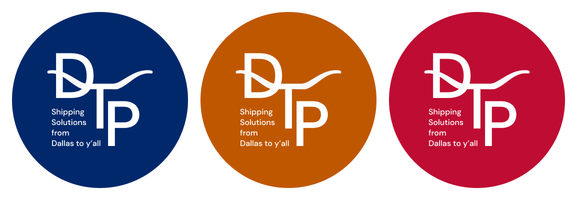
The logo is very effective and the logotype is easily legible! My only suggestion would be to play around with how you separated the words in the "shipping solutions from Dallas to y'all" phrase, as the "from" being the only word in the line is a bit awkward looking
4 months ago by Eylul Oguz
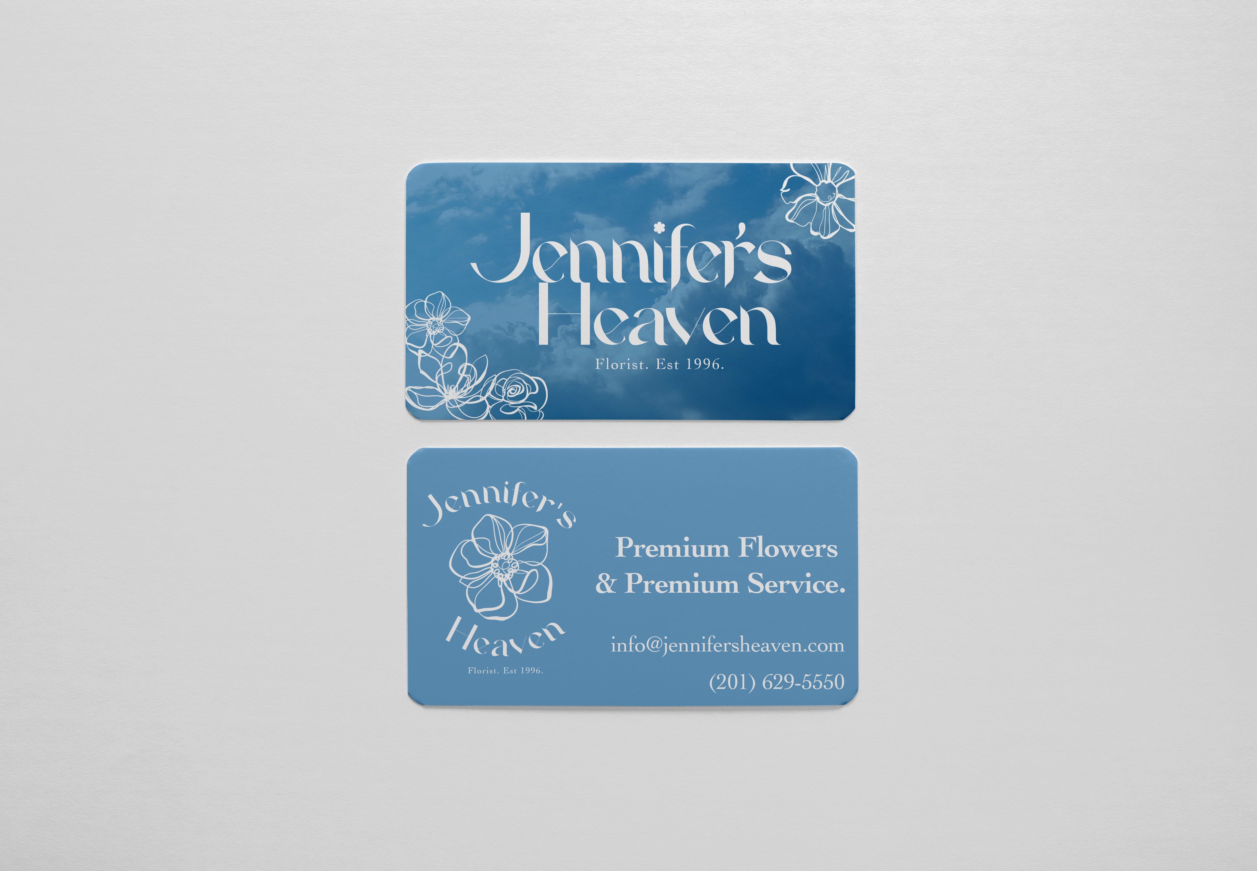
This looks so well done! Great choice of font and background image! Just being nitpicky, is there a way to increase the thickness of the thin parts of the text, as it may make the text easier to read.
4 months ago by Eylul Oguz
Posts
Dwight's Teahouse
- Report
4 months ago by Eylul Oguz
Practicing on Adobe Illustrator as I am not so good at vector art :(
Hello,
I am Dwight, I just founded a new business called Dwight's Teahouse. We are looking for someone that can design a professional logo for our business. I think a wordmark would look cool. Can you do that?
I am Dwight, I just founded a new business called Dwight's Teahouse. We are looking for someone that can design a professional logo for our business. I think a wordmark would look cool. Can you do that?
 4 Likes
 3
3
I honestly love how you incorporated the teacup aspect! Creative!
3 months ago by M. - Reply
First impression: i read a capital G in the shape of the cup, and I had to read it twice since the interlocking letters make it difficult. Colors and overall style is OK.

4 months ago by Julio Ferro - Reply
Its fantastic and eyecatching keep it up and would love to work with you in future projects thanks for your hardwork
4 months ago by subham - Reply