Franco
Posts
1
Likes
12
Liked Posts
1
Given Feedback
11
Feedback
too difficult to read, don't rotate the name of the brand

6 months ago by Franco
Looks like a watch logo but i like it

6 months ago by Franco
the upper typo does not seem coherent with the other typo

6 months ago by Franco
Looks a bit basic, be careful with the weight of de M, takes too much protagonists, and try to align the tip of the S with the T

6 months ago by Franco
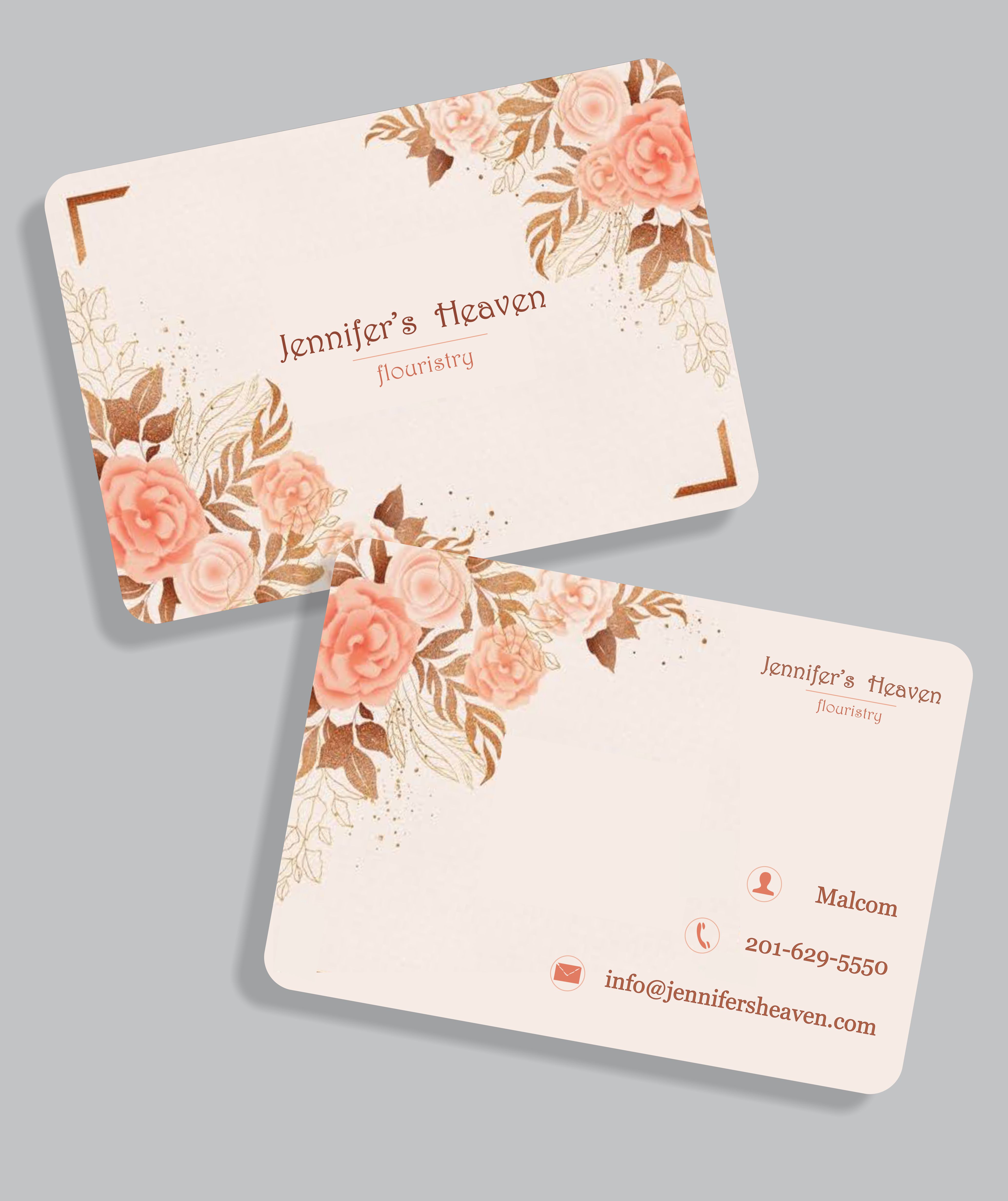
I´ll suggest that don´t use hyperrealistic illustrations in business cards
6 months ago by Franco
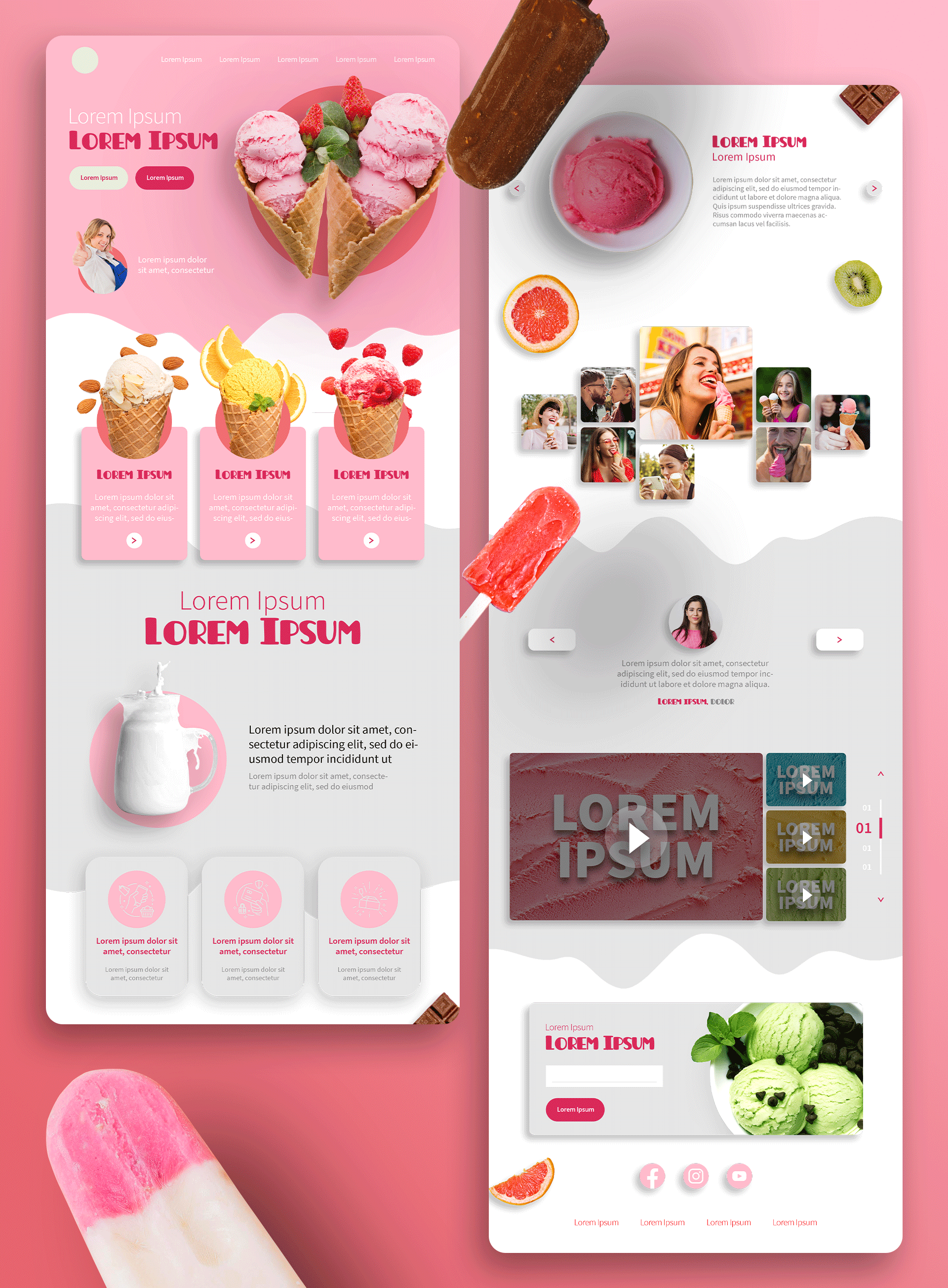
Nice work! I will suggest that use less grey in food advertisements
6 months ago by Franco
Nice job!!

6 months ago by Franco
Nice work, but I will suggests that where the S meets the T at the top looks a bit strange since I can see the origin of the T stick

6 months ago by Franco
Nice work with the double S, I will suggest making more round the corners, in some places, it looks a bit pointy

6 months ago by Franco
I personally use adobe suit to do my design work, try it! and follow YT tutorials

6 months ago by Franco
Nice work, the only thing I noticed is that the outer circle looks a bit crushed, if that was the initial intention, I suggest exaggerating it, even more, to prevent it from being seen as a mistake

6 months ago by Franco
Posts
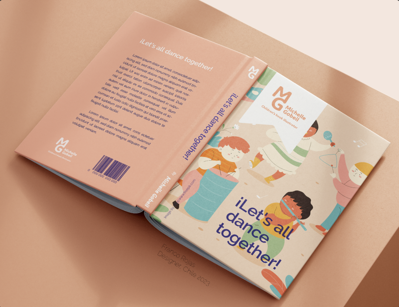
Michelle Gobeil Logo
- Report
6 months ago by Franco
This is what Michelle Gobeil's logo would look like
in use in a children's illustration book
in use in a children's illustration book
Michelle Gobeillogo
 12 Likes
 3
3
I like it. It seems to hypnotize me to read and leave a bookmark.
5 months ago by Dan Roe Jaspe - Reply
amazing
6 months ago by Eric_D08 - Reply
cool
6 months ago by Sandy Johnson - Reply