Roman
Posts
1
Likes
2
Liked Posts
2
Given Feedback
6
Feedback
it looks cool, cool colors but i would change the color of the text because it is easy to read

1 year ago by Roman
good
1 year ago by Roman
wow! that's amazing!

1 year ago by Roman
not bad

1 year ago by Roman
pretty good

1 year ago by Roman
wow! that's nice!

1 year ago by Roman
Posts
Logo design
- Report
Roman • 1 year ago
abstract Logo design for Song room
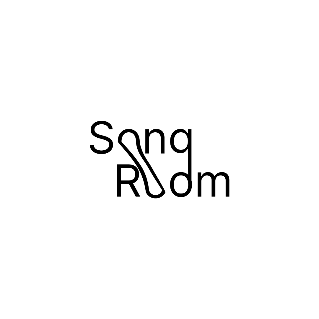


First of all, I like the creativeness you've used to make a single 'O' for sOng ROom, however, I feel like you can do it more better. The logo is minimalistic which I really like, but at the same time it feels bland. Try experimenting with fonts and textures. Also, it is hard to read at first because the 'g' in song looks like a 'q' and also the elongated 'O' looks out of place.
1 year ago by Bemsana - Reply