Brandon Middleton
Posts
9
Likes
20
Liked Posts
13
Given Feedback
0
Posts
Loftry
- Report
Brandon Middleton • 1 year ago


love the minimalist style to it
1 year ago by Defrey - Reply
This is lovely!
1 year ago by Bernard Nchikpa - Reply

Netaid
- Report
Brandon Middleton • 1 year ago


i really like it! but maybe you could try to line up the "new york" with the "D", so it ends at the same point, but other than that its perfect i think, great work!
1 year ago by Oskar Gufler - Reply
Mi Casa
- Report
Brandon Middleton • 1 year ago


I love it! The chilli gives a great vibe and I love the colour scheme
1 year ago by elora - Reply
BeachSquare
- Report
Brandon Middleton • 1 year ago
Logo, app icon, and pattern for goodies
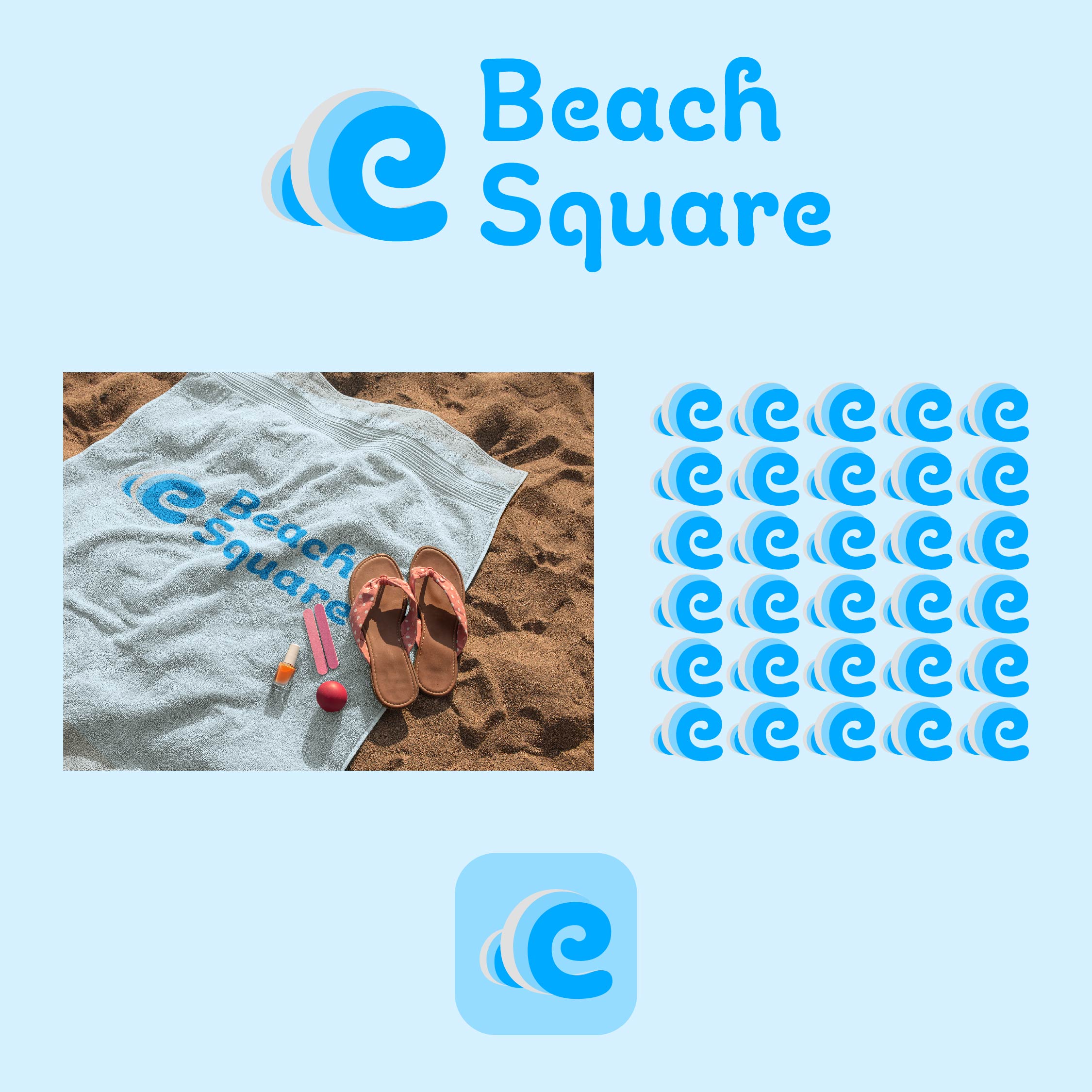

a nice one
1 year ago by HANENE - Reply