Rachelle Hu
Posts
1
Likes
3
Liked Posts
6
Given Feedback
3
Feedback
Thanks David! I'll be sure to be cognizant of empty space and redundancy in my future design work!
2 years ago by Rachelle Hu
Thank you so much Tasha! Sorry for the late reply, but I really appreciate your critiques and will make sure to pay attention to those details in the future.
2 years ago by Rachelle Hu
I love how the line makes it feel dynamic

2 years ago by Rachelle Hu
Posts
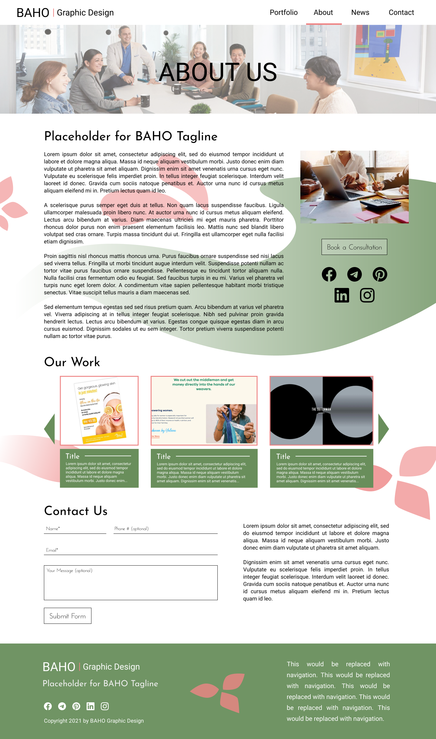
Baho About Page
- Report
2 years ago by Rachelle Hu
About page for Baho graphic design firm
Hi!
I'm Tamekia, founder of Baho. I am looking for someone that can design a professional website for my graphic design firm. We need a simple about-page for our website. Can you help me out?
I'm Tamekia, founder of Baho. I am looking for someone that can design a professional website for my graphic design firm. We need a simple about-page for our website. Can you help me out?
 3 Likes
 4
4
Beautiful colour scheme! The use of gradients work well. I think the slider of "our work" is a good addition to the about page that encourages clients to further explore. A few things to help enhance your design:
1. The margin on the right should be consistent with the margin on the left. If you look closely the image above "book a consultation" is slightly closer to the border of the page.
2. Make sure all text is legible against the background. In the areas where the red and green are underneath the text, it is harder to read and distracting for the eye.
2 years ago by Tasha Hannon - Reply
Thank you so much Tasha! Sorry for the late reply, but I really appreciate your critiques and will make sure to pay attention to those details in the future.
2 years ago by Rachelle Hu - Reply
First of all good job on the webpage, I love how you kept the number of colours to a minimum. I also like how the colours complement each other. The composition/layout is good but I think it could be even better if you used a bit more empty space between the images and the text to balance it out. I think you can remove the social media icons under the images to the left since you´ve already had them at bottom of the page. Other than that I think that the web page is good, great work and keep going :) //David
2 years ago by David - Reply
Thanks David! I'll be sure to be cognizant of empty space and redundancy in my future design work!
2 years ago by Rachelle Hu - Reply