Rahmania Brilianti
Posts
0
Likes
0
Liked Posts
5
Given Feedback
13
Feedback
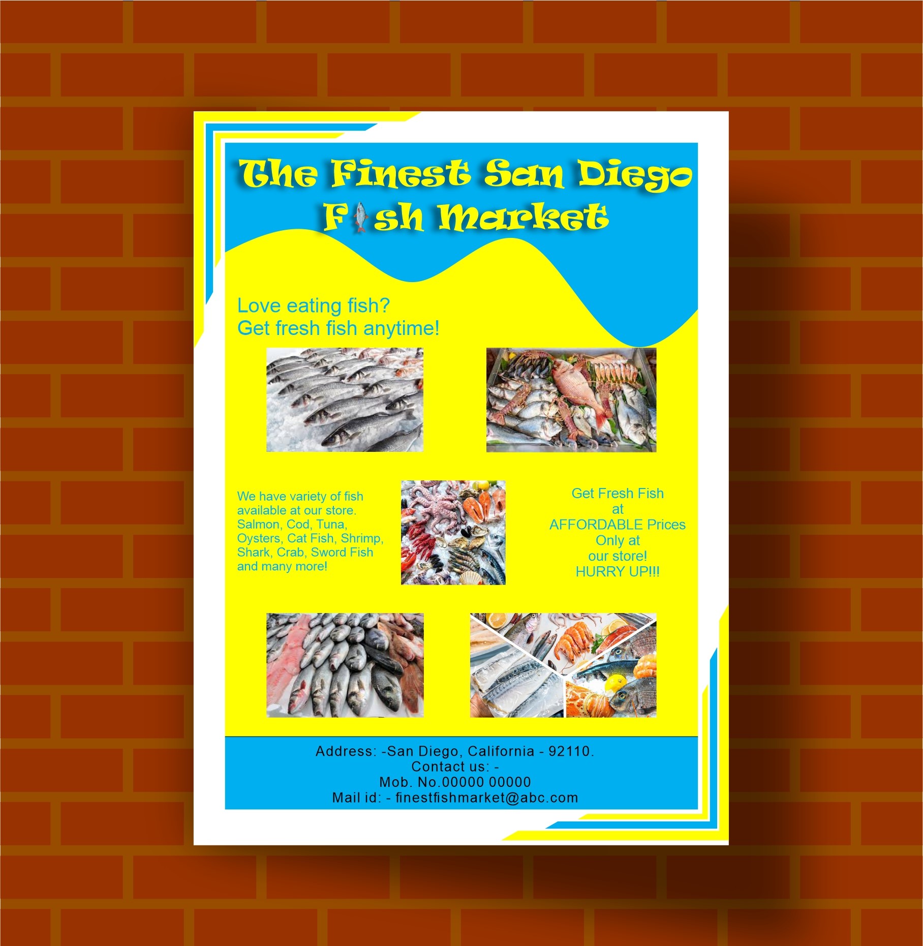
Yellow as background and blue as text, it's not match. Maybe you can use black-yellow and blue -white. I thought it's not readable fish icon on blue background. Make a picture on frame or make a description as subtitle for each picture. Good luck
3 months ago by Rahmania Brilianti
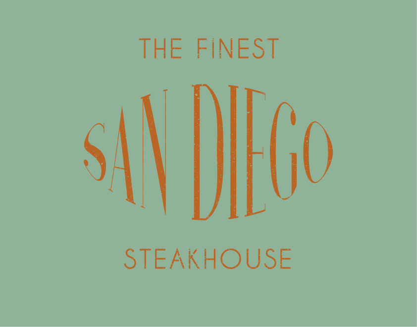
There is space between N and D
3 months ago by Rahmania Brilianti
The box can be around the letter, i think

3 months ago by Rahmania Brilianti
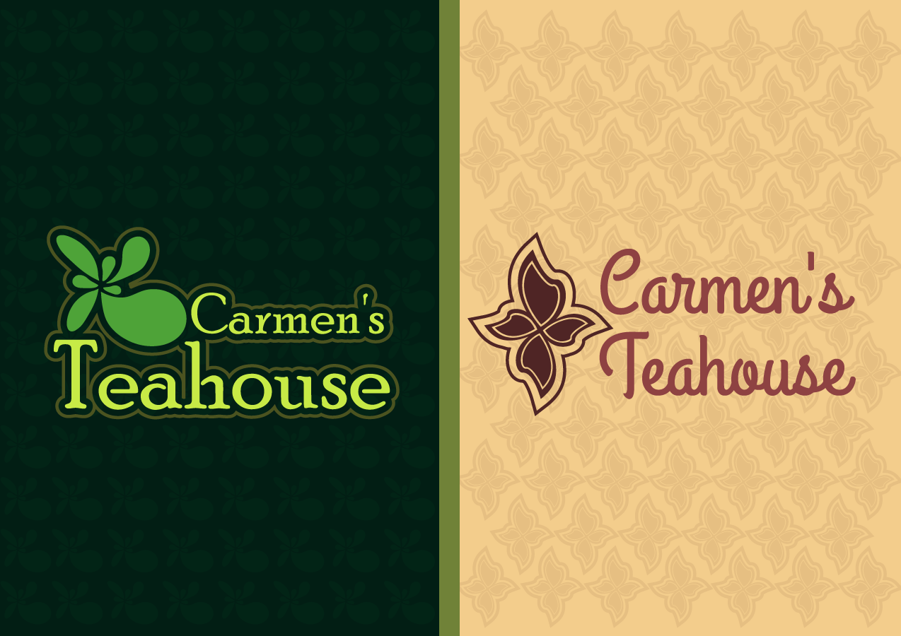
Make the subtitles smaller

3 months ago by Rahmania Brilianti
Great, 👍🏻

3 months ago by Rahmania Brilianti
That's Nice, I thought it's good be " We Collect Values"

3 months ago by Rahmania Brilianti
That's Nice, Look Attractive

3 months ago by Rahmania Brilianti
I love the brown logo, but i think you can get a better typograpghy
3 months ago by Rahmania Brilianti
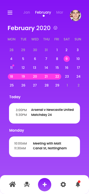
Great Job! I think icon on bottom bar better in same size.
3 months ago by Rahmania Brilianti
Great job

3 months ago by Rahmania Brilianti
Great logo

3 months ago by Rahmania Brilianti
That's great, Don't write too close to the border
3 months ago by Rahmania Brilianti
I think to register now don't size, make it bigger and highlight the link

3 months ago by Rahmania Brilianti