irem
Posts
0
Likes
0
Liked Posts
0
Given Feedback
6
Feedback
I like the third one, darker background with yellowish text, however the second and fourth ones are hard to read because of the background

5 months ago by irem
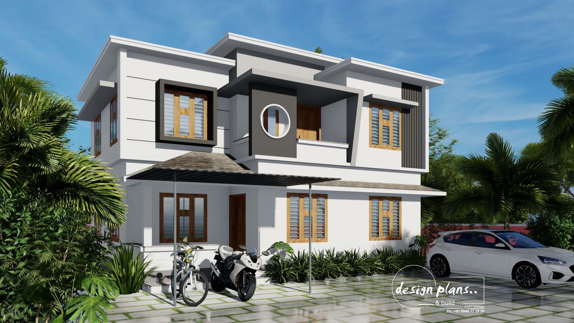
It did not look realistic
5 months ago by irem
very very good, well done! I just don't like the font of the text.
5 months ago by irem
It looks good. just i want to mention that, if you add some leaves to the branches, it would look more realistic.
5 months ago by irem
It looks very good. I did not like the background color though, it will be better if it is a solid color. Also, the text looks a little cheap.

5 months ago by irem
It looks nice, excellent job, yet as an architect, I would like to say that the materials of the building could be a little more realistic. none of the real-life buildings seem like that. To do that you can use aging effects in render programs. also, adding some people with movement effects can help.
5 months ago by irem