Nonop
Posts
0
Likes
0
Liked Posts
1
Given Feedback
4
Feedback
Good work
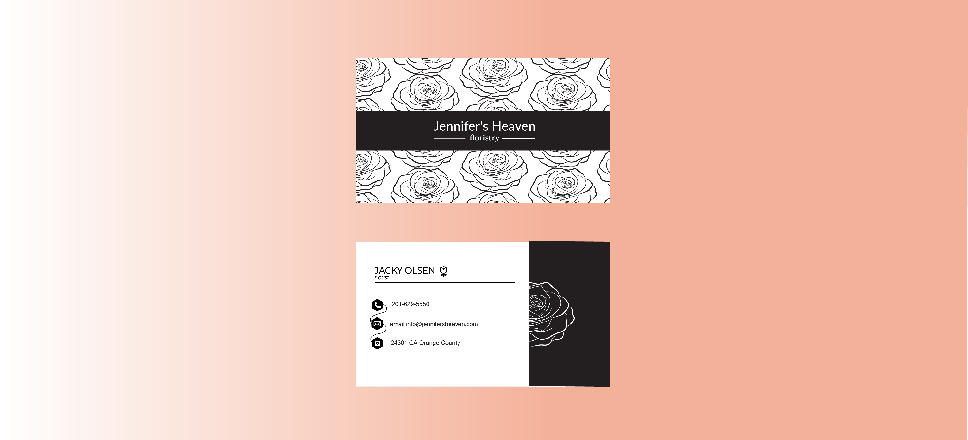
4 months ago by Nonop
I like the monogram with the two L letters that make up the Z. I just dislike the gradient behind the text, it’s my opinion but I prefer it on black and white like the mockups
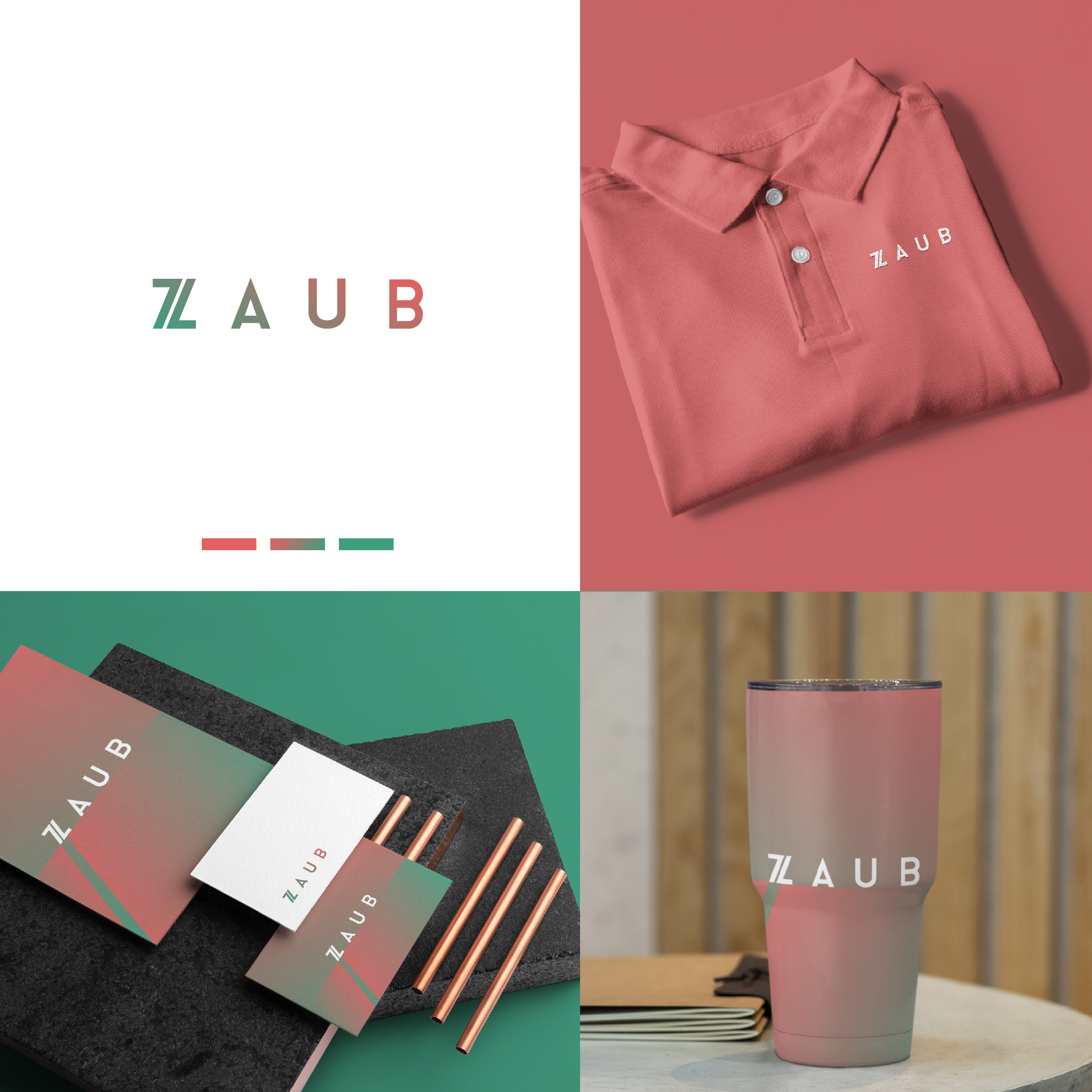
4 months ago by Nonop
Good ! I like the logo on the mock-ups. I find that put the text of the logo in a square is very inventive, and the Colors remind the retro times, I like very much !
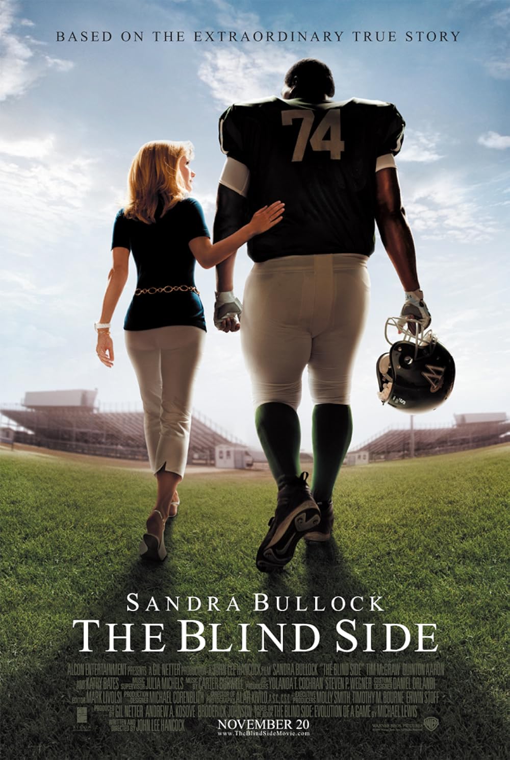
4 months ago by Nonop
Good! I like the poster of the movie; it's very realistic! The attention to detail is impressive, from the vibrant colors to the expressive characters. It's a visual feast that truly sets the tone for what promises to be an exciting cinematic experience. Can't wait to see if the film lives up to the artistic promise of its poster!
4 months ago by Nonop