Neely Tak
Posts
0
Likes
0
Liked Posts
1
Given Feedback
9
Feedback
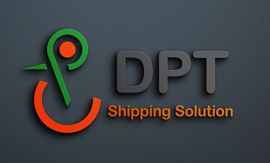
I love it! I wish that the logo had rounded ends like the font, or have the subtext "Shipping Solution" be a 'sharper' font like the duck. But it's a great, solid design! Super cute but modern logo!
8 months ago by Neely Tak
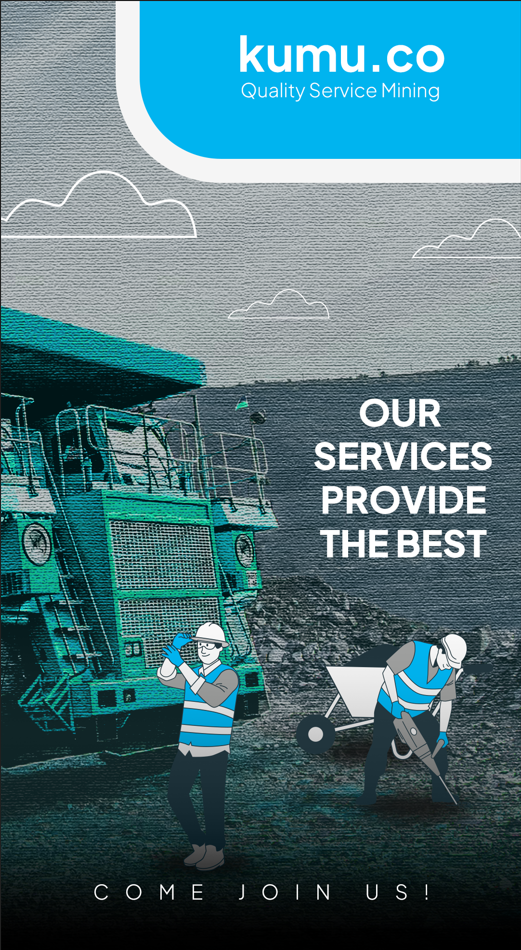
I love the mixture of textures and the combo of illustration and photo!
The logo seems a little small, but otherwise I love the fonts and colors!
8 months ago by Neely Tak
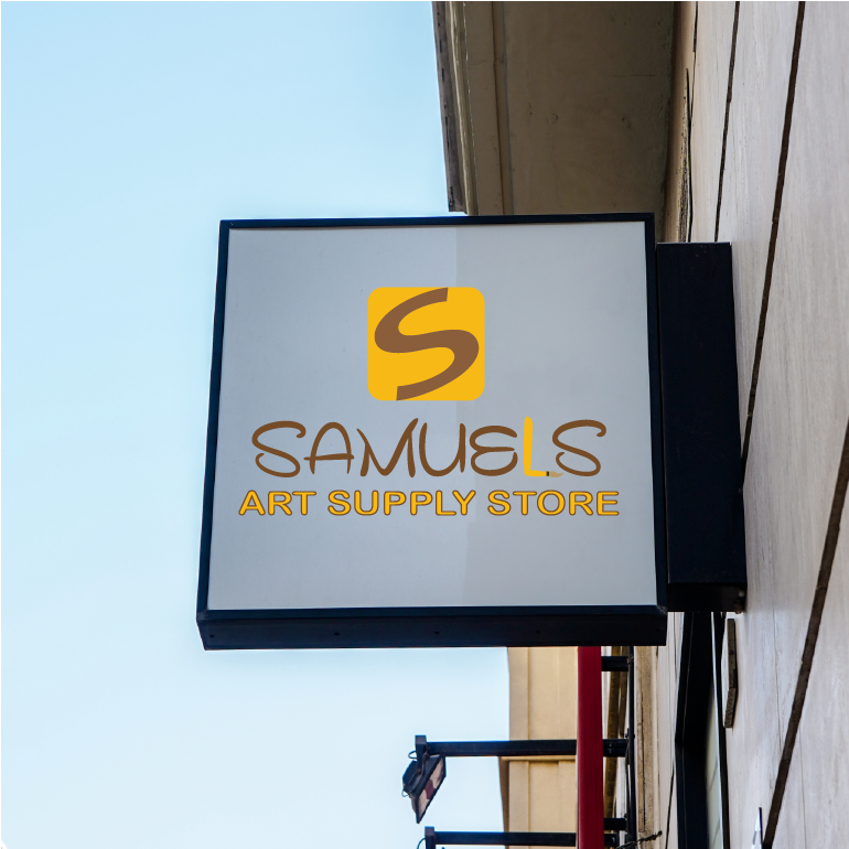
I think the symbol should be the paintbrush 'L', it's very creative and it already stands out! Or perhaps have the 'S' of the symbol be the same font as the name, that way they more related design-wise. The outlining of the Art Supply Store is a nice touch, but slightly outdated; yellow is a hard one to work with, but if the words had a rectangle behind it they would be more readable. (you could even make the box into a ruler! or would that be better for a school logo?)
So, maybe different colors and/or fonts? Overall, you have a very strong hierarchy of the design as it is and the design 'reads' as a craft store as prompted! Great Job!
8 months ago by Neely Tak
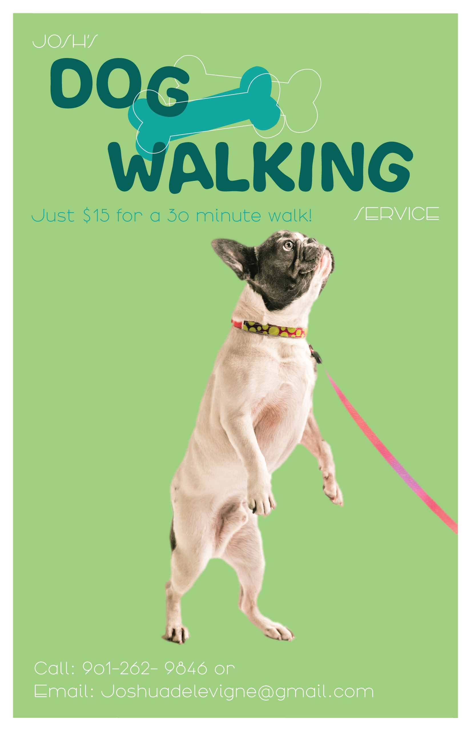
I love the font family, however this part looks a little off. Maybe make each entire line a different font?
I love the design overall, very clean and eye-catching!
8 months ago by Neely Tak
I love the colors and feel. A little extra challenge: how you would make a single color version? There's a lot of intersections and colors that play a beautiful part of the design, but sometimes clients need a all-black or all-white logo for single color printing (like on a box).
It's a very cozy design anyways, the fonts are actually what the client would have wanted!
8 months ago by Neely Tak
I love the colors! If you reflect the design you could even use it as the 'C' for the name!
8 months ago by Neely Tak
The fonts you use reminds me a TV show - very strong and powerful! However, the design should incorporate something that lets you know what their services are at a glance- maybe some silverware icons/graphics.
Otherwise, the feel of the entire design is super strong and really makes it seem like a professional diner.
8 months ago by Neely Tak
Very nice!
Maybe make the 'S' intertwine with 'D' to give it more depth?
And/or the design doesn't really *show* what services they give... maybe something that has a washing machine, or something clothes related?
But I do love the fonts you chose! They are easy to read for cursive :)
8 months ago by Neely Tak
I really love the hierarchy of the fonts!
However, I feel like this line is either too thin or the color is too bright - a little difficult to see it from a distance.
Great Job!
8 months ago by Neely Tak