fogcannon3
Posts
0
Likes
0
Liked Posts
0
Given Feedback
5
Feedback
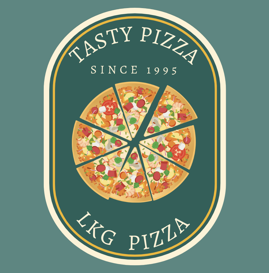
The curvature of the "tasty pizza" text does not match the overall curvature of the oval at the top, it's less arched. The "LKD Pizza" text also does not match the overall curvature as it's too arched. Other than that, good design.
10 months ago by fogcannon3
Quite a good design!

10 months ago by fogcannon3
You should add a bit more padding between the text and the rectangular shape encompassing the elements of the navbar. The text could also use a font change to make it more modern.

10 months ago by fogcannon3
I think you can add a drop shadow behind the "ROL.COM" text on the front of the card, or change the text color altogether to make it easier on the eyes.

10 months ago by fogcannon3
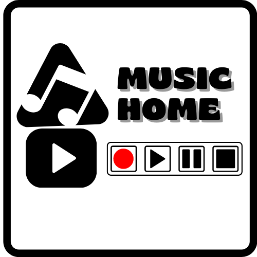
I think you could do without the text shadow behind "Music Home" as it seems to be the only element with a shadow. The triangle also seems to be a bit skewed to the left. Other than that, it looks fine
10 months ago by fogcannon3