Angie
Posts
0
Likes
0
Liked Posts
0
Given Feedback
2
Feedback
LOVE. I wish I had a better time understanding the purpose of the company by the logo. Otherwise I like the literal boxing of the "B"!

10 months ago by Angie
I like this direction! Just a few comments...
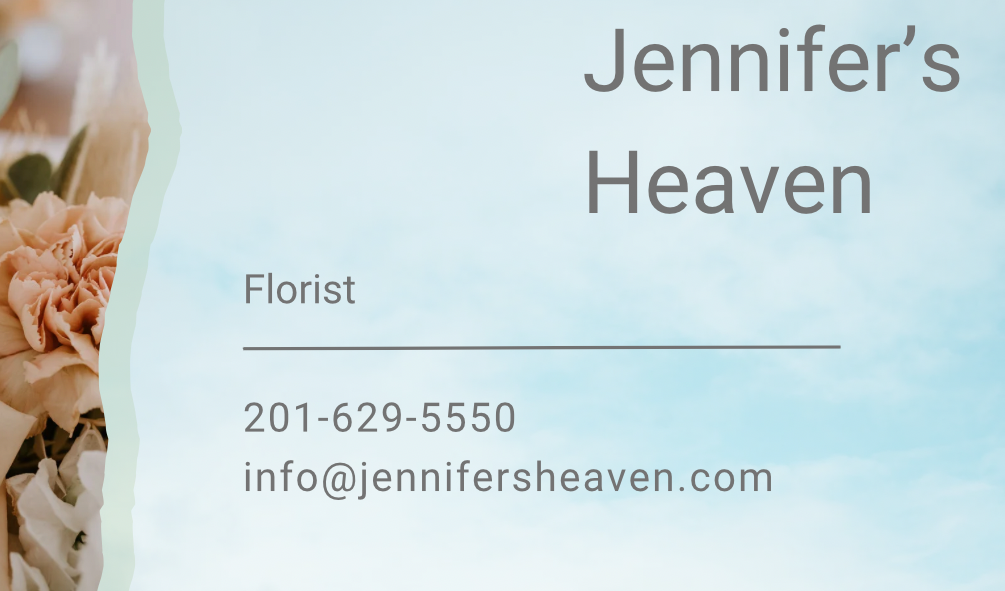
*For business cards, respect print margin. Name is close to edge in upper right
*Would love if you gave more space to the flower imagery. Better yet have the flowers cut into the paper edge effect to create a sense of layering
* I would review other business cards and check hierarchy and proximity of information.

10 months ago by Angie