Marie-Ange Koné
Posts
0
Likes
0
Liked Posts
0
Given Feedback
7
Feedback
I really really love the font, the colors and imagery.

1 year ago by Marie-Ange Koné
The open mic is not easily readable. There is a lot of information in general. Also there is a lack of white space around the text and images on each side of the image.
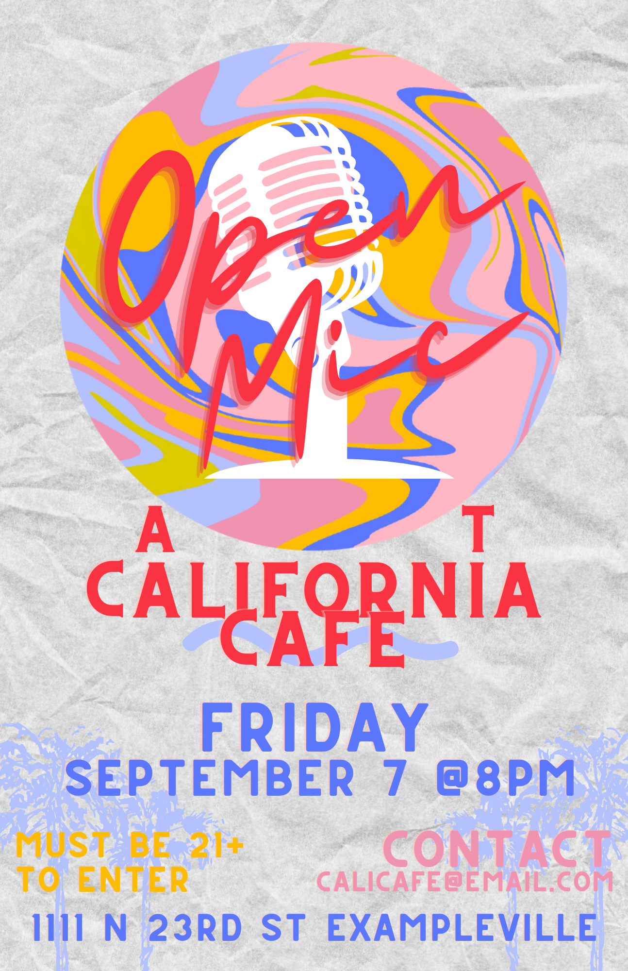
1 year ago by Marie-Ange Koné
Really nice I like it !
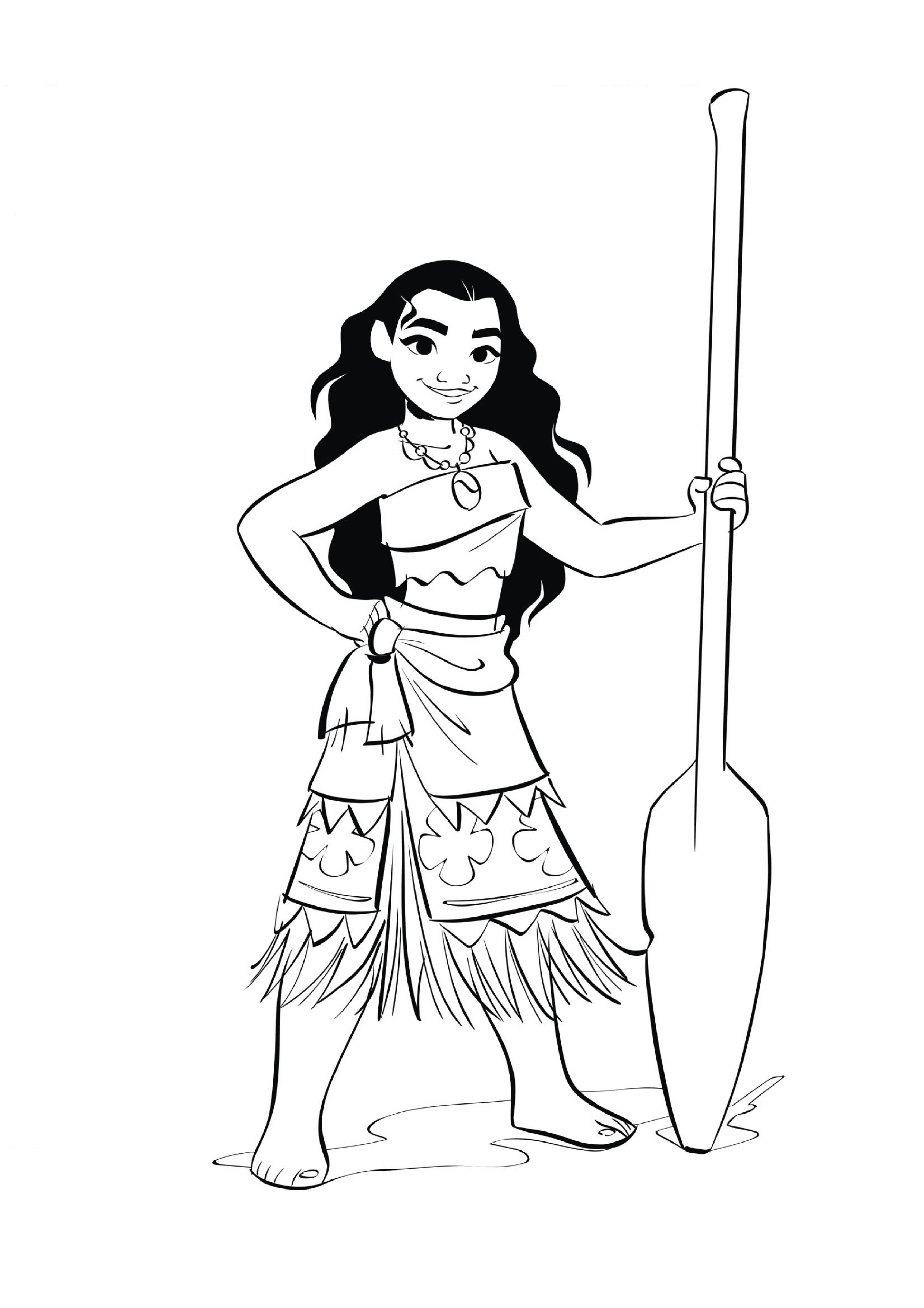
1 year ago by Marie-Ange Koné
Too flat
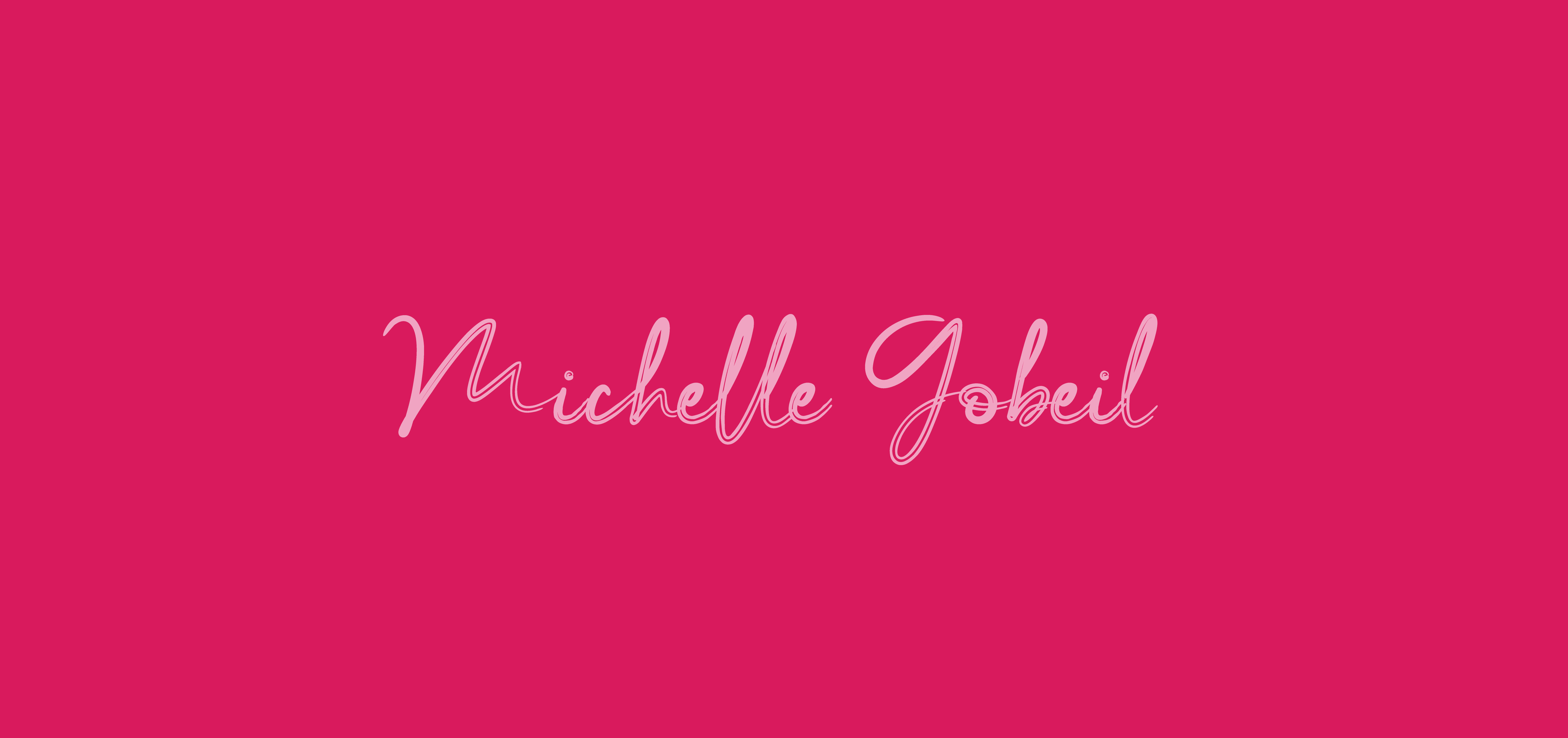
1 year ago by Marie-Ange Koné
I really like this design it's really beautiful. The font is great. The minimalism keeps the attention on the right information. The pairing of font is nice. The only negative thing is that the image chosen in cropped on the right side and it shows.
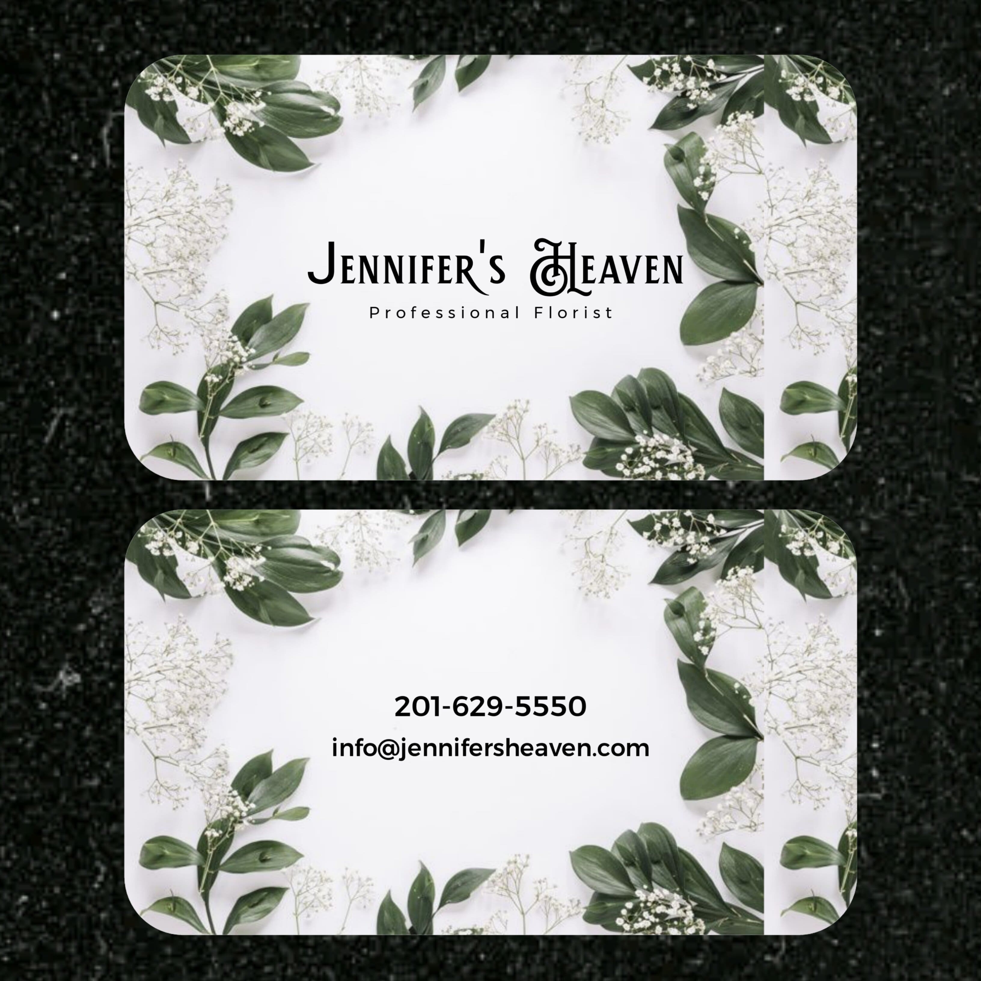
1 year ago by Marie-Ange Koné
The text of the logo looks like it has been scrunched and the text below doesn't have the same composition (Aligned on the left or right ?)

1 year ago by Marie-Ange Koné
I think the color of the plane and the planet is not contrasted enough with the background.

1 year ago by Marie-Ange Koné