Alisha
Posts
0
Likes
0
Liked Posts
0
Given Feedback
17
Feedback
I think it's a great logo, I think it's common for movie theatres to have red in their designs though so that could be a small improvement.
5 years ago by Alisha
Very creative and well put together!

5 years ago by Alisha
I love this!
5 years ago by Alisha
I'd agree with the comment about maybe using a font with more curves. To be honest, I didn't read it all so excuse me if I repeat anything, but I think you should pick out brighter colors like bright yellows or blues.
5 years ago by Alisha
I love the 3D effect and the use of gradients in this design

5 years ago by Alisha
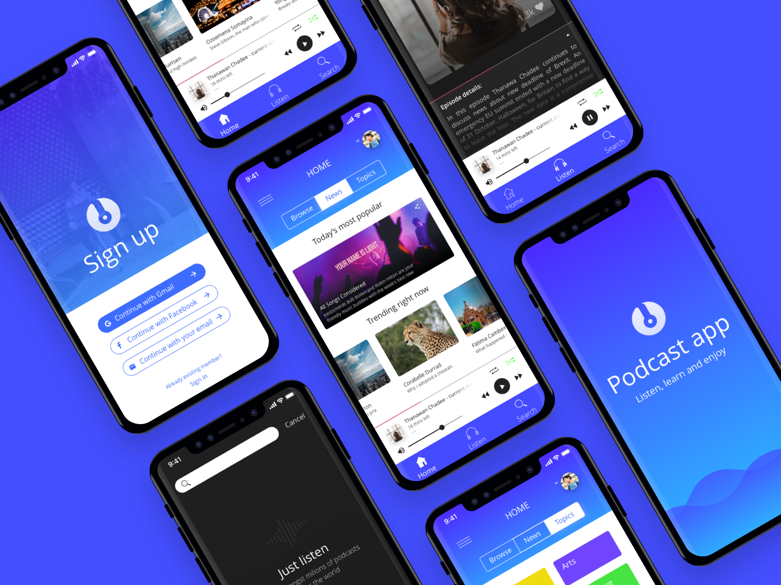
I love this mix of realism and illustrative design elements
5 years ago by Alisha
I think you could work on the tangents in this design a bit. Color choice is also very erratic in my opinion.

5 years ago by Alisha
Looks professional and beautiful

5 years ago by Alisha
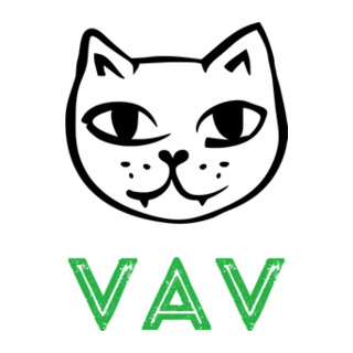
Fun, cute, and minimal! I love it!

5 years ago by Alisha
I think the font could be slightly closer to the image to give it a complete look.
5 years ago by Alisha
This is perfect, it looks very professional and well thought out.

5 years ago by Alisha
I love this, it's planned out very well and it's aesthetically pleasing to the eye
5 years ago by Alisha
I think maybe you could add a white outline to the lettering to make the visibility better and maybe a few gradients to make this design more dynamic.
5 years ago by Alisha
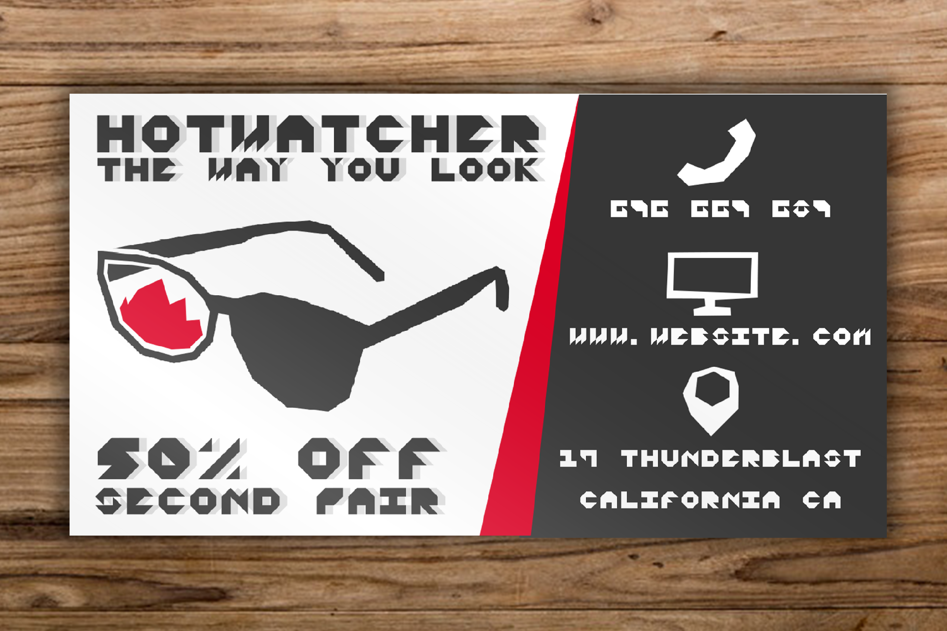
I like this logo but I think it could be more dynamic. Maybe add some drop shadows or some gradients to the design.

5 years ago by Alisha
I like the design, I think readability might be an issue though
5 years ago by Alisha
I love this logo, it's simple and gets the point across.

5 years ago by Alisha
What fonts are these?

5 years ago by Alisha