Nguyen Duong
Posts
0
Likes
0
Liked Posts
1
Given Feedback
1
Feedback
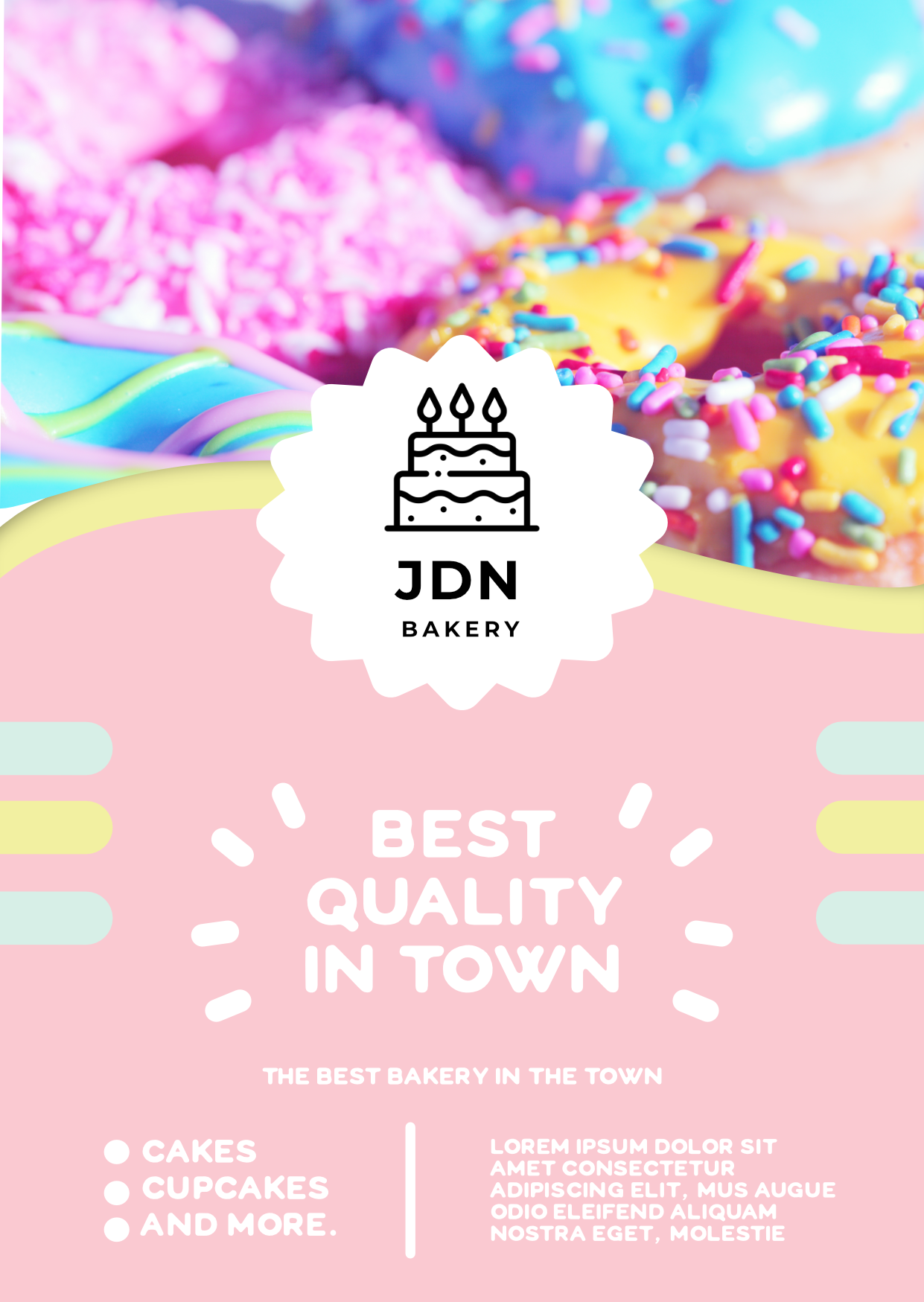
The design succeeded in giving off the delightful, bright and sweet vibe of the shop. Here are just some adjustments I would recommend. First of all, how about creating more contrast in your color schemes, a Light Pink underneath a White Text is hard to read. Secondly, use just one typeface or mix two of them together to creating more connection between the brand logo and body content (you could consider using a hand-written typeface to give the flyer a more organic aura). Lastly, just minor, three circles at "cake, cupcake, and more" seems to be unaligned. Hope this helps and have a great time with your design work!

4 years ago by Nguyen Duong