Waffle
Posts
2
Likes
16
Liked Posts
3
Given Feedback
1
Feedback
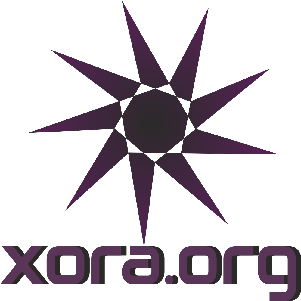
There are several things going on all at once. I notice a slight gradient in the triangles and then there are dark inner pieces inside of the letters to give it depth? Another thing that sticks out to me is having 2 large pieces battling each other. There needs to be more of a balance between the logotype and icon. Which do you want people to see more? What is the significance with the star? Is there a story to tell here? There are a lot of factors to consider.
3 years ago by Waffle
Posts
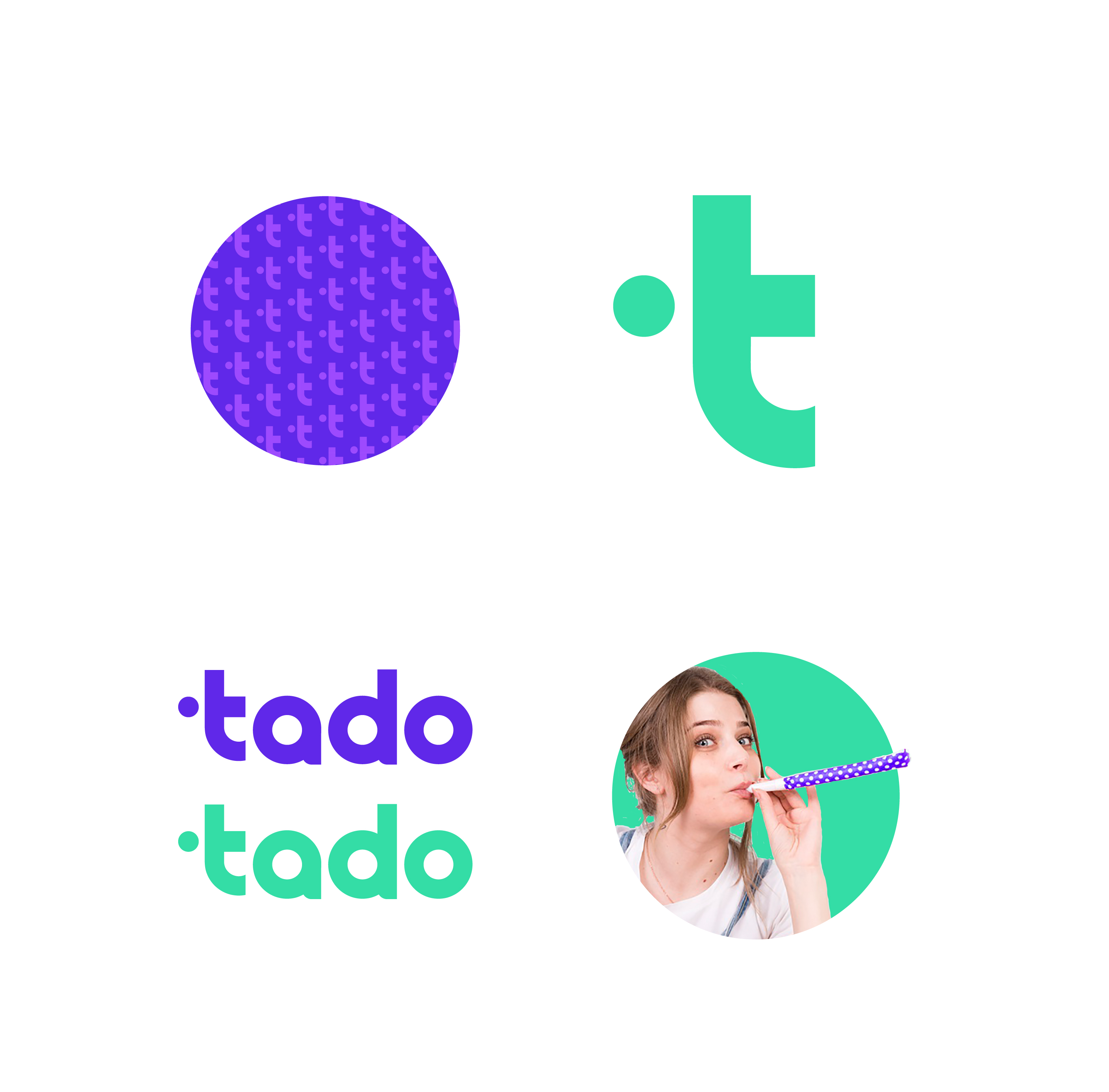
Tado Logo Concept
- Report
3 years ago by Waffle
 9 Likes
 1
1
very nice and smooth, welldone
2 years ago by Paula Hany - Reply
