Liz Zvereva
Posts
0
Likes
0
Liked Posts
0
Given Feedback
2
Feedback
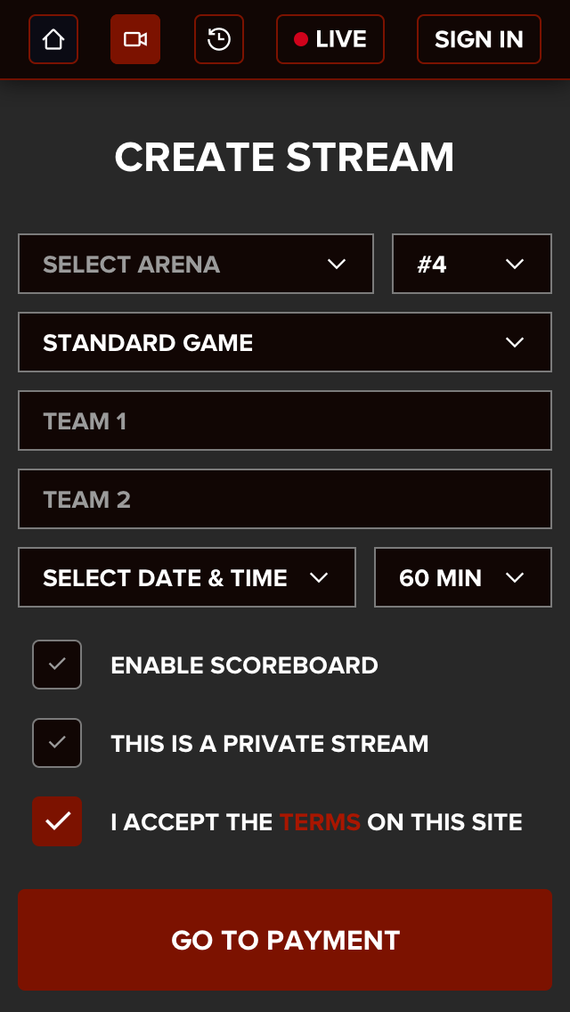
Not to say dark, but heavy. Maybe try to use fewer outlines? Similar to this example: https://dribbble.com/shots/4816828-Deposit Or maybe you can make the background color the same color as the background color in the form. Similar to this: https://dribbble.com/shots/4925155-Crowdrise-by-GoFundMe-Sign-Up-Page
5 years ago by Liz Zvereva
When it comes to design/user experience maybe you can use this for inspiration https://wetransfer.com/ It's clean, quick, and easy to use.
5 years ago by Liz Zvereva