Manik Rege
Posts
0
Likes
0
Liked Posts
1
Given Feedback
1
Feedback
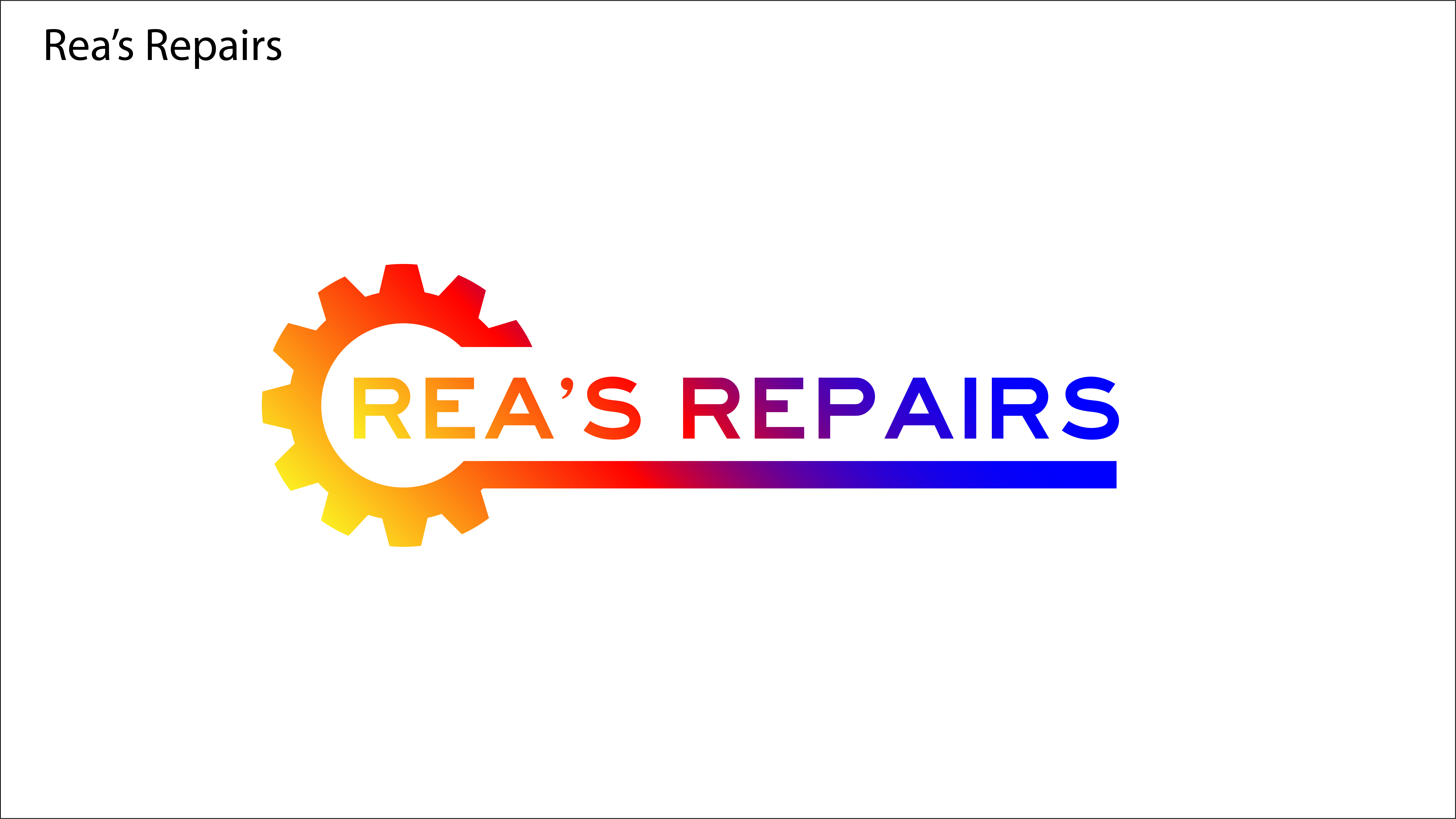
I like the clean font and design. But in terms of colour, its a huge variation for a logo, which makes brand recall (remembering it) very difficult. I'd recommend you use one colour sch
eme rather than using the entire spectrum from bright red/orange to blue.

4 years ago by Manik Rege