Toni-Louise O'Sullivan-Hayball
Posts
5
Likes
13
Liked Posts
1
Given Feedback
6
Feedback
Love this, very easy on the eyes too and bright colours catching your attention!

1 year ago by Toni-Louise O'Sullivan-Hayball
Great usage of a logo and icon together!

1 year ago by Toni-Louise O'Sullivan-Hayball
This is so cute and eye catching for your customers!
1 year ago by Toni-Louise O'Sullivan-Hayball
Looks very pristine and professional
1 year ago by Toni-Louise O'Sullivan-Hayball
Absolutely love it, such a stand out logo and very recognisable!

1 year ago by Toni-Louise O'Sullivan-Hayball
Absolutely love the design
1 year ago by Toni-Louise O'Sullivan-Hayball
Posts
Veav Music business card
- Report
1 year ago by Toni-Louise O'Sullivan-Hayball
Hi,
I'm Sadye, I recently started a new business called Veav. For a while now, I've been looking for a good designer for my music production business. I want to have a business card for myself. We primarily use the color red (#ef4848). We would love to work with you!
I'm Sadye, I recently started a new business called Veav. For a while now, I've been looking for a good designer for my music production business. I want to have a business card for myself. We primarily use the color red (#ef4848). We would love to work with you!
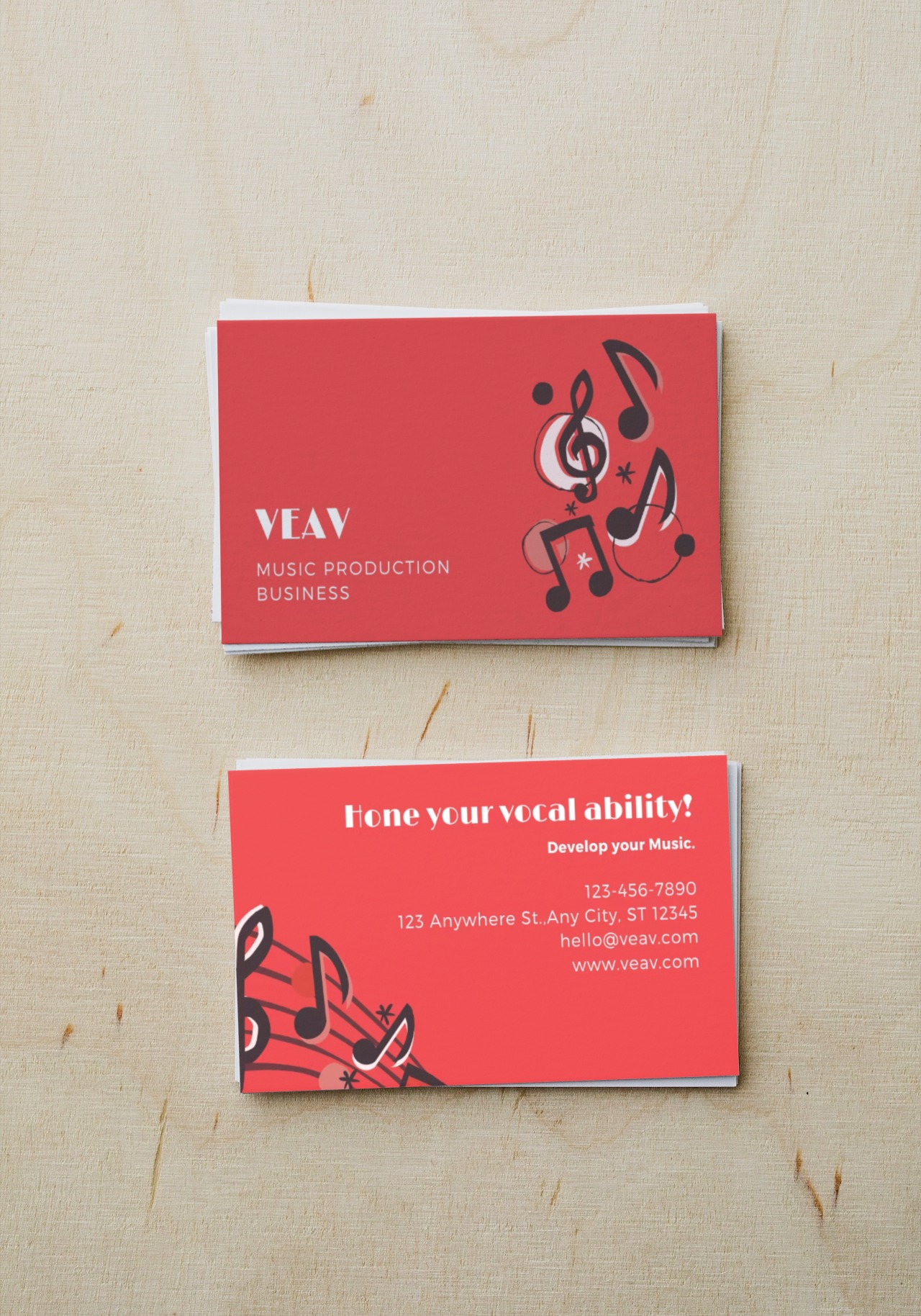
 2 Likes
 3
3
Simple and nice
1 year ago by Ogechukwu - Reply
I especially like the selected font which matches well with the symbols
1 year ago by Noam - Reply
Niceee
1 year ago by Abdul Hadi - Reply
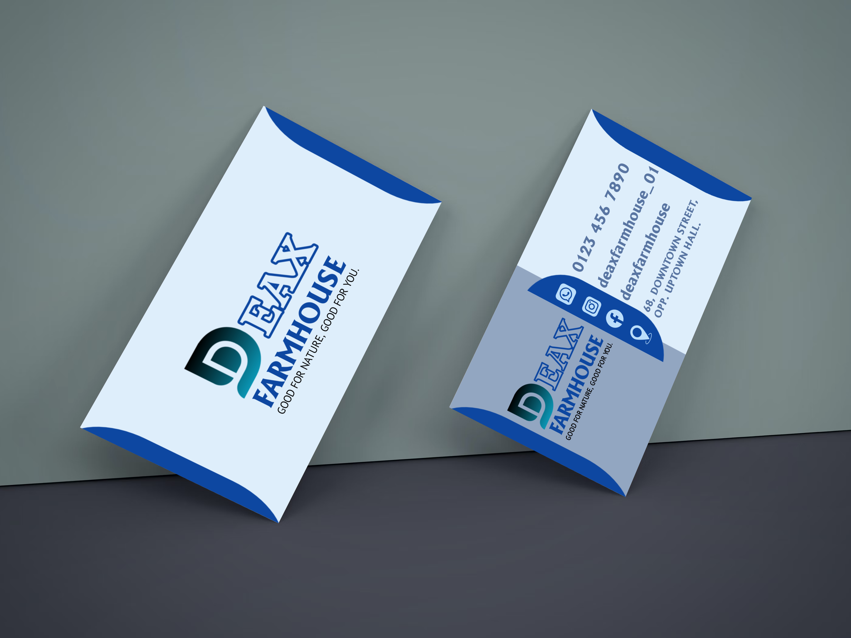
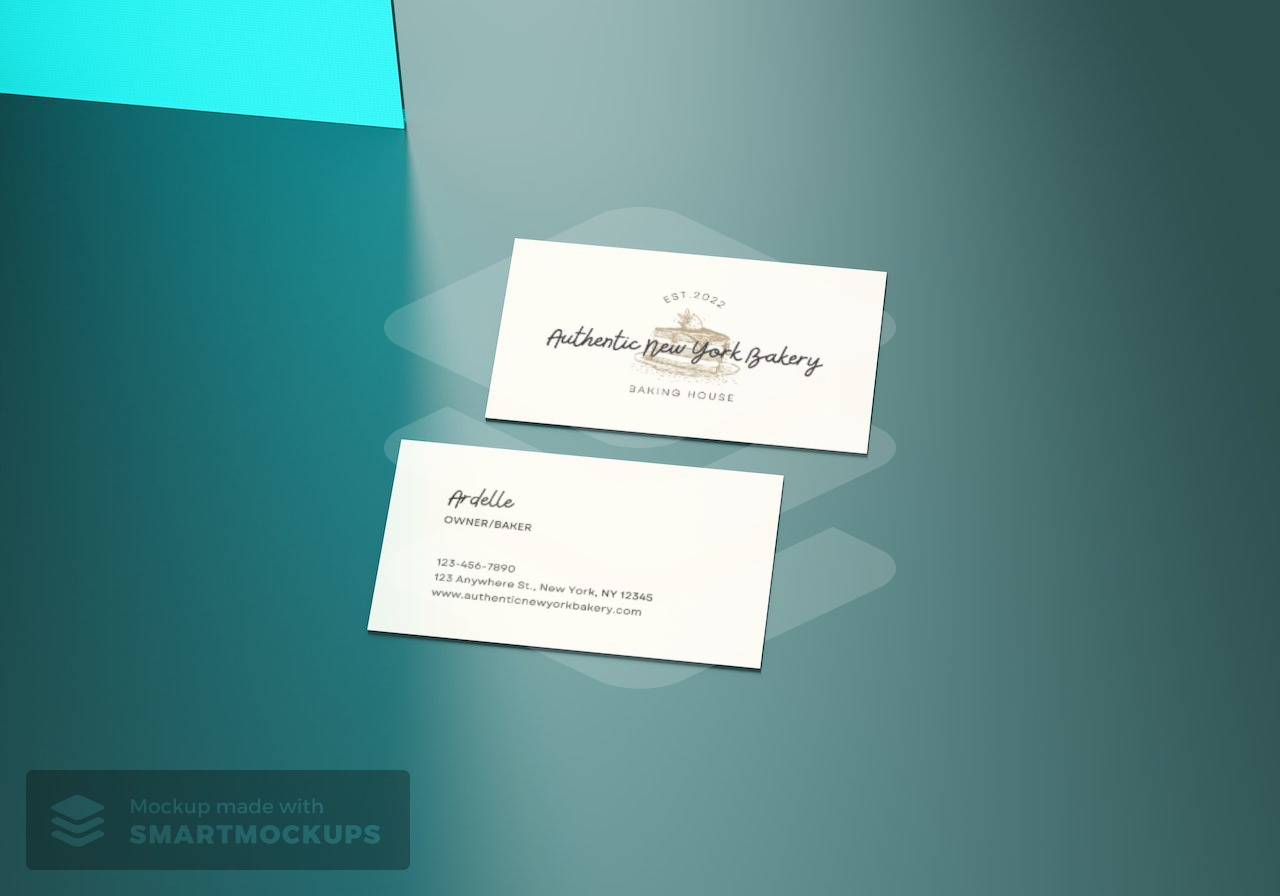
Minimal Bakery business card
- Report
1 year ago by Toni-Louise O'Sullivan-Hayball
Hey,
I'm Ardelle, owner of Authentic New York Bakery. For a while now, I've been looking for a good designer for my Bakery. I want to have a business card for myself. Can you help me out?
I'm Ardelle, owner of Authentic New York Bakery. For a while now, I've been looking for a good designer for my Bakery. I want to have a business card for myself. Can you help me out?
 1 Like
2
1 Like
2
I like the "est. 2022," the art style and the font. The art and "est." text give it an almost vintage feel which I feel like match with the name of the bakery, making it feel more "authentic". The font type of the business name seems cute and quaint which makes it feel like a small business, adding to the authenticity. The layout is clear and easy to read. Great job!
1 year ago by Tia Moore - Reply
E-Zone Wordmark Logo
- Report
1 year ago by Toni-Louise O'Sullivan-Hayball
1 Like
2
Easy and clear, maybe you can do most next time, for example you can use a different and particular font!

1 year ago by Elisa Maria - Reply
Nice design!
1 year ago by Erika - Reply
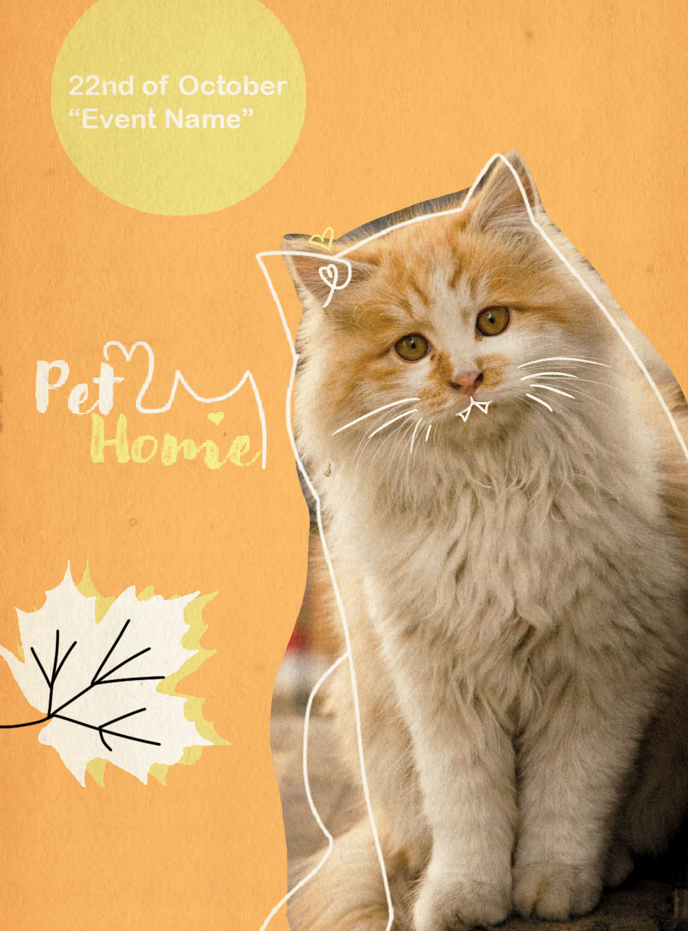
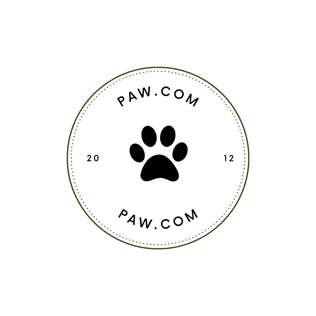
Paw.com Logo
- Report
1 year ago by Toni-Louise O'Sullivan-Hayball
5 Likes
2
Great Start. You have a-lot of white space to play with. Perhaps sizing up the text and mainly the paw print in the center to help fill up more of the empty white space; being that the paw is in the center it can use more of the attention. Making it bigger would definitely help
1 year ago by Daryl - Reply
Like the minimal elements.
1 year ago by Erika - Reply
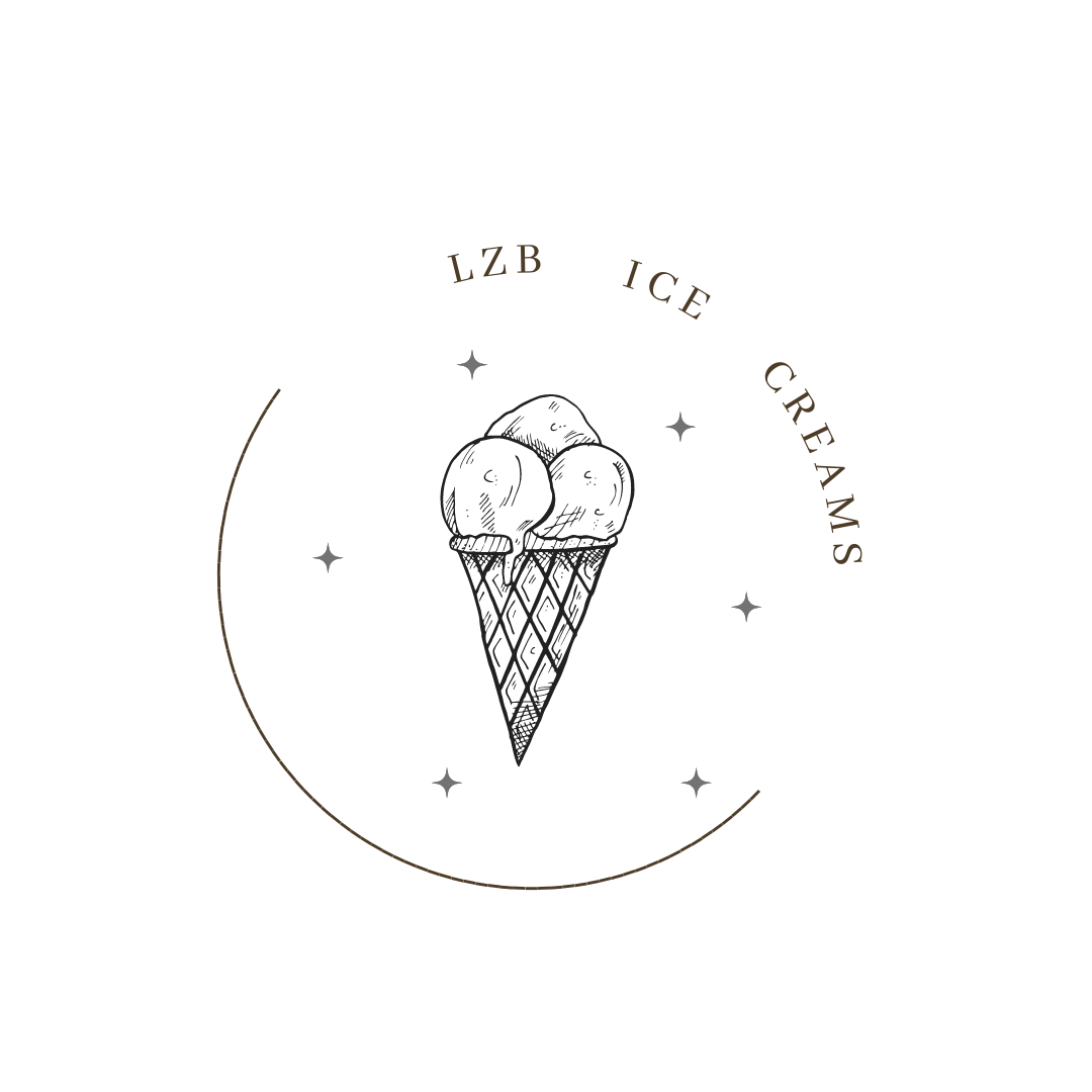
Logo for an Ice Cream Company
- Report
1 year ago by Toni-Louise O'Sullivan-Hayball
Hey!
I'm Angelic, founder of LZB Ice creams. For a while now, we've been looking for a good logo for our Ice creams. I think a combination mark will fit best with the business. Would you be interested?
I'm Angelic, founder of LZB Ice creams. For a while now, we've been looking for a good logo for our Ice creams. I think a combination mark will fit best with the business. Would you be interested?
 4 Likes
2
4 Likes
2
I like it!
1 year ago by Elisa Maria - Reply
love the sketch style of the ice cream
1 year ago by Alexis Vasquez - Reply