Heloisa
Posts
2
Likes
5
Liked Posts
7
Given Feedback
3
Feedback
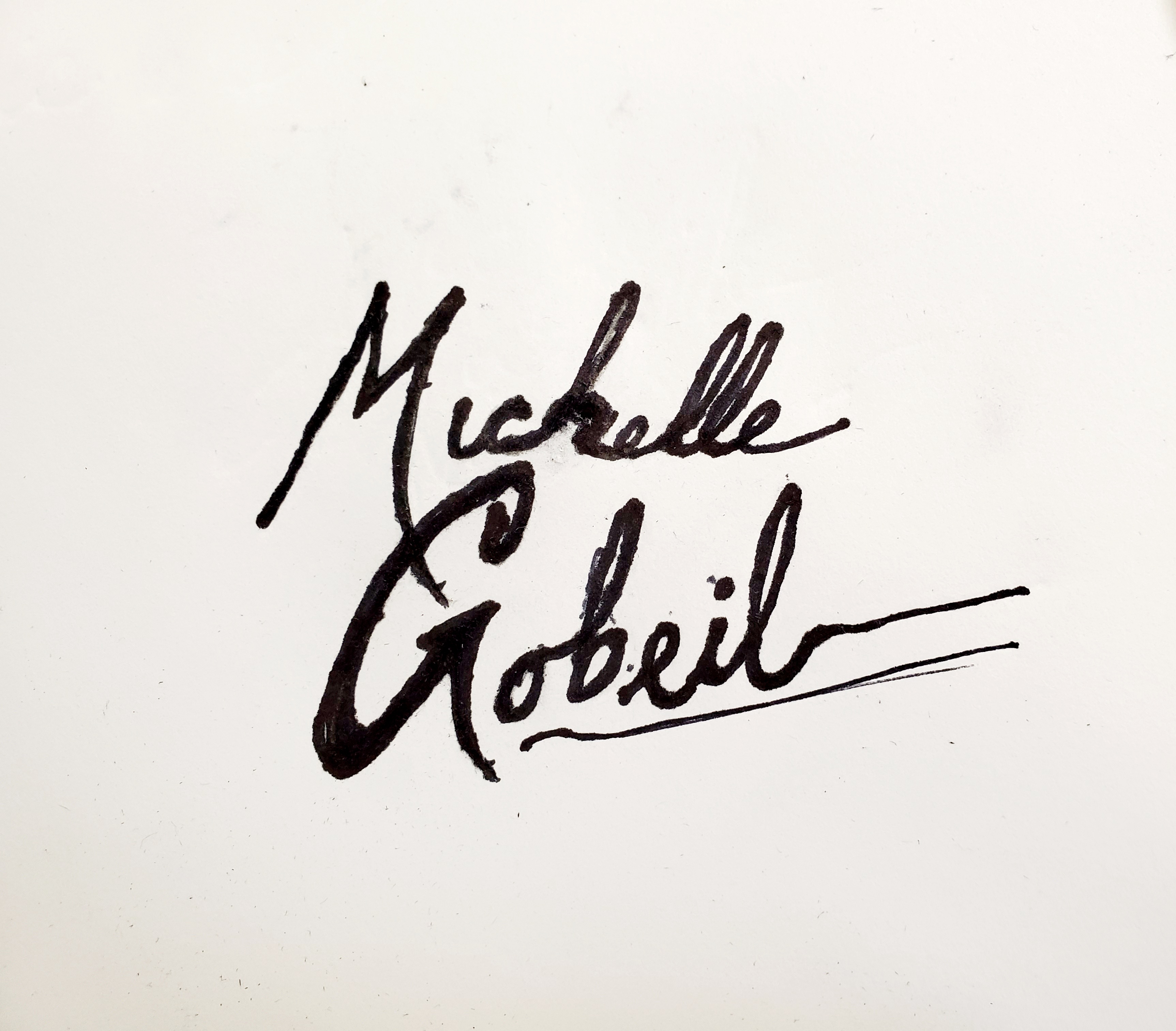
I really like how easy it is to read it and the texture of this brush!
1 year ago by Heloisa
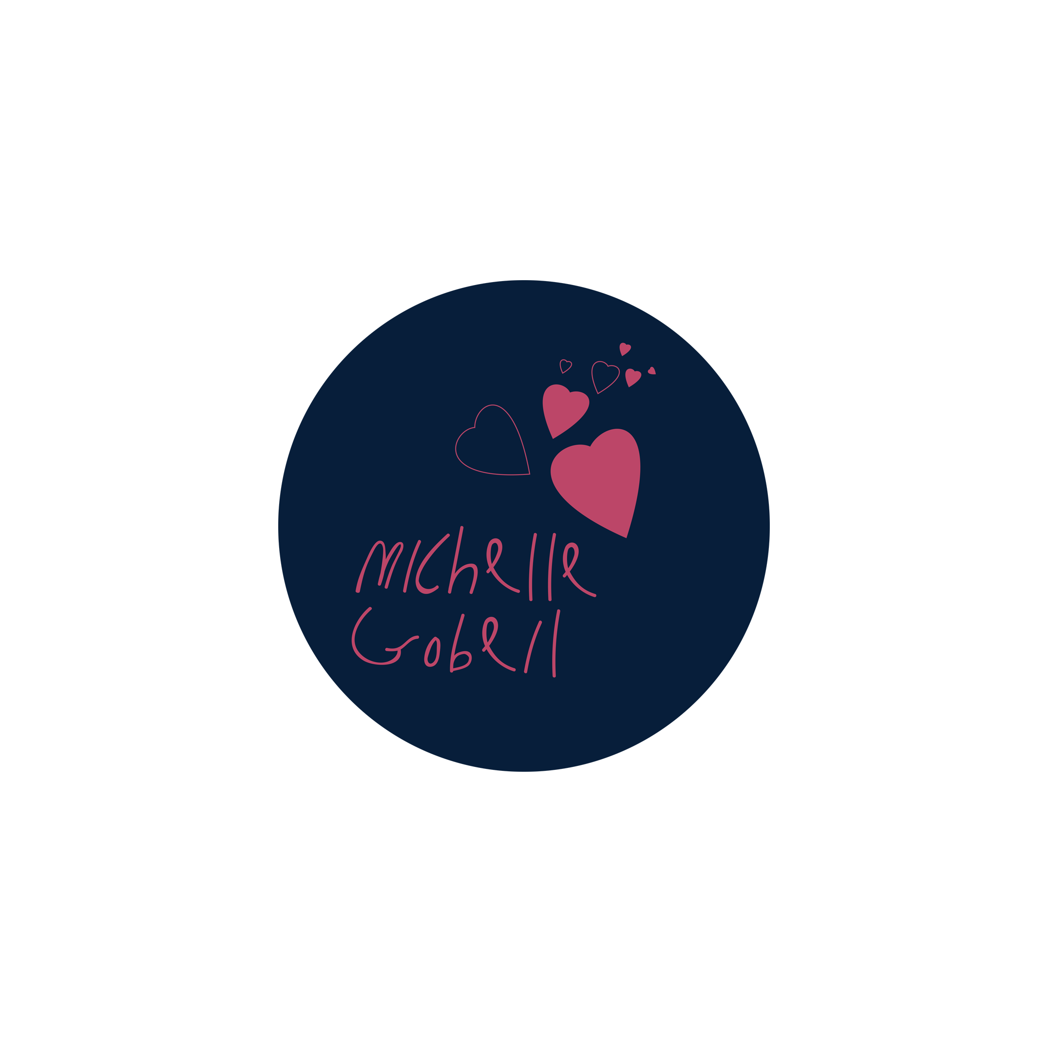
I believe the font is very thin with poor contrast again the dark background, making it harder to read. I would have name taking most of the circle space and add the hearts as an extra touch, maybe smaller.
1 year ago by Heloisa
It looks like a painter's signature!! I really like it!
1 year ago by Heloisa
Posts
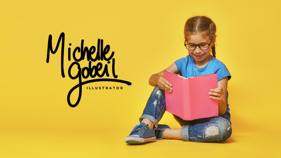
Michelle Gobeil - signature logo
- Report
1 year ago by Heloisa
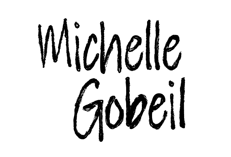
Considering the request on the brief as to not use font for the logo, I wrote it myself using a more playful handwriting. My intention was to make it easy to read. I made another one I liked better, but I thought a cursive handwriting would make it harder for kids to read it.
Michelle Gobeillogo
 3 Likes
 1
1
Very nice handwriting! It looks good.
1 year ago by Claudia - Reply
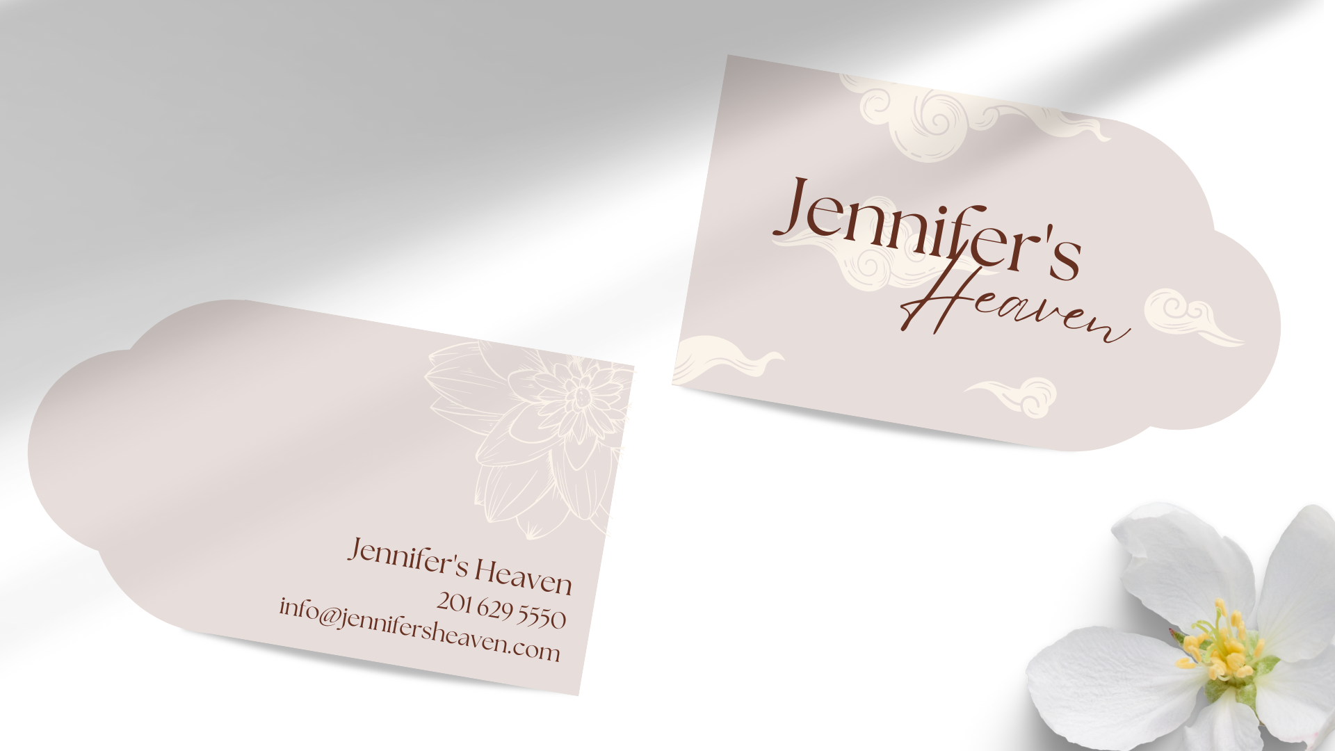
Jennifer's Heaven
- Report
1 year ago by Heloisa
Jennifer's Heavengraphic
 2 Likes
1
2 Likes
1
I love the dainty look of this! Is it a business card?
1 year ago by Nadia - Reply