Adam Snetiker
Posts
1
Likes
2
Liked Posts
0
Given Feedback
2
Feedback
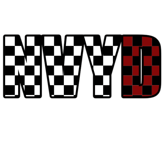
When you design a logo, consider how it would look at different sizes. If you make this one very small, it may be difficult to read because of the pattern. It's cool, but for me the checkerboard makes the letters somewhat difficult to distinguish from one another.
1 year ago by Adam Snetiker
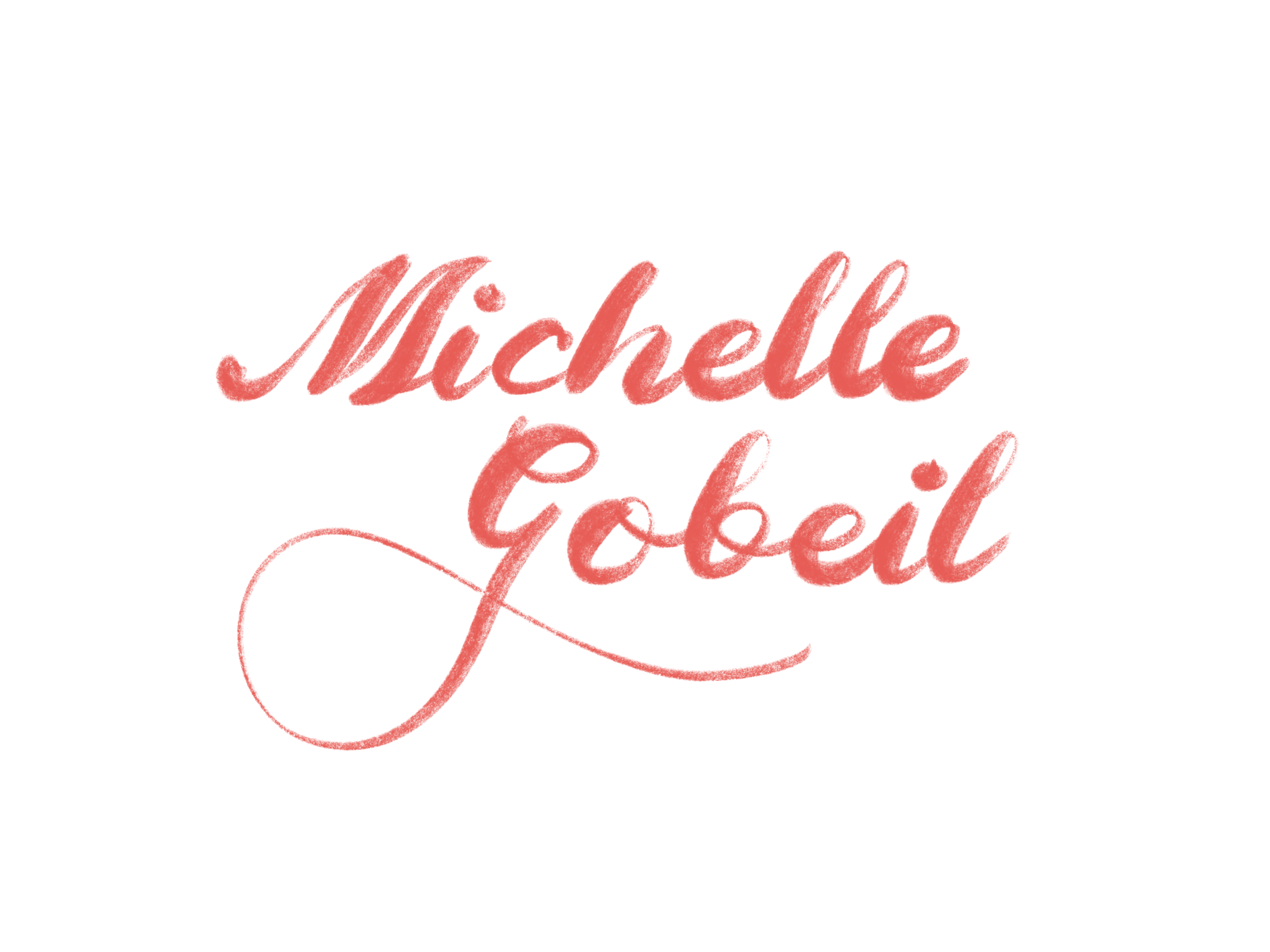
Very natural, almost looks like a subtle crayon texture. Definitely doesn't look like a pre-made font, so good work!
1 year ago by Adam Snetiker
Posts
Michelle Gobeil
- Report
1 year ago by Adam Snetiker
Simple, natural-looking wordmark with colorful accents that represent the artistic qualities of an illustrator.
Michelle Gobeillogo

 2 Likes
 1
1
Nice work
1 year ago by Magasha.magasha - Reply