Juan Cruz
Posts
1
Likes
3
Liked Posts
2
Given Feedback
27
Feedback
i LOVE this. so unique, childish. I def see this printed in a book
10 months ago by Juan Cruz
ahahhahahah, what i meant was that that font, extremely probable to be brush script, has been so used, seen and is so recognizable that the company would loss its uniqueness; same would happen if a toys company uses comic sans. Do you get it? anyways, the organization lf the interface is extremely well done, but a think another font would be better
1 year ago by Juan Cruz
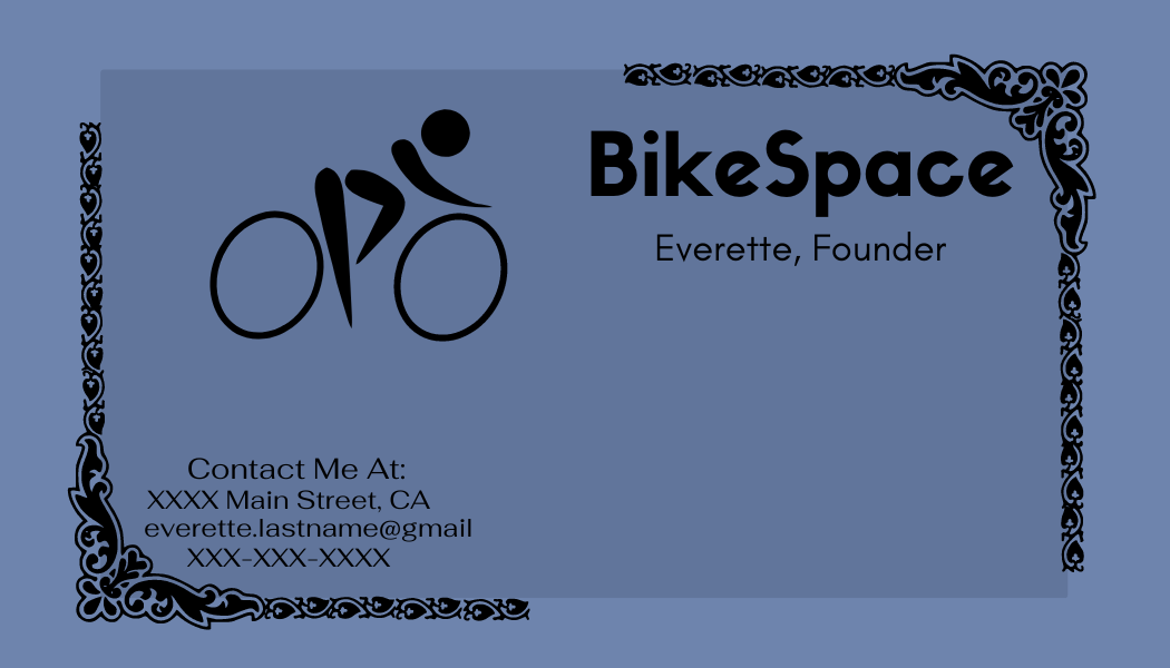
love BikeSpace lettermark, not big fan of the other things
1 year ago by Juan Cruz
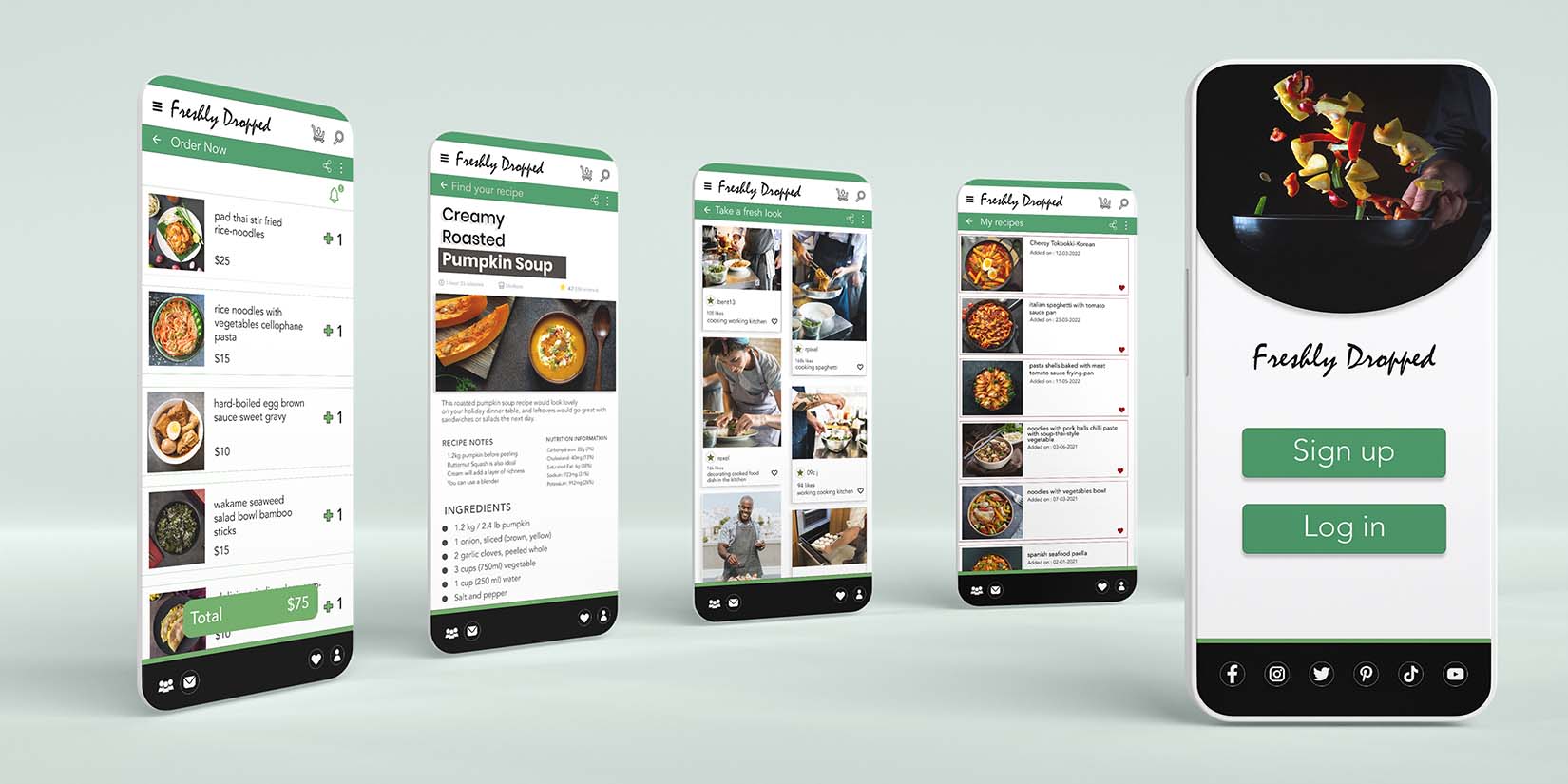
lots of info

1 year ago by Juan Cruz
good idea of the icon, can execute better. Poor text font
1 year ago by Juan Cruz
change sign mark and car does not merge well

1 year ago by Juan Cruz
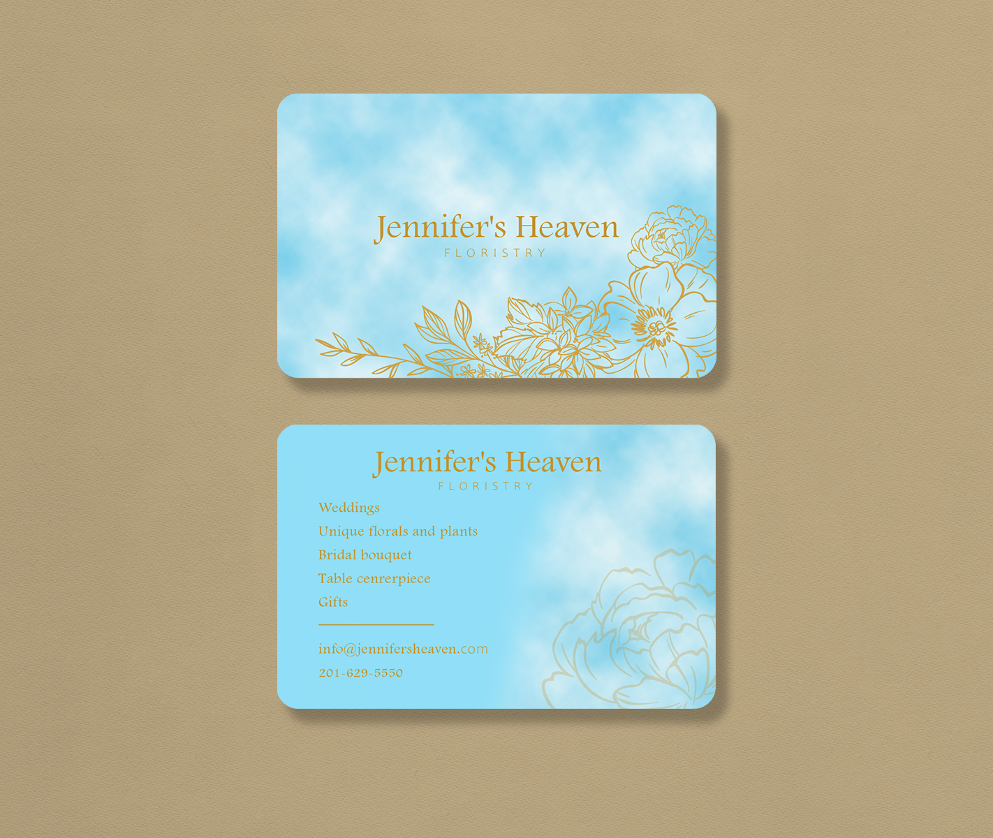
not fan of the background pattern

1 year ago by Juan Cruz
contrast problem
1 year ago by Juan Cruz
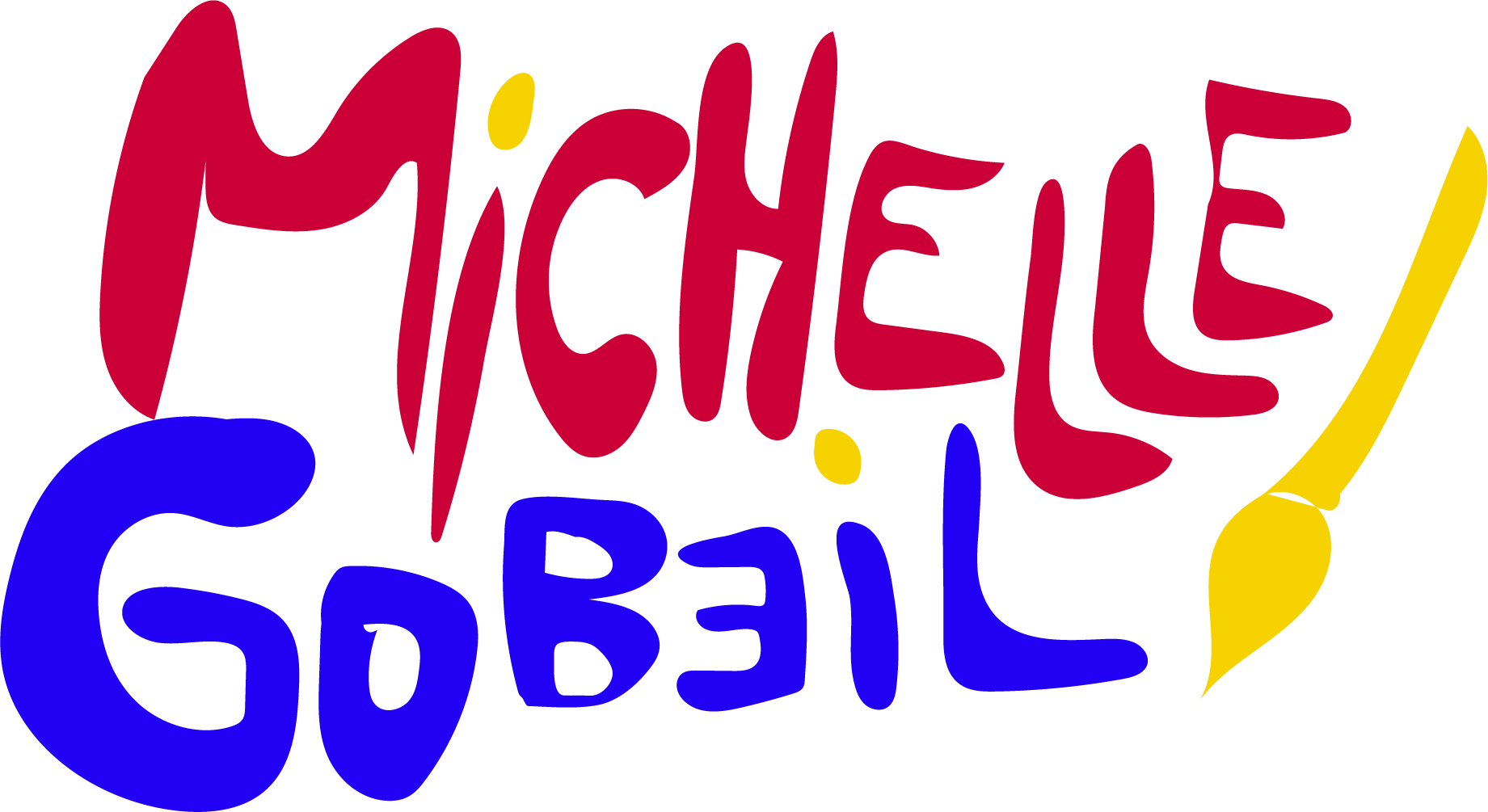
definitely change brush script font.
1 year ago by Juan Cruz
check eyes, eyelids, eyebrows shadows
1 year ago by Juan Cruz
love font

1 year ago by Juan Cruz
would not put the shadows
1 year ago by Juan Cruz
would make the bottom text little bigger. Maybe check colors
1 year ago by Juan Cruz
Check color of text and how it merges with the photo

1 year ago by Juan Cruz
watermark, not clean, and not best font

1 year ago by Juan Cruz
not fan of the background of the card and mock up
1 year ago by Juan Cruz
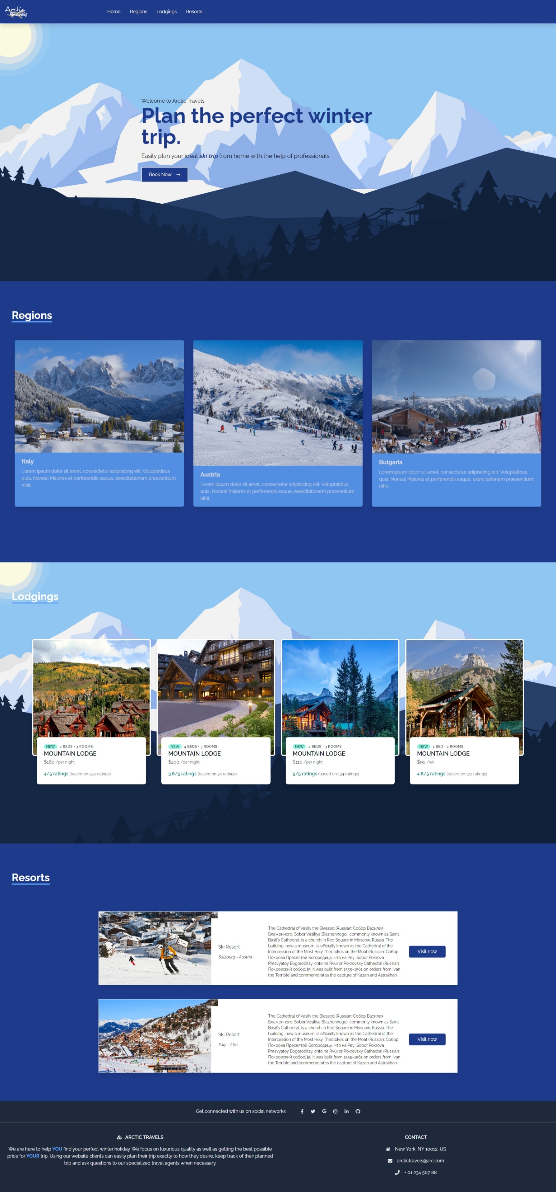
Love this, first part is crazy. Not quite fan of top left logo "Arctic levels"
1 year ago by Juan Cruz
Needs something characteristic. This is just text

1 year ago by Juan Cruz
would change background cloud color, or text, so more contrast is achieved
1 year ago by Juan Cruz
Check font
1 year ago by Juan Cruz
text confused by the illustrations at the back
1 year ago by Juan Cruz
Love this.

1 year ago by Juan Cruz
umm.. not quite good for me. Looks literally like a traffic sign.

1 year ago by Juan Cruz
error at the apostrophe, and would change the butterfly for a line illustration

1 year ago by Juan Cruz
check scalability
1 year ago by Juan Cruz
:)

1 year ago by Juan Cruz
clean. Nice color. Can´t quite tell what is the illustration

1 year ago by Juan Cruz
Posts
Retro lettermark logo: zec.net
- Report
1 year ago by Juan Cruz
Retro letermark for zec.net
Hi!
I'm Timika, owner of zec.net. For a while now, we've been looking for a good logo for our business. I think a lettermark will fit best. Can you help me out?
I'm Timika, owner of zec.net. For a while now, we've been looking for a good logo for our business. I think a lettermark will fit best. Can you help me out?
 3 Likes
 2
2
Wow! Prestine👌
9 months ago by Mujeeb Amoo - Reply
:)
1 year ago by Juan Cruz - Reply