Soheyl
Posts
2
Likes
5
Liked Posts
3
Given Feedback
2
Feedback
I'm not sure about the typeface.
also the design is a bit confusing and too layered up in my opinion.
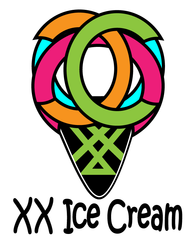
4 years ago by Soheyl
I like the color combination and how the darker color on the film roll depicts shadow, all because you reversed the color combination on film roll.
I think if the texts were left aligned it would work better for me. on the other hand, the two vertically aligned letter "E" looks good. so alignment of the two letter "O" might look good as well. or maybe a serif typeface?
overall it's a smart design.

4 years ago by Soheyl
Posts
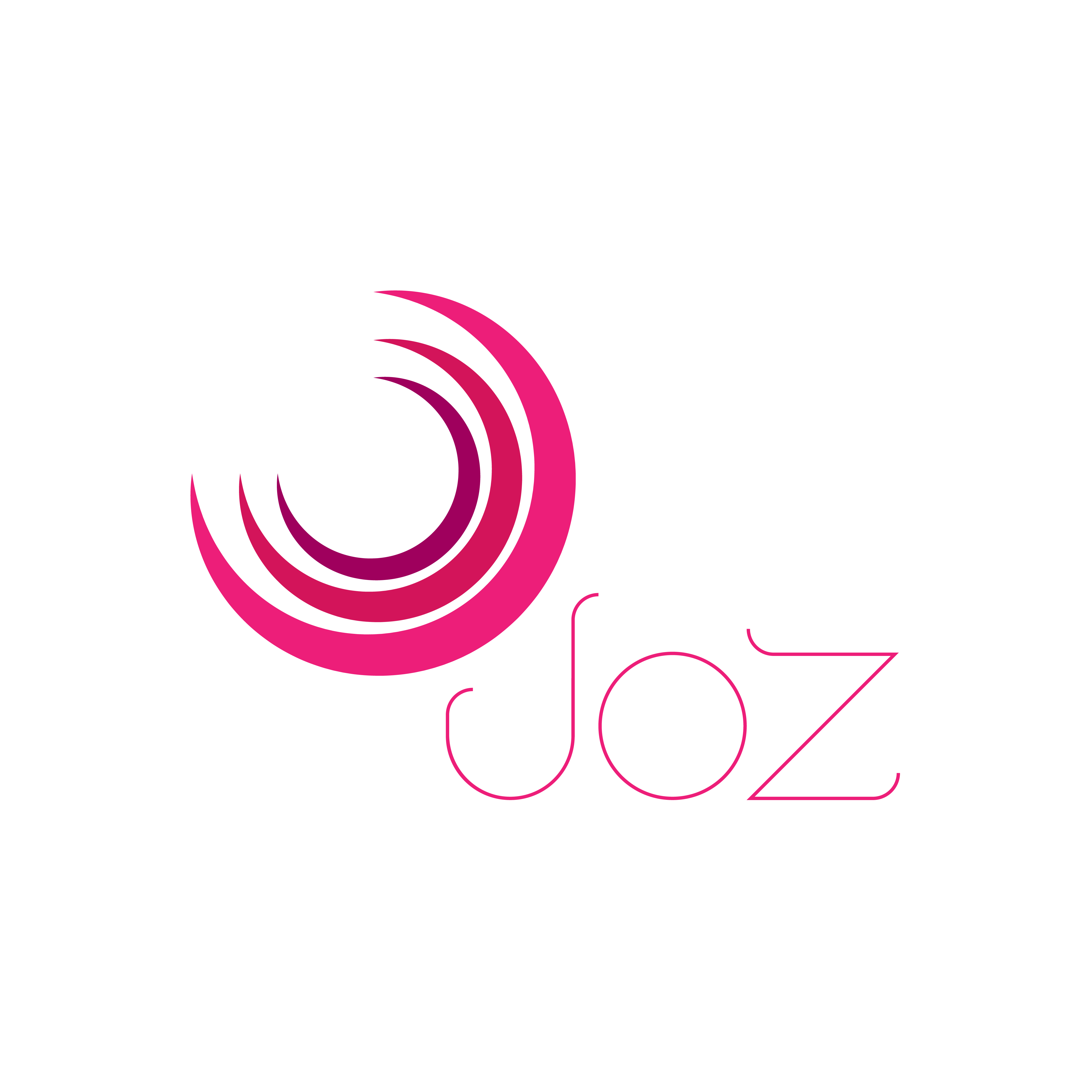
JOZ
- Report
4 years ago by Soheyl
Design a Combination Mark for a company named JOZ.
(Combination & Abstract)
(Combination & Abstract)
 3 Likes
 1
1
font is a little too thin maybe
4 years ago by mar�a - Reply
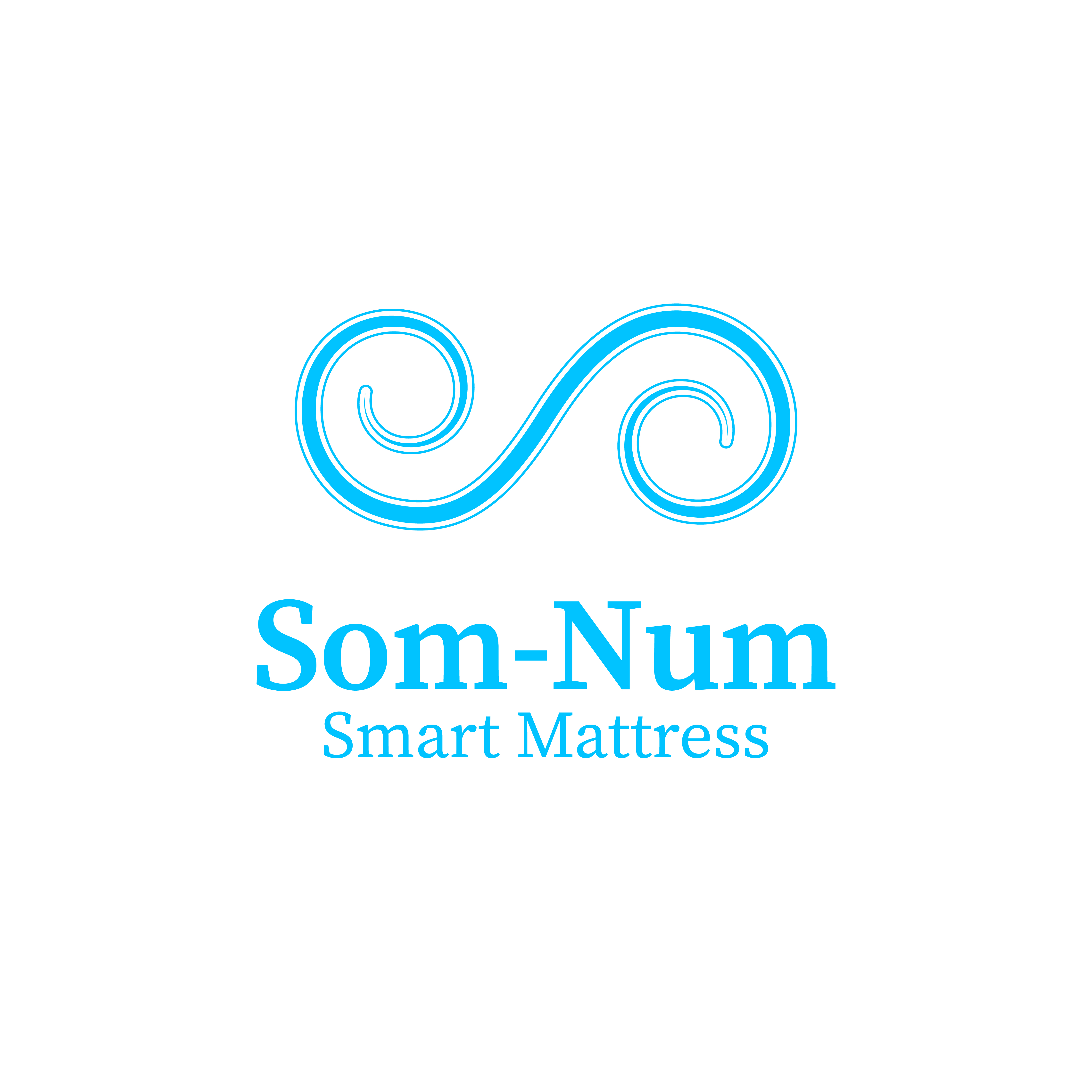
Som-Num Mattress
- Report
4 years ago by Soheyl
Design a logo for smart mattress.
Simple and recognizable.
Simple and recognizable.
Som-Numlogo
 2 Likes
0
2 Likes
0