Debi Prasad Mishra
Posts
0
Likes
0
Liked Posts
3
Given Feedback
6
Feedback
Do you have a reason for putting knight's helmet in the logo?

4 years ago by Debi Prasad Mishra
That isn't even looking as book
4 years ago by Debi Prasad Mishra
It looks more of .NET logo

4 years ago by Debi Prasad Mishra
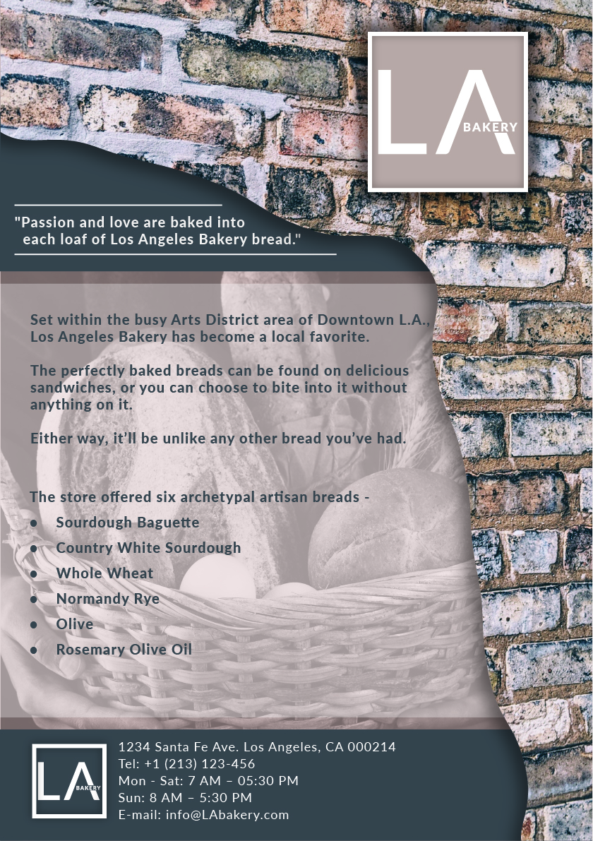
Lack of contact information on the card.

4 years ago by Debi Prasad Mishra
It looks so dull. Contrast issue. The text isn't visible.
4 years ago by Debi Prasad Mishra
There are contrast issues in the poster. Don't know where to look around. White Text on the light green isn't visible.

4 years ago by Debi Prasad Mishra