Christopher Pendleton
Posts
8
Likes
3
Liked Posts
3
Given Feedback
8
Feedback
Nice use of the fuselage with the lettering
1 year ago by Christopher Pendleton
Very clean design! Nice colour palette also. Maybe round the corners of the text box as everything else is rounded? Excellent work
1 year ago by Christopher Pendleton
The incorporation of the house is excellent! I really like this. It hits the brief perfectly and the logo clearly evokes the business name. Well done!
1 year ago by Christopher Pendleton
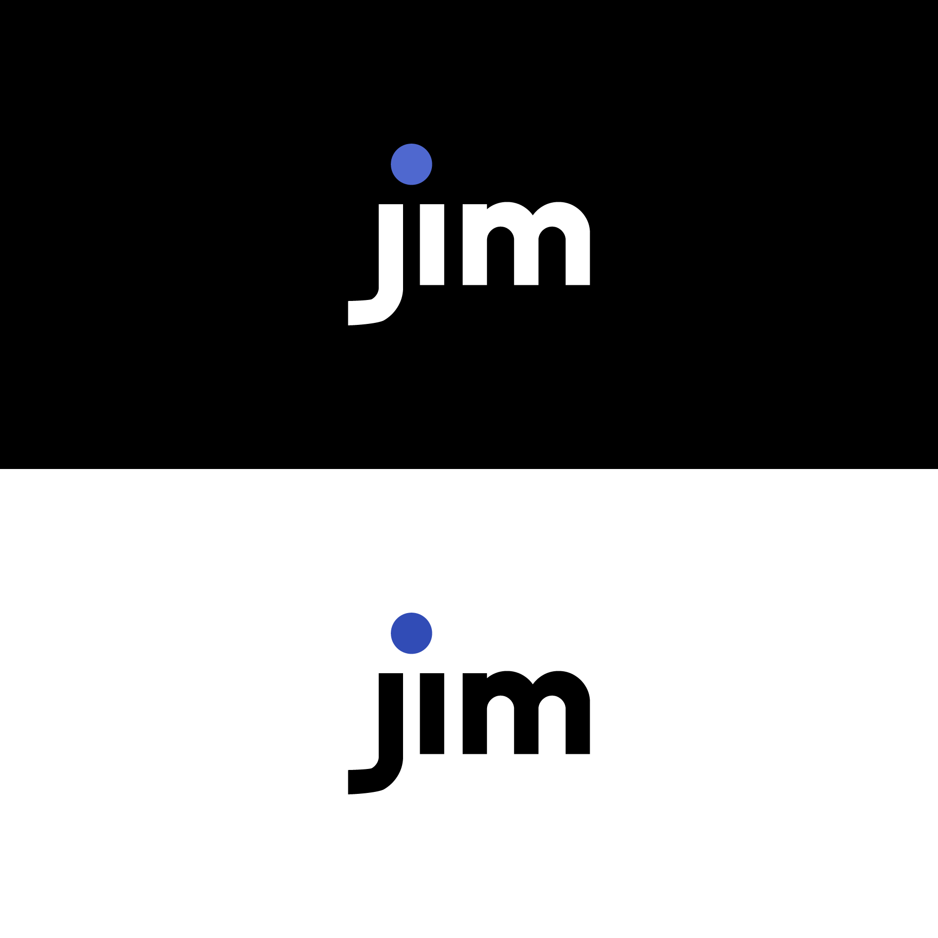
The subtle dot for both the j and i with the colour scheme is very nice.
1 year ago by Christopher Pendleton
I love the explanation behind the different semi circle sizes and it comes across perfectly here in my opinion. Really well done.

1 year ago by Christopher Pendleton
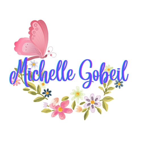
Nicely framed text with illustrated flora which says straight away 'illustrator'. The text itself does look pen-like but it does look like a font because of how perfect it does look in regard to the two L's in Michelle and last L in Gobeil looking identical. Slight variations in the lettering would give this that more unique look from the brief to compliment the stunning flora and butterfly frame. Good job.
1 year ago by Christopher Pendleton
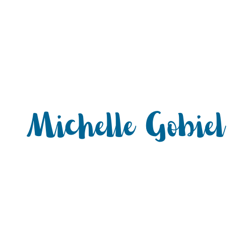
Very nice, clean pen strokes which fit the brief. The rounded and soft edges show a more welcoming nature that relates to a children's illustrator. Well done.
1 year ago by Christopher Pendleton
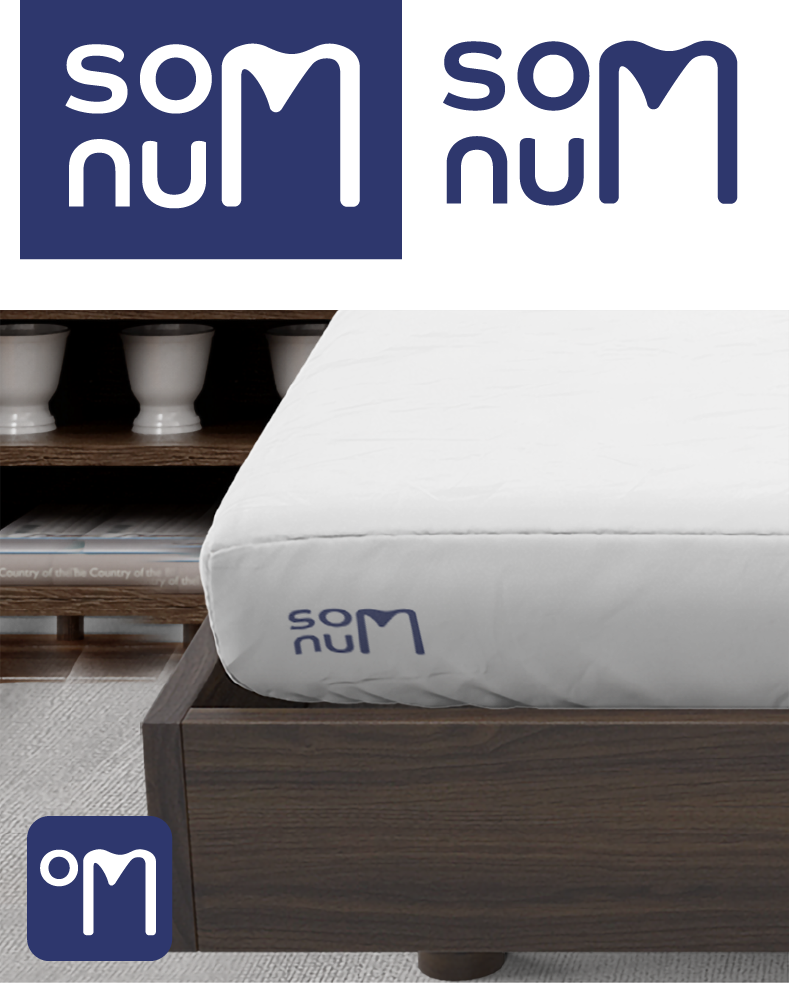
Love the incorporation of the m into both words. And the colour choice is calm too which is a bonus for the product type.
1 year ago by Christopher Pendleton
Posts
Daily Fake Clients logo 05/09/22 - Duor
- Report
1 year ago by Christopher Pendleton
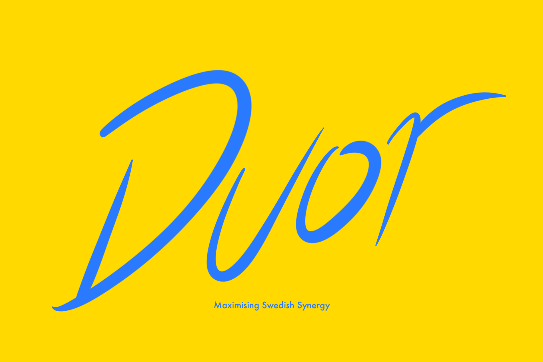
I researched what Duor meant.
duor (Swedish)
Noun - duor
Indefinite plural of duo
So I quickly did this script pen wordmark based for an imaginary mentorship business that helps teams, duos, B2B relationships (synergy) work better.
duor (Swedish)
Noun - duor
Indefinite plural of duo
So I quickly did this script pen wordmark based for an imaginary mentorship business that helps teams, duos, B2B relationships (synergy) work better.
 1 Like
 1
1
would make the bottom text little bigger. Maybe check colors
1 year ago by Juan Cruz - Reply
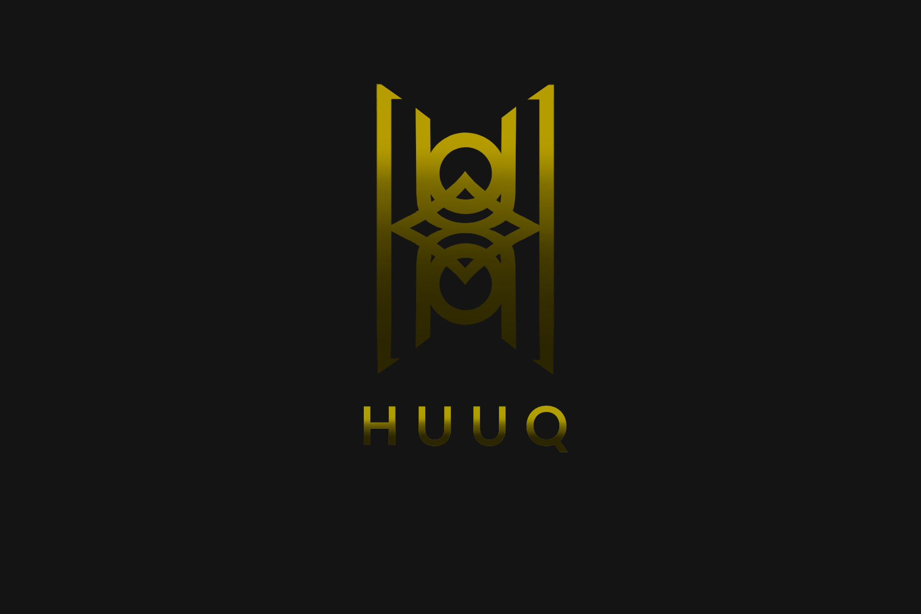
Daily logo 4th September - HUUQ lettermark
- Report
1 year ago by Christopher Pendleton
I used each individual letter to make a large h with the letters combined within. First time trying a logo like this where I checked off each letter as I went on.
 1 Like
2
1 Like
2
would not put the shadows
1 year ago by Juan Cruz - Reply
I think the shadow on the logo itself is ok, just not on the actual letters
1 year ago by Andrea Cline - Reply
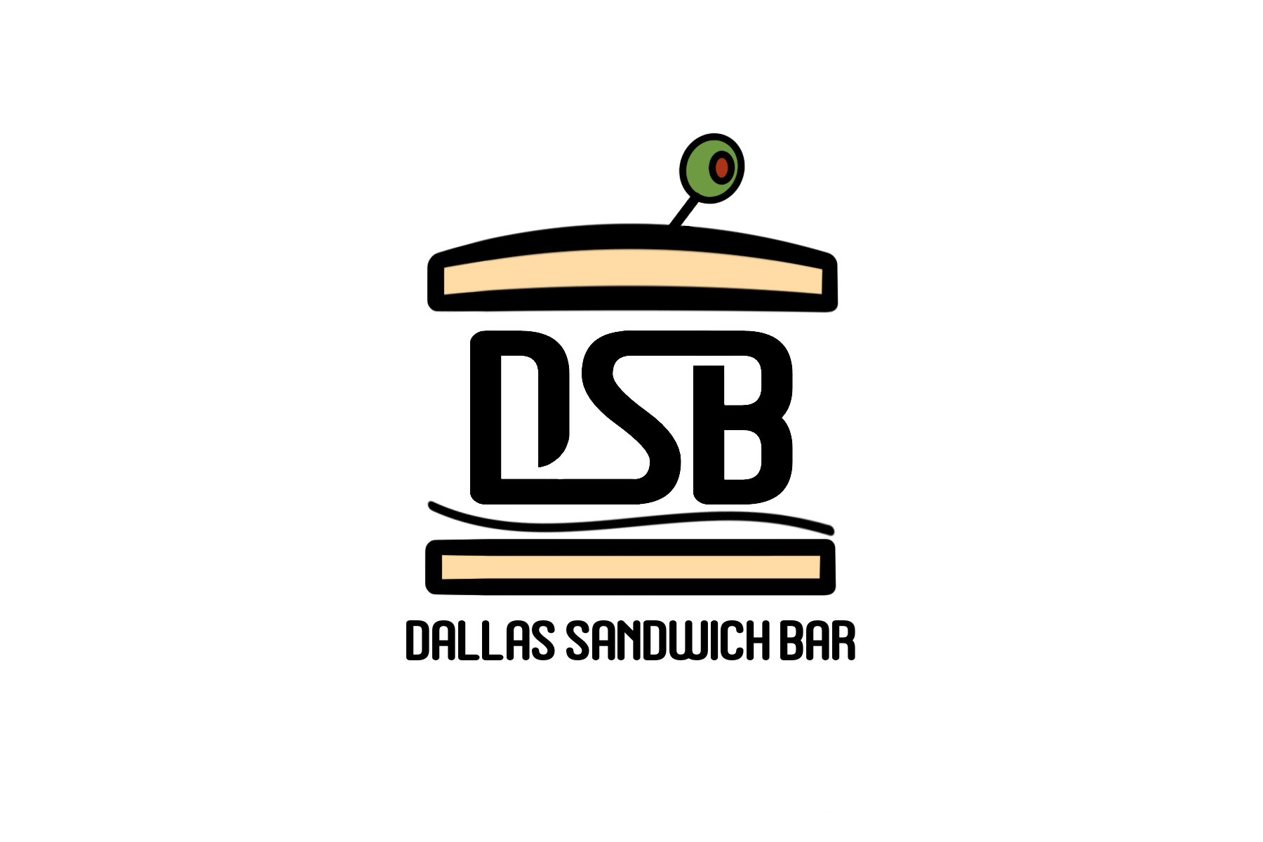
Fake Clients Daily Logo 17/08/22 - Dallas Sandwich Bar
- Report
1 year ago by Christopher Pendleton
Minimal logo with the initials of Dallas Sandwich Bar making up the filling of the sandwich with a nice olive dressed on top!
 1 Like
1
1 Like
1
woww
1 year ago by ibraheem asif - Reply
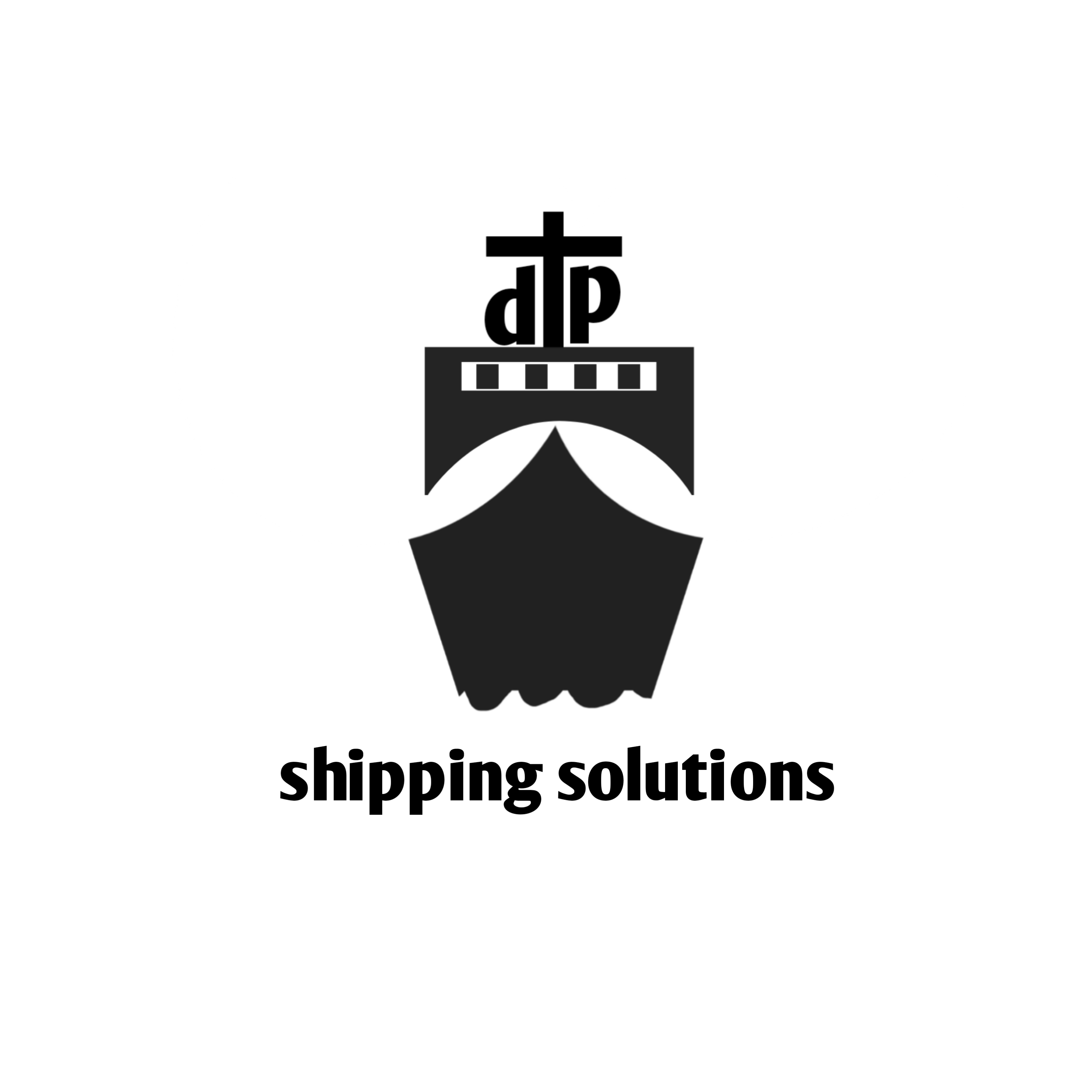
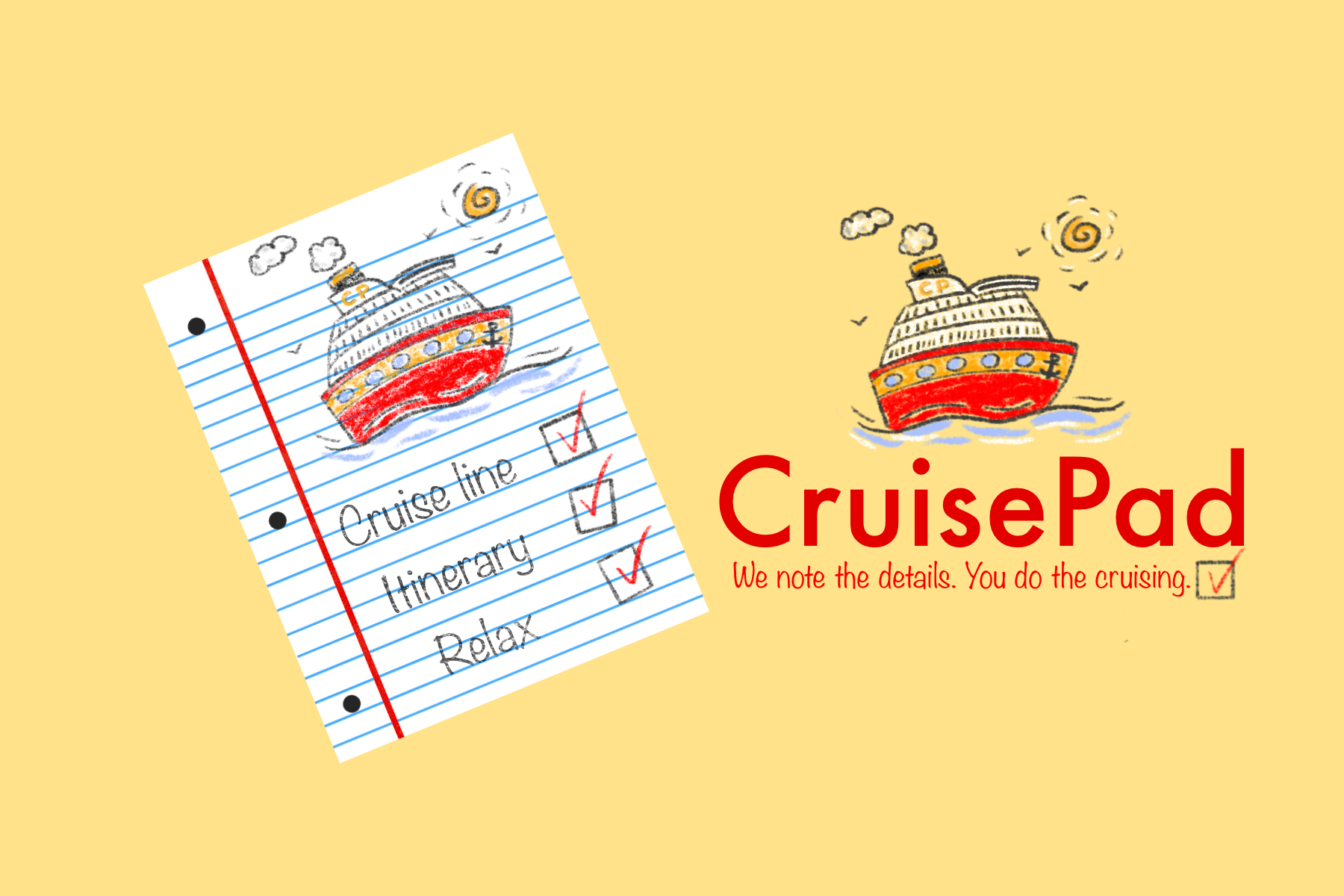
FakeClients Daily Brief - CruisePad mascot logo
- Report
1 year ago by Christopher Pendleton
I used a notepad and being excited for a cruise holiday as my inspiration. I recently went on a cruise and my wife made lists of everything which this is themed on. So I imagined the CruisePad business to be a cruise planning/booking agent and a ticked list being their offer to the customer. The mascot is a doddle cruise ship that someone might doddle in their own notepad. Feedback is most welcome.
 Like
1
Like
1
the color and design looks great
1 year ago by Kiki Rhama - Reply
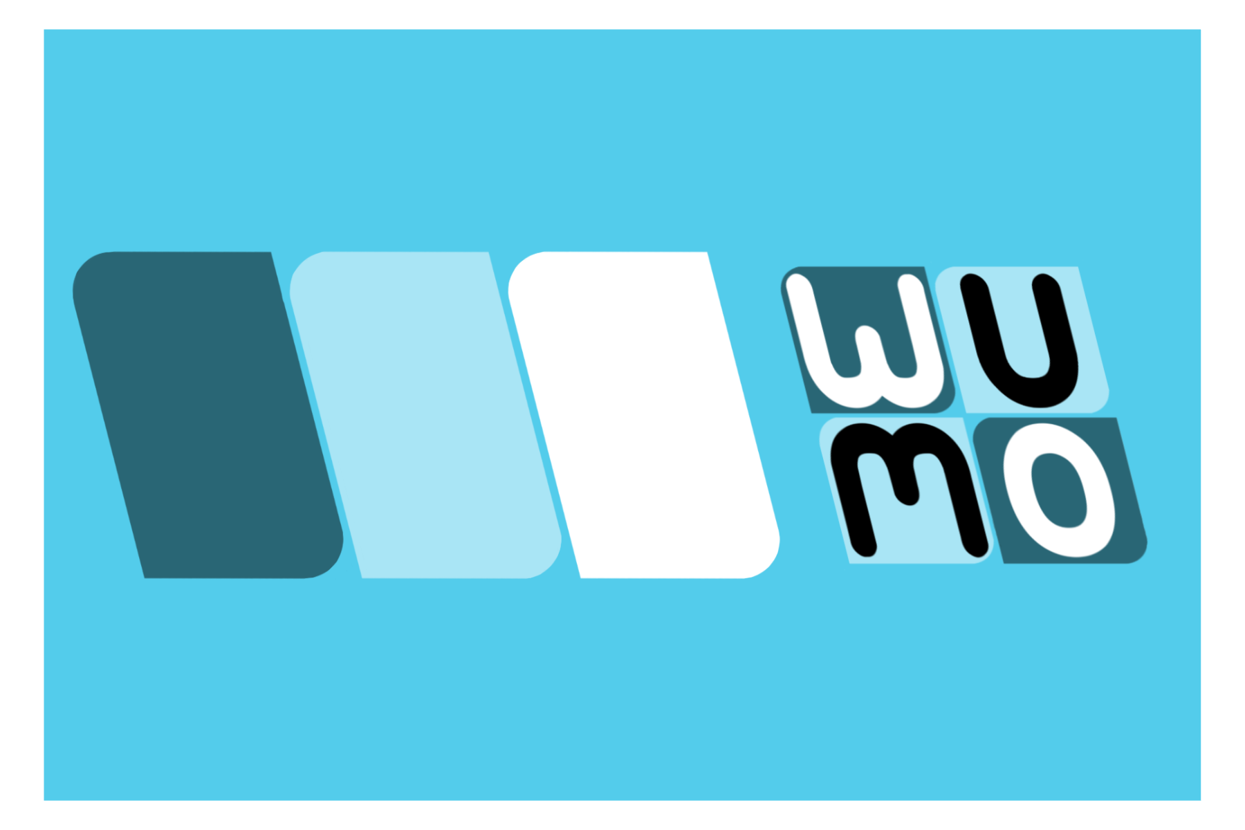
Wumo generated brief - Abstract mark with Combination Mark logo
- Report
1 year ago by Christopher Pendleton
Abstract (left) and combination logo (right)
 Like
1
Like
1
awesome job
1 year ago by Kiki Rhama - Reply