Eugene
Posts
6
Likes
17
Liked Posts
5
Given Feedback
0
Posts
The Roaster Bean
- Report
4 years ago by Eugene
Create a logo for a coffee shop
 2 Likes
 1
1
Very creative and well put together!
4 years ago by Alisha - Reply
Movie Zone
- Report
4 years ago by Eugene
Create a logo for a new theater
 4 Likes
3
4 Likes
3
I think it's a great logo, I think it's common for movie theatres to have red in their designs though so that could be a small improvement.
4 years ago by Alisha - Reply
I really like it :)
4 years ago by jiri_pudich - Reply
I like the color combination and how the darker color on the film roll depicts shadow, all because you reversed the color combination on film roll.
I think if the texts were left aligned it would work better for me. on the other hand, the two vertically aligned letter "E" looks good. so alignment of the two letter "O" might look good as well. or maybe a serif typeface?
overall it's a smart design.
4 years ago by Soheyl - Reply
Panda Global
- Report
4 years ago by Eugene
 4 Likes
2
4 Likes
2
Cute logo. If I were to improve it, I'd round the edges on the panda a little to match the font. Also, consider making the word "Global" slightly bolder, so it doesn't disappear, when you shrink the logo down to a few cm. Really good job!
4 years ago by Alex Strøm - Reply
Fun, cute, and minimal! I love it!
4 years ago by Alisha - Reply
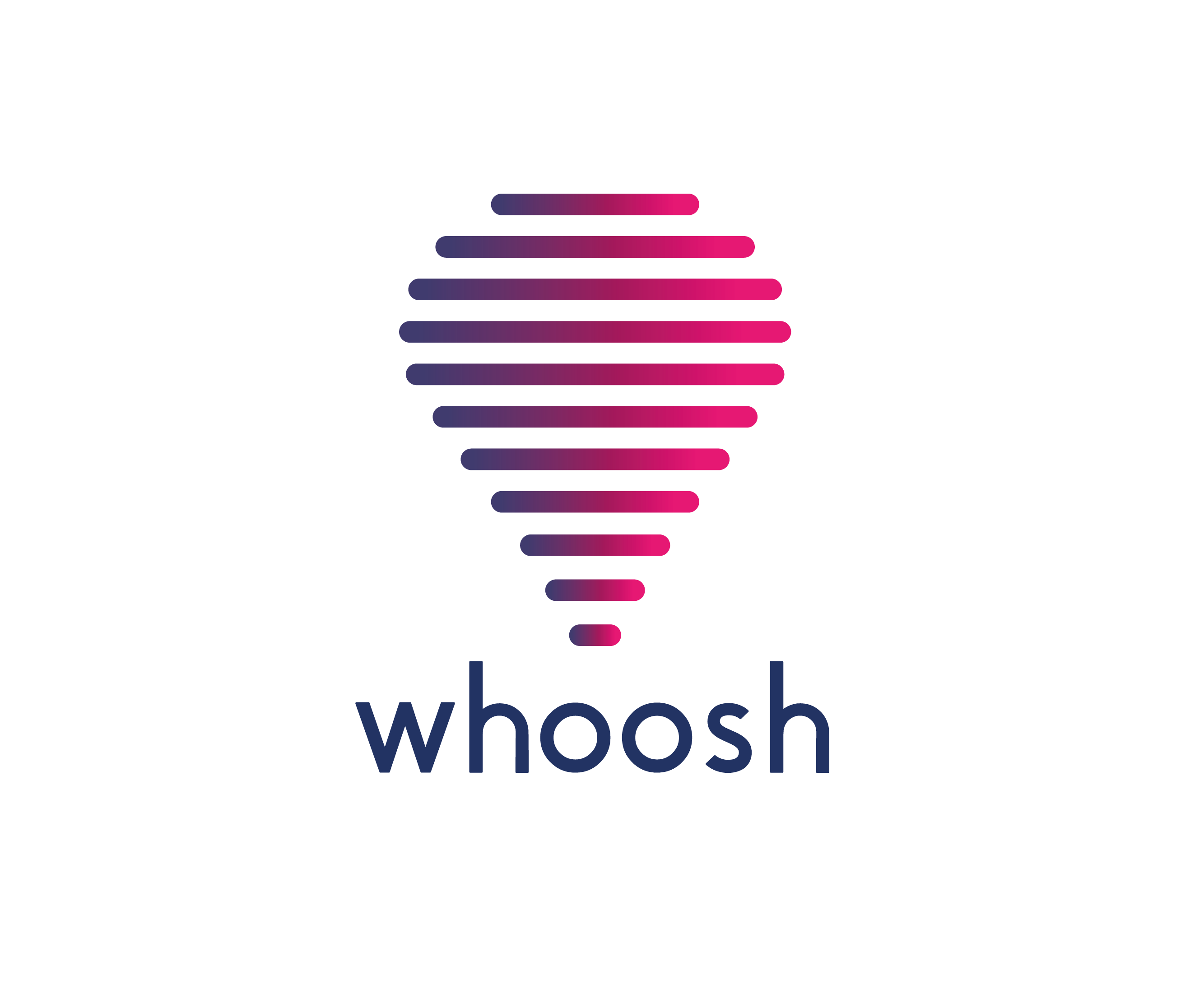
Whoosh
- Report
4 years ago by Eugene
Design a logo featuring a hot air balloon.
4 Likes
3
Hi Eugene. This design is really nice! The lines reminds me of soundbars, I don't know if that was intentional, but i like it. I also really like the gradient.
If I were to change anything, I would round the corners of the font, so they match the hot air balloon. It would also make the typeface look more custom.
Really good job! Keep up the good work!
4 years ago by Alex Strøm - Reply
looks cool
4 years ago by mar�a - Reply
Looks professional and beautiful
4 years ago by Alisha - Reply