Justin Howard
Posts
1
Likes
2
Liked Posts
0
Given Feedback
1
Feedback
I really like the way you tiled the photos at the bottom, it really drew my eye to the beautiful photos. I don't really like the pattern on the orange background though, it feels a little too busy. If it was just solid orange I feel like it would be more striking.

4 years ago by Justin Howard
Posts
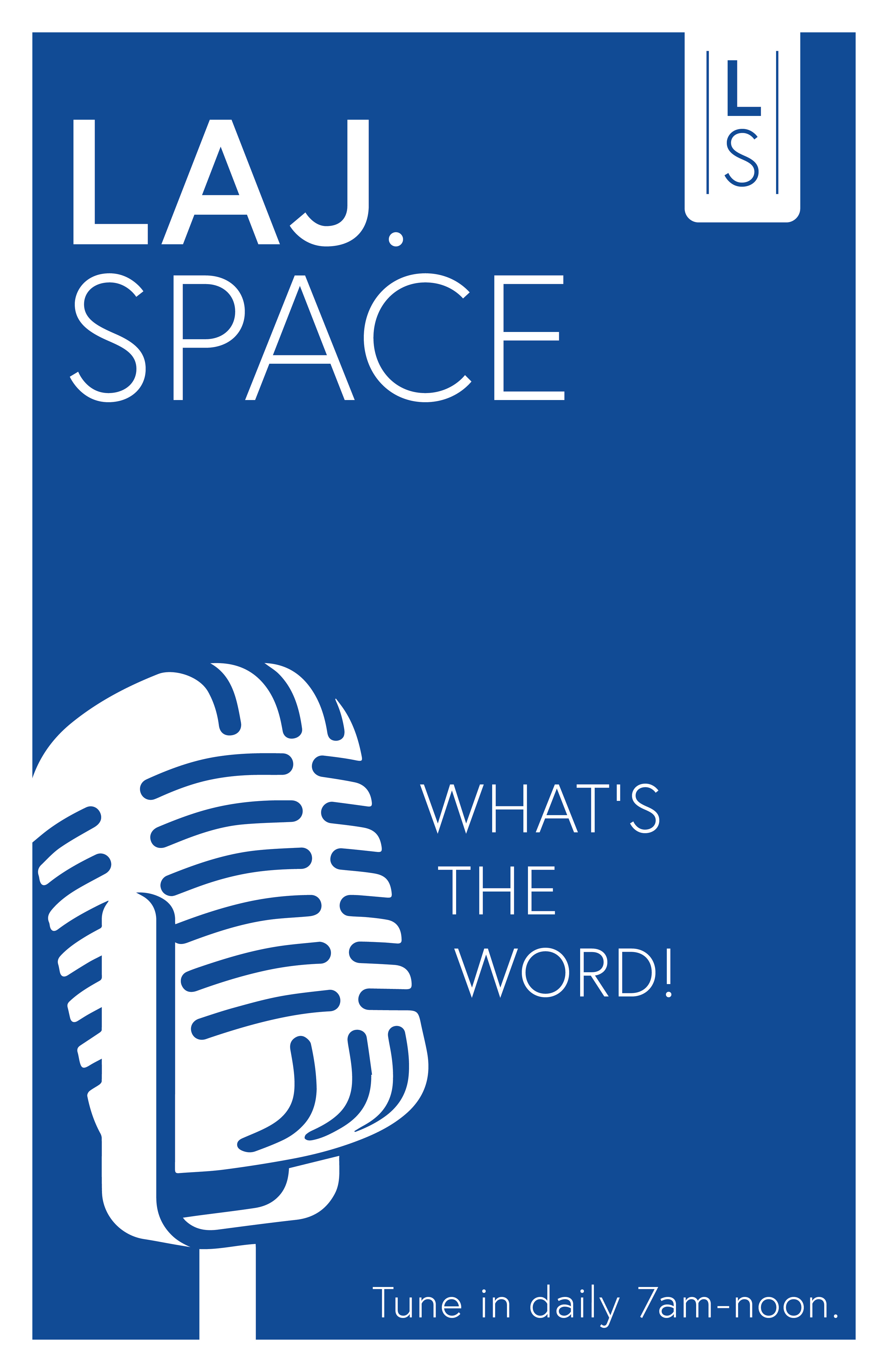
Laj.Space Poster
- Report
4 years ago by Justin Howard
This is a poster for a broadcasting company who's call to action is just to tune in. They use blue as their primary color, and so I kept it pretty simple.
 2 Likes
 0
0