Monja
I am a second-year graphic design student based in South Africa.
Posts
2
Likes
1
Liked Posts
28
Given Feedback
6
Feedback
This is a creative idea. I would give you a tip and say you make the font of jan.com as thin as the illustration or play around with the "C". Currently, the design is very awkward.
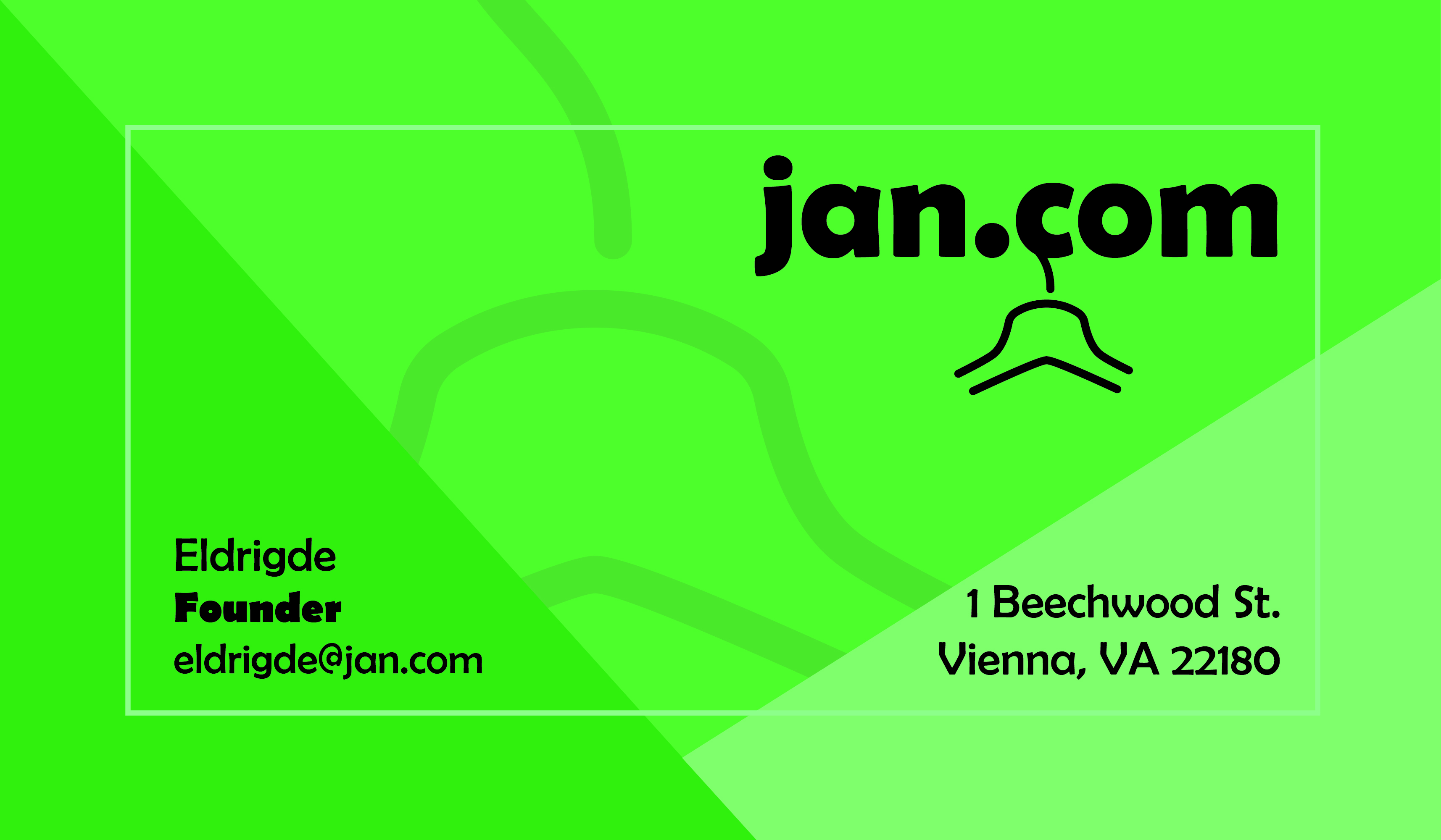
1 year ago by Monja
This is cool. Neat and professional.
1 year ago by Monja
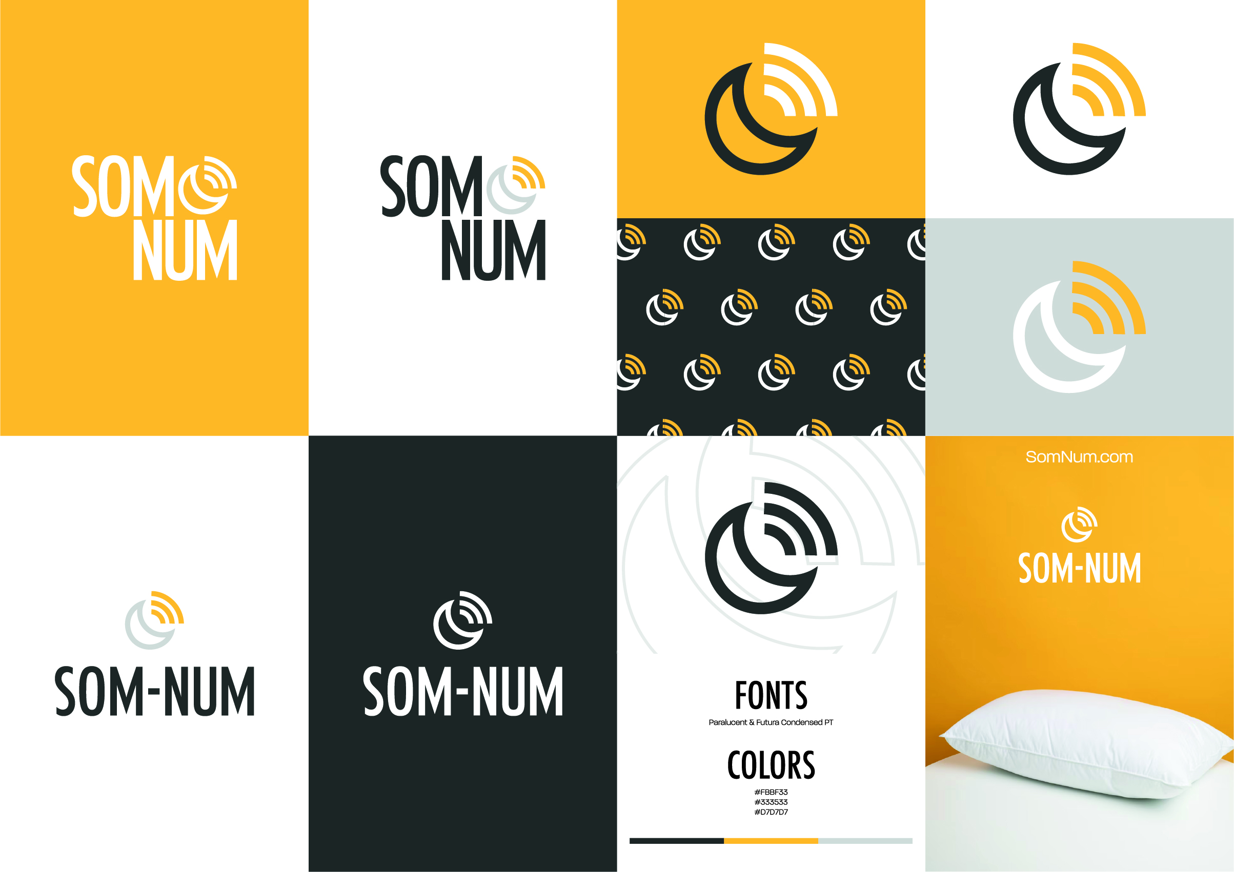
One tip I can give you is to remember to set up margins when working to ensure your design fits perfectly in the middle. I would add the person's Name and Surname for people to know who they are talking to.
1 year ago by Monja
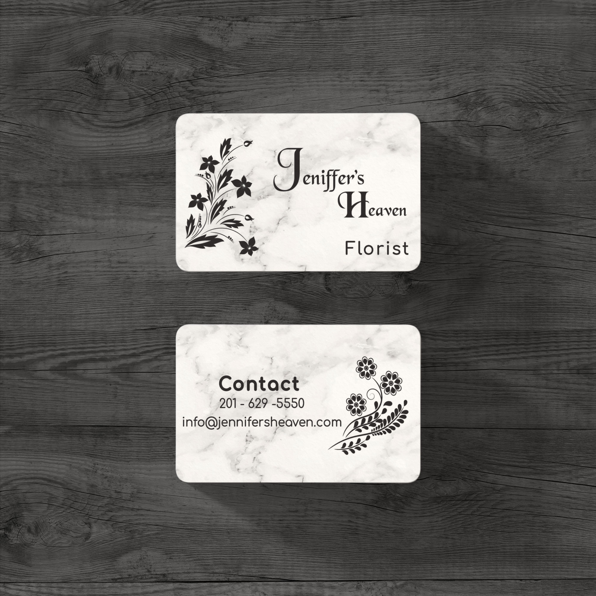
This is very cute. I like it a lot.
1 year ago by Monja
You can maybe play around with different fonts and sizes.
1 year ago by Monja
This is a nice logo. I am unsure if the icon used is supposed to be skewed or done on purpose—excellent use of colour and spacing.

1 year ago by Monja
Posts
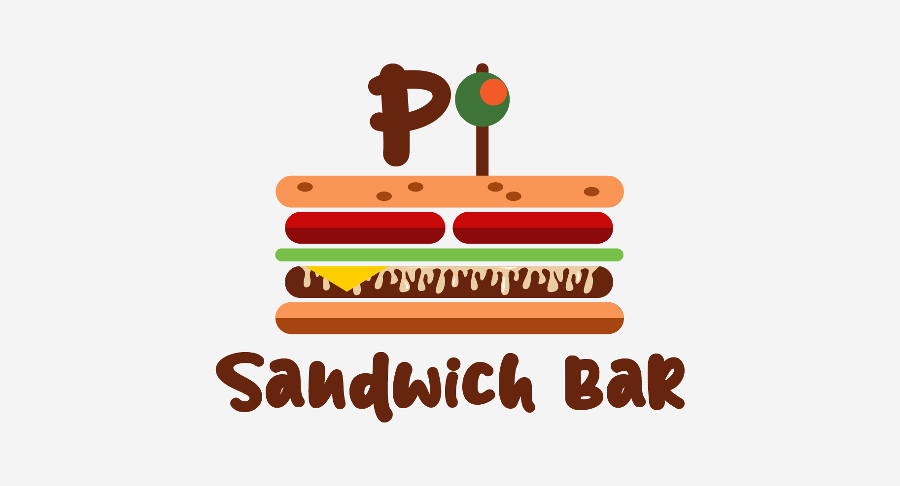
PI Sandwich Bar Logo
- Report
1 year ago by Monja
Hey!
I am Rea, owner of PI Sandwich bar. For a while now, we've been looking for a good logo for our Sandwich bar. I like pictorial marks. Would you be interested?
I am Rea, owner of PI Sandwich bar. For a while now, we've been looking for a good logo for our Sandwich bar. I like pictorial marks. Would you be interested?
 1 Like
 1
1
Love this design! the typeface you choose is so unique! and the single slice of cheese adds some humor!
1 year ago by Catherine Bosse - Reply
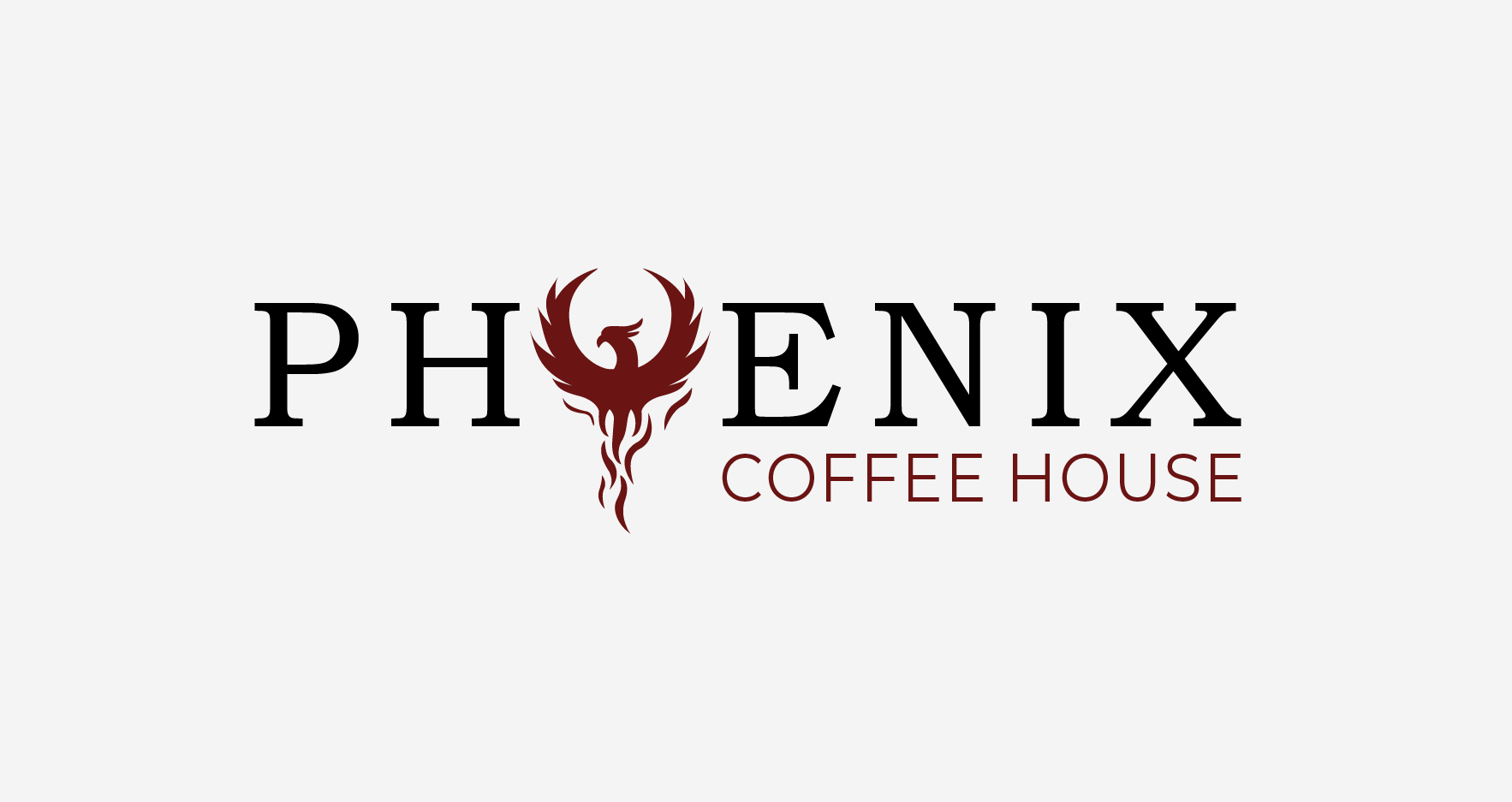
Phoenix Coffee House Logo
- Report
1 year ago by Monja
The brief required me to make a logo for a Phoenix Coffee House business. The logo is a wordmark logo. The phoenix represents steam that comes from coffee. As a phoenix represents being born again, drinking coffee makes you feel alive.
 Like
1
Like
1
Great concept! I would do the steam's stripes more bold, but it looks very cool just as it is
1 year ago by Krisbell - Reply