Hana
Posts
2
Likes
4
Liked Posts
1
Given Feedback
1
Feedback
I like the way you used white space to show entrance but I think that these tiny white spaces around entrance are narrow so it feels like the whole logo is narrow.

1 year ago by Hana
Posts
Alec's Cakery logo
- Report
1 year ago by Hana
Hi!
I am Alec, founder of Alec's Cakery. For a while now, we've been looking for a good logo for our business. I think a lettermark will fit best. Can you do that?
I am Alec, founder of Alec's Cakery. For a while now, we've been looking for a good logo for our business. I think a lettermark will fit best. Can you do that?

 3 Likes
 1
1
great logo really happy to work with you
1 year ago by illes - Reply
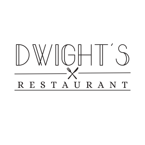
Logo for Dwight's restaurant
- Report
1 year ago by Hana
Hey!
I am Dwight, I just founded a new business called Dwight's Restaurant. We're looking for someone that can create a simple logo for our business. I think a wordmark would look cool. Can you do that?
I am Dwight, I just founded a new business called Dwight's Restaurant. We're looking for someone that can create a simple logo for our business. I think a wordmark would look cool. Can you do that?
 1 Like
1
1 Like
1
I like it! The two fonts compliment each other nicely! I would maybe add more space between "restaurant" and the bottom line, it feels a little off balance to me!
1 year ago by Brett Mikaluk - Reply