Bethany Gill
Posts
3
Likes
3
Liked Posts
4
Given Feedback
4
Feedback
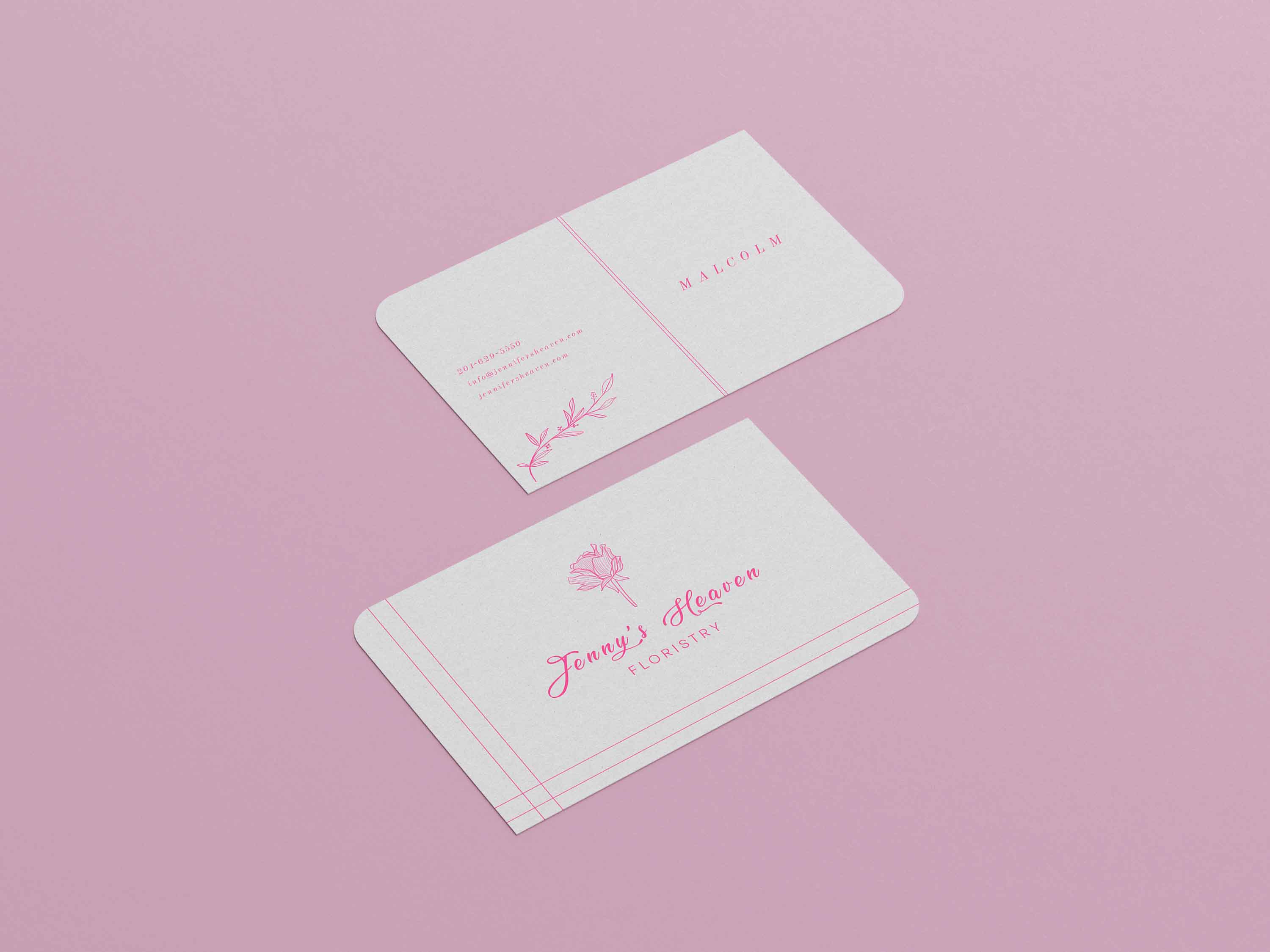
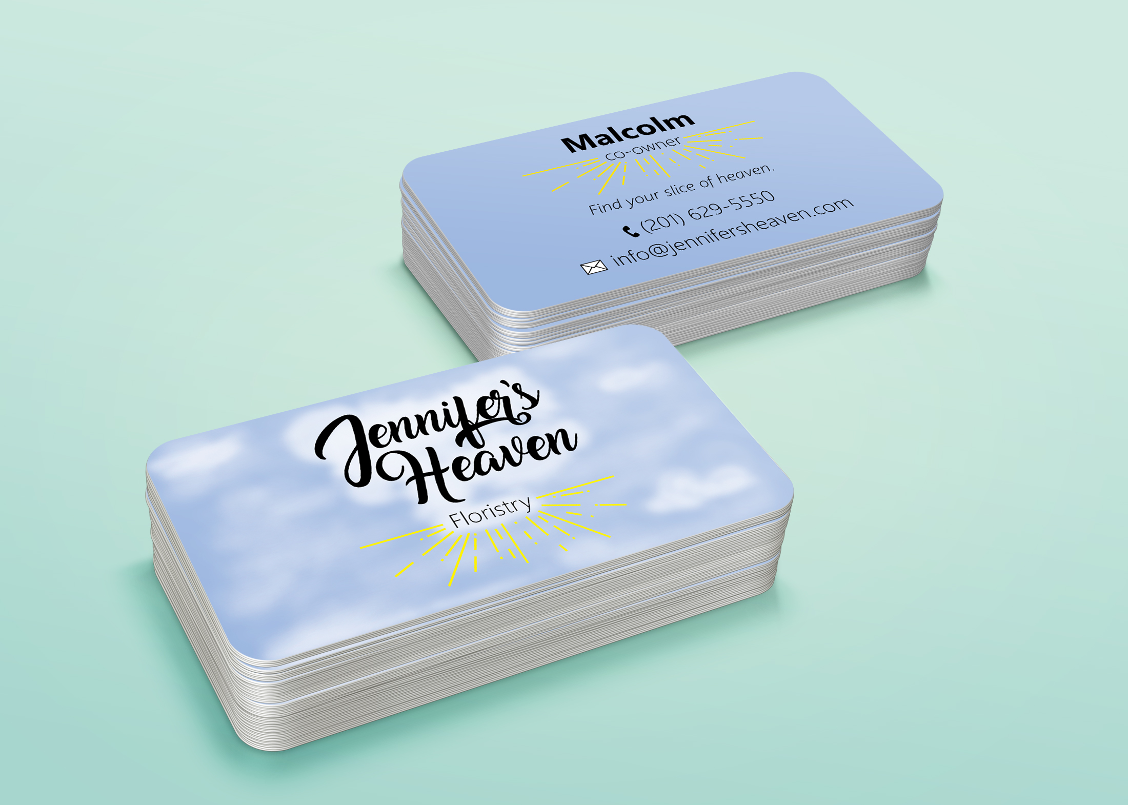
Beautiful florals. Consider adding the name and title of the person to contact. Also consider the practicality of the size and shape of the card as if someone were really going to put this in their wallet. Not saying it wouldn't work, I love the shape, just something to think about.

1 year ago by Bethany Gill
Lovely design. The contact information seems it would be a bit hard to read for most people in a real-world setting given the size and color. Play around with the size of the font to see what would work
1 year ago by Bethany Gill
love the imagery and colors
1 year ago by Bethany Gill
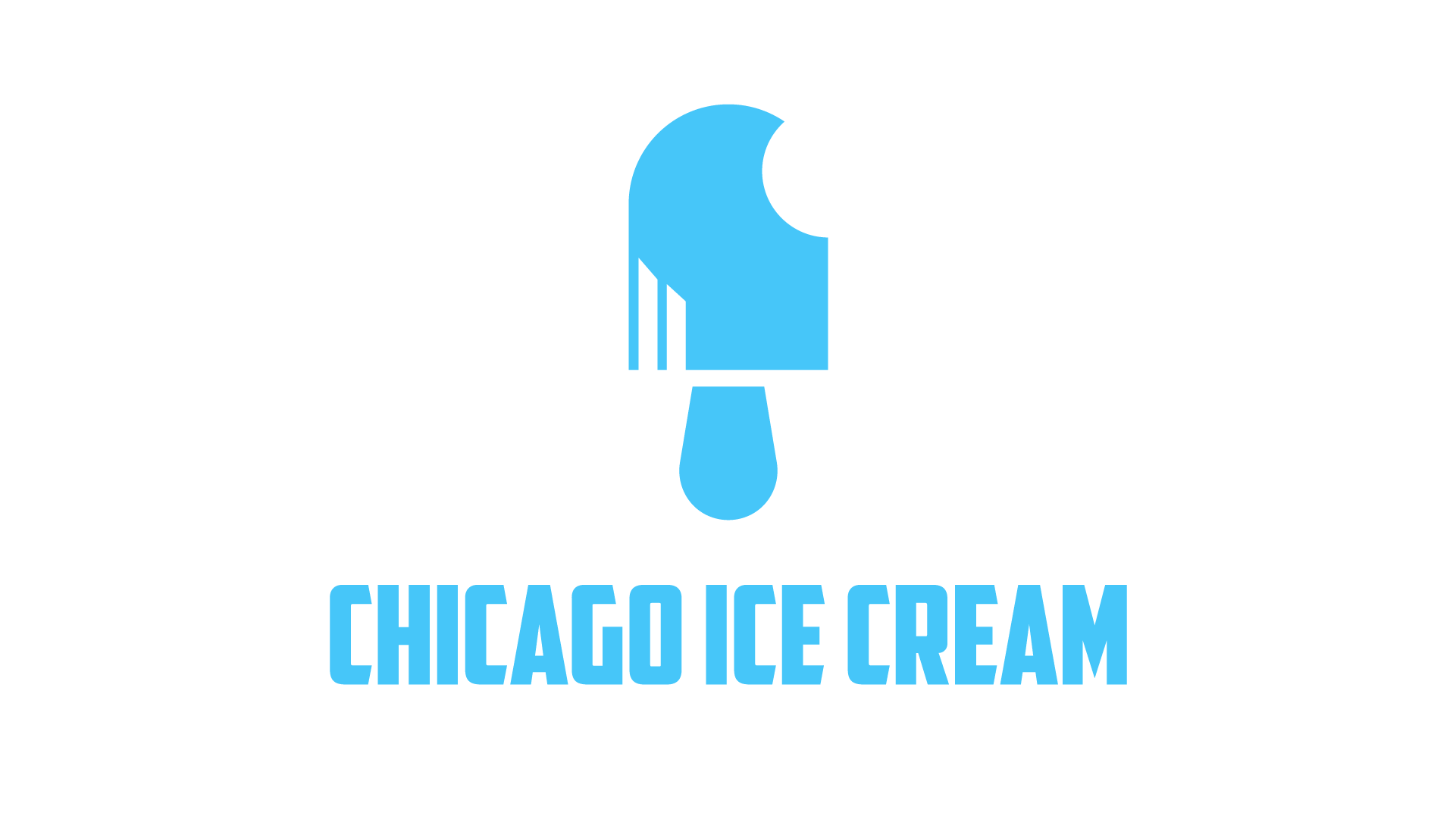
Love the idea of the bite missing and the ice cream drips. I think I'd like to see the drips have a curve to them to mimic the ice cream stick and give the design a more fluid feel. So cute
1 year ago by Bethany Gill
Posts
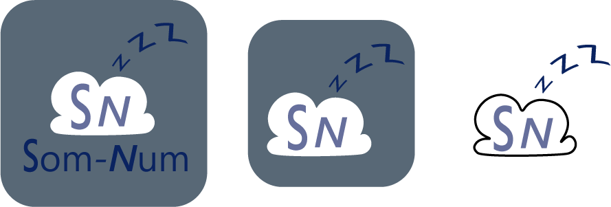
Som-Num
- Report
1 year ago by Bethany Gill
Three versions of the logo to work in different settings. I wanted to portray the idea of sleep (zzz's) being sent to the cloud in the same sense that the mattress would be storing your sleep patterns. The color palette takes inspiration from nighttime hues.
Som-Numlogo
 Like
Like
 1
1
I really like the last version of the logo,I think it's is more clean and simple. There are a few things that I would change about it, but over all it's good!
1 year ago by Junavie - Reply
Michelle Gobeil
- Report
1 year ago by Bethany Gill
Michelle Gobeillogo
 Like
1
Like
1
Very simple but unique.
1 year ago by Yoshiko Zoe Aban - Reply
Jennifer's Heaven
- Report
1 year ago by Bethany Gill
Jennifer's Heavengraphic
 3 Likes
1
3 Likes
1
Wow!
1 year ago by Yoshiko Zoe Aban - Reply