Judith Holwerda
Posts
0
Likes
0
Liked Posts
0
Given Feedback
7
Feedback
it is a bit too colorful and buzzy for an outstanding logo. Check this video out about colors. Really helped me. https://www.youtube.com/watch?v=_2LLXnUdUIc&list=PLpQQipWcxwt9U7qgyYkvNH3Mp8XHXCMmQ&index=7&t=0s
5 years ago by Judith Holwerda
like the image but would just use one steady color in the text. This is a bit hard to read.

5 years ago by Judith Holwerda
really unique and will definetely work in aan artistic environment.
5 years ago by Judith Holwerda
I really like the font you chose! I would look to your outlining. The F an U for example also have lines where you can revere to in your outlining. I also think that de small black stripe on the right side isn't necessary for readability.

5 years ago by Judith Holwerda
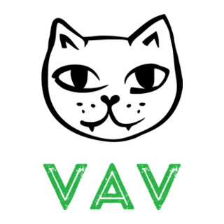
Like the combination of letters and illustration. Also the color really speaks to me. I would leave the structure in the letters because the cat picture already gives me an authentic feeling.
5 years ago by Judith Holwerda
Like the color and the primary font. I do not know what kind of feeling of idea de orange geomatric form needs to give me. I do not get a pizza-feeling. But maybe this is a really new company ;)

5 years ago by Judith Holwerda
Ik really like the feeling and flow on this logo. It reminds me of the sign for 100 percent wool. I don't know if it is on purpose but I would look to that space between the lines are even.

5 years ago by Judith Holwerda