Nader
Posts
3
Likes
5
Liked Posts
0
Given Feedback
0
Posts
Chicago Pizzas
- Report
5 years ago by Nader

 4 Likes
 3
3
What fonts are these?
4 years ago by Alisha - Reply
Like the color and the primary font. I do not know what kind of feeling of idea de orange geomatric form needs to give me. I do not get a pizza-feeling. But maybe this is a really new company ;)
5 years ago by Judith Holwerda - Reply
Yuxa
- Report
5 years ago by Nader
1 Like
2
I like the stripes but I would centre the text to the mark and maybe watch out for the swastika that seems to form as it may be offensive to some

5 years ago by lily - Reply
Ik really like the feeling and flow on this logo. It reminds me of the sign for 100 percent wool. I don't know if it is on purpose but I would look to that space between the lines are even.
5 years ago by Judith Holwerda - Reply
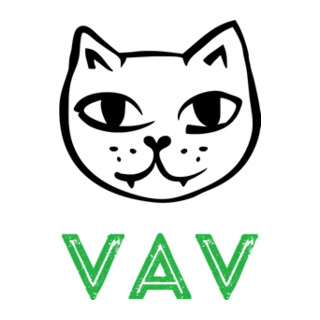
VAV
- Report
5 years ago by Nader
 Like
2
Like
2
I think the font could be slightly closer to the image to give it a complete look.
4 years ago by Alisha - Reply
Like the combination of letters and illustration. Also the color really speaks to me. I would leave the structure in the letters because the cat picture already gives me an authentic feeling.
5 years ago by Judith Holwerda - Reply