Damien Knight
Posts
1
Likes
1
Liked Posts
0
Given Feedback
3
Feedback
I think the cupcake is too big and square to work as an O. It doesn't really fit with the typeface when it takes the space of 2+ letters. The font is also very "paragraphy" and unmemorable, and the apostrophe doesn't work that well with that kerning.
2 years ago by Damien Knight
Wow, that is brilliant! Love the little pepper and how bold the colours are. Logo so good I actually might order some Mexican food.

2 years ago by Damien Knight
It might be a bit bland, and muted. The font on "WORLD" is a bit too serious and imposing for the subject matter too. I don't want to stray too far from your concept but maybe a more colourful 80s vibe could work.

2 years ago by Damien Knight
Posts
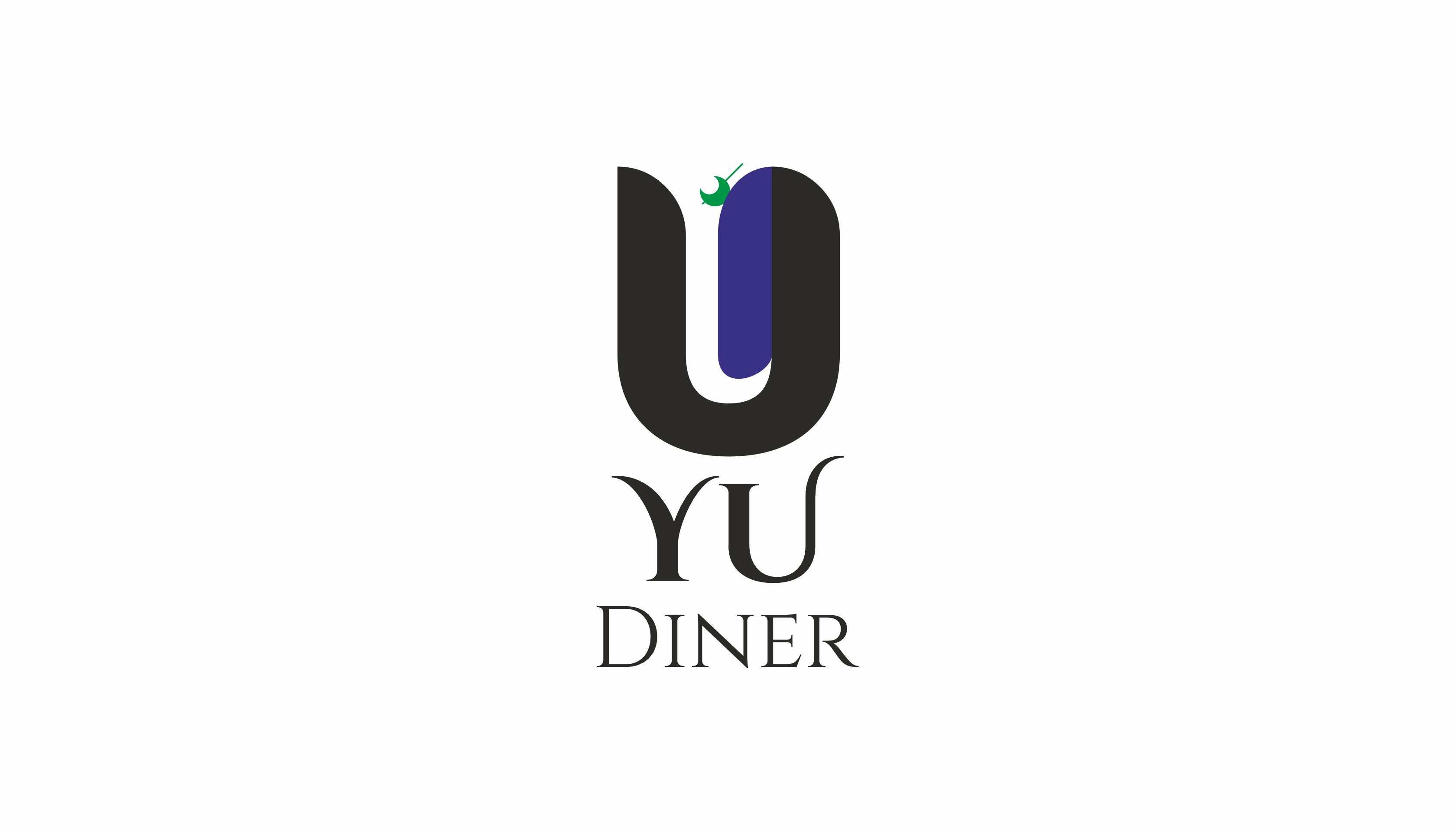
Simple YU Diner Logo
- Report
2 years ago by Damien Knight
I'm very new to graphic design, this is one of the first logos I tried making, so be gentle. It's very simple, I used the format of the U to create a Y inside it (I don't know if it worked that well) and added the little olive to it, making a Martini glass to denote "class". On the same note I used the font Cinzel for the name, which I like a lot. Tell me what you guys think!
Hey There,
I am Chester, creator of YU Diner. I'm looking for someone that can make a good logo for my Diner. I would like the logo to be an abstract mark. Can you do that?
I am Chester, creator of YU Diner. I'm looking for someone that can make a good logo for my Diner. I would like the logo to be an abstract mark. Can you do that?
 1 Like
 1
1
So I had to read your description to understand what was going on with the green olive and the lettering. That green olive also doesn't look like an olive but more like a crescent moon with a line through it. Also think if this were to be scaled it would get lost since it's already so small. I'm trying to see where the "y" is inside the "U" and can't. Also consider the fact it is a diner, diners aren't really known for being classy but more casual.
2 years ago by Molly - Reply