Jenn
Posts
3
Likes
9
Liked Posts
4
Given Feedback
2
Feedback
A responsive logo is a logo that changes as it gets smaller so it can be adapted to be used in various places. Sometimes they change in colour and other times they just eliminate elements for the logo to make sense when it's small.
2 years ago by Jenn
That's when a responsive logo would come in handy.
2 years ago by Jenn
Posts
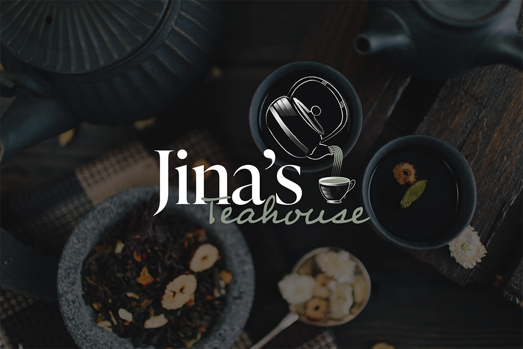
Jina's Teahouse Logo Mockup
- Report
2 years ago by Jenn
By Jenn Canning
 5 Likes
 1
1
This design is nice but the 'Teahouse' is not easily readable and the tea falling out from the kettle feels bit wierd. Jina's font is nice. Would I be able to use this as circular logo?
2 years ago by Riddhi vekariya - Reply
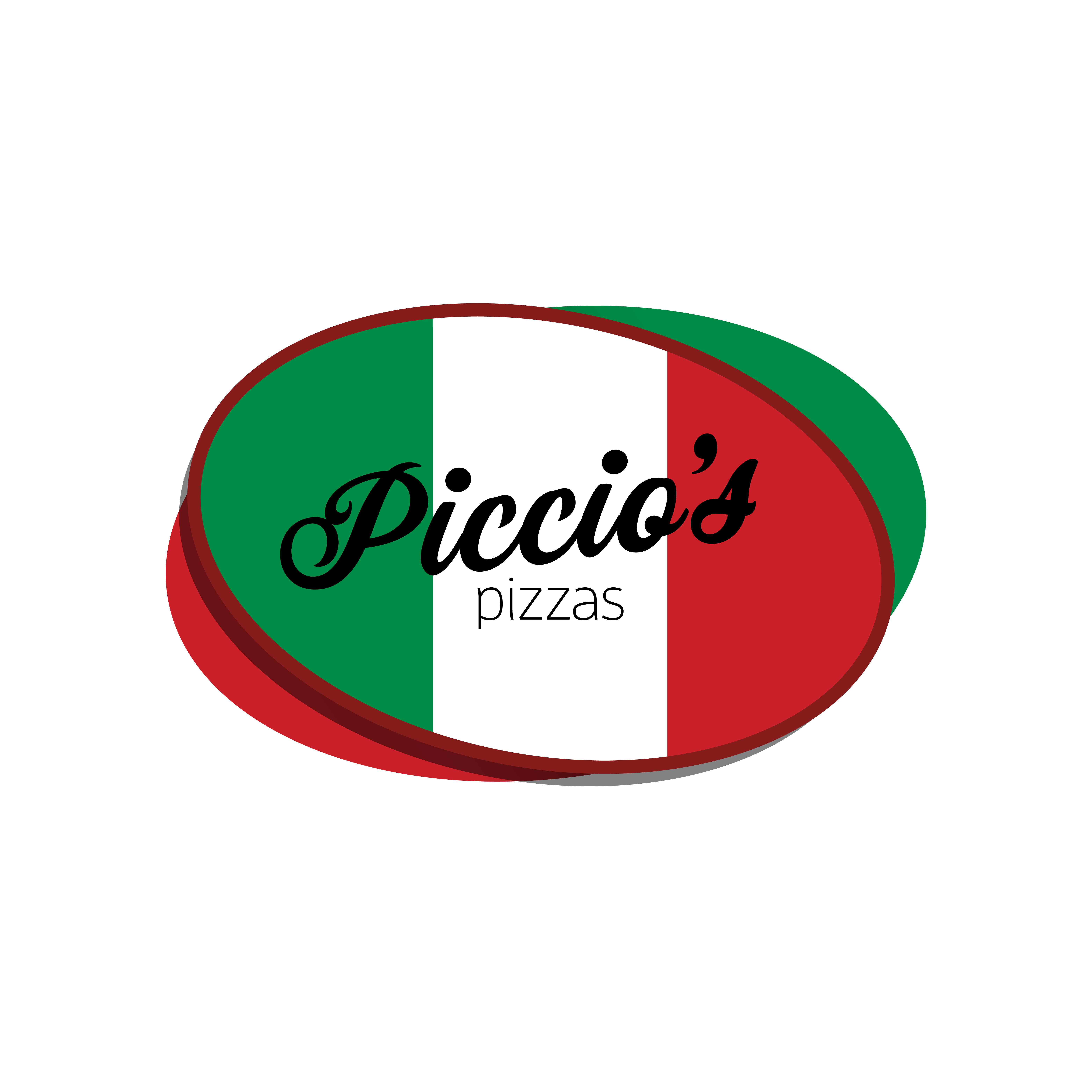
Piccio's Pizzas Logo
- Report
2 years ago by Jenn
by Jenn Canning
1 Like
5
pizzas is too small and won't be readable from far away or scaled
2 years ago by Riddhi vekariya - Reply
That's when a responsive logo would come in handy.
2 years ago by Jenn - Reply
Could you explain what that means? I genuinely don't know lol
2 years ago by Alexis Vasquez - Reply
A responsive logo is a logo that changes as it gets smaller so it can be adapted to be used in various places. Sometimes they change in colour and other times they just eliminate elements for the logo to make sense when it's small.
2 years ago by Jenn - Reply
Got it thank you for taking the time to explain
2 years ago by Alexis Vasquez
Record World Brief
- Report
2 years ago by Jenn
By Jenn Canning
 3 Likes
2
3 Likes
2
I personally like the bold imposing “world” and its contrast to the light scratchy “record”. But I’d agree a more colorful scheme might be better
2 years ago by Alexis Vasquez - Reply
It might be a bit bland, and muted. The font on "WORLD" is a bit too serious and imposing for the subject matter too. I don't want to stray too far from your concept but maybe a more colourful 80s vibe could work.
2 years ago by Damien Knight - Reply