Rehana
Posts
4
Likes
2
Liked Posts
1
Given Feedback
7
Feedback
The green could probably be less transparent

2 years ago by Rehana
This is a really good design. The machines could neatened up.

2 years ago by Rehana
It has potential but it's quite hard to understand what it might be

2 years ago by Rehana
This effect is brilliant. I would love to know how you did it

2 years ago by Rehana
The background print looks really good. The dotted lines around the picutre dont look quite right

2 years ago by Rehana
The colours go well together

2 years ago by Rehana
I like the overall idea however the lettering needs to be more distinct as it blends in with the logo

2 years ago by Rehana
Posts
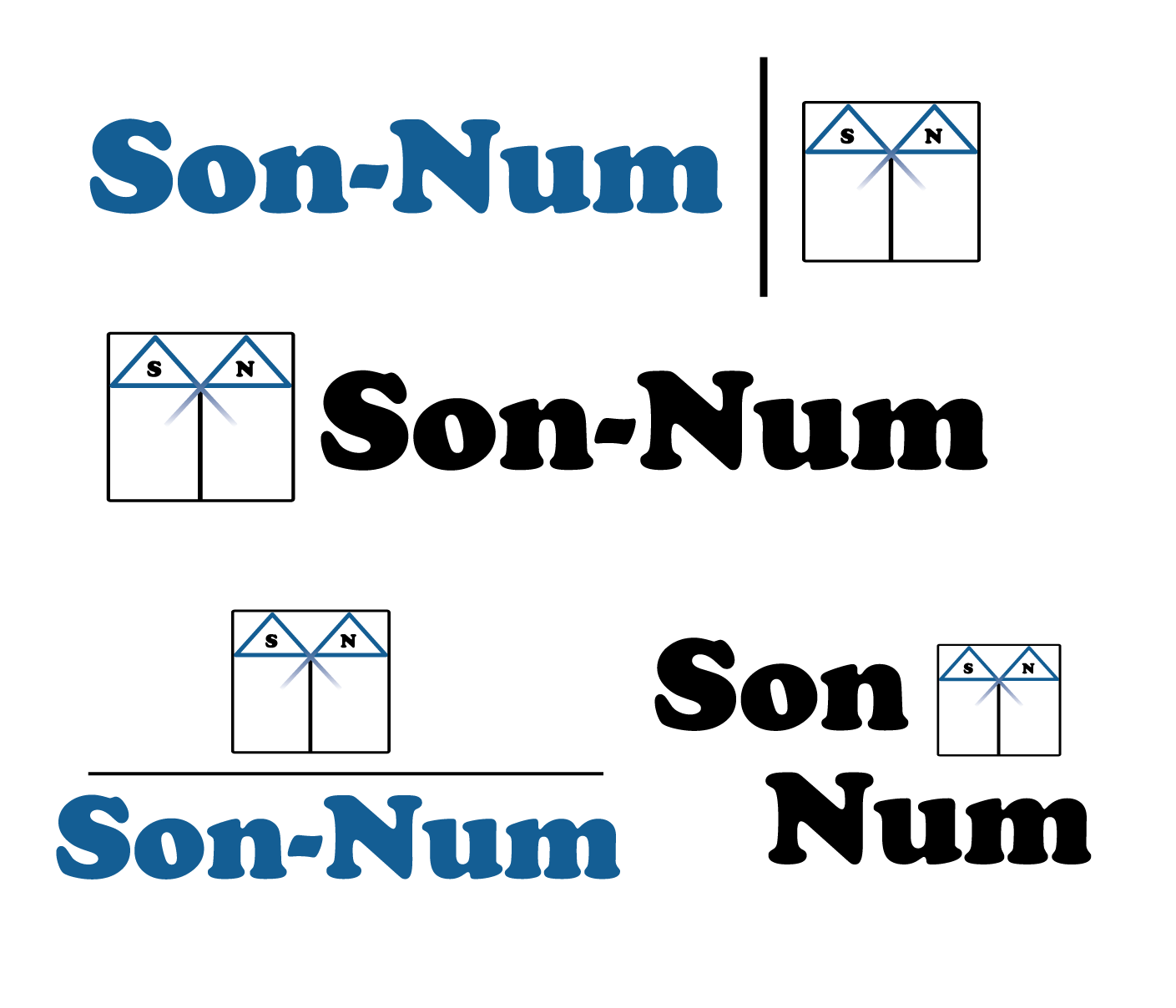
Son-Num
- Report
2 years ago by Rehana
Matress company
Som-Numlogo
no
8 months ago by Corinne - Reply
JH
- Report
2 years ago by Rehana
Florist buisness card
Solid 7
8 months ago by Ichimaruwu - Reply
DTP
- Report
2 years ago by Rehana
Shipping company logo
What about putting a star (one of US' 50) in the middle of letter T?

2 years ago by Sergey Borisov - Reply
