Joshua Herring
Posts
1
Likes
5
Liked Posts
0
Given Feedback
1
Feedback
I like the idea, but it feels a bit too dense. The removal of such lines, like the gray/white circle bit might help it. Furthermore, lines on the cloud seem a bit too small and merge with the design at a distance. Overall, just clean up some of the lines and remove or alter the very thin ones and you're golden. Keep up the good work!
4 years ago by Joshua Herring
Posts
Som-Num
- Report
4 years ago by Joshua Herring
Brief:
Hi!
We are an up-and-coming startup based in Seattle that develops smart mattresses, called �Som-Num� (from the Latin word somnum, meaning sleep). Our business is still very young as we have just finished the Kickstarter campaign for our Bluetooth-enabled mattress. We don�t have a good logo yet and we actually need one before the end of this week because the pre-ordered mattresses are going into production next week.
We would like to have a simple, but recognisable icon for our logo. The logo should be able to be easily embroidered on the mattresses, so no complex designs. We are already developing an app to go with it so it should work on smaller screens and in an app store. The icon should appear fun and not too serious.
Below, we have listed some of our competitors with logos that we like:
Casper
Helix Sleep
Tuft & Needle
Can you help us out?
Erica Perez
Founder and CEO of Som-Num
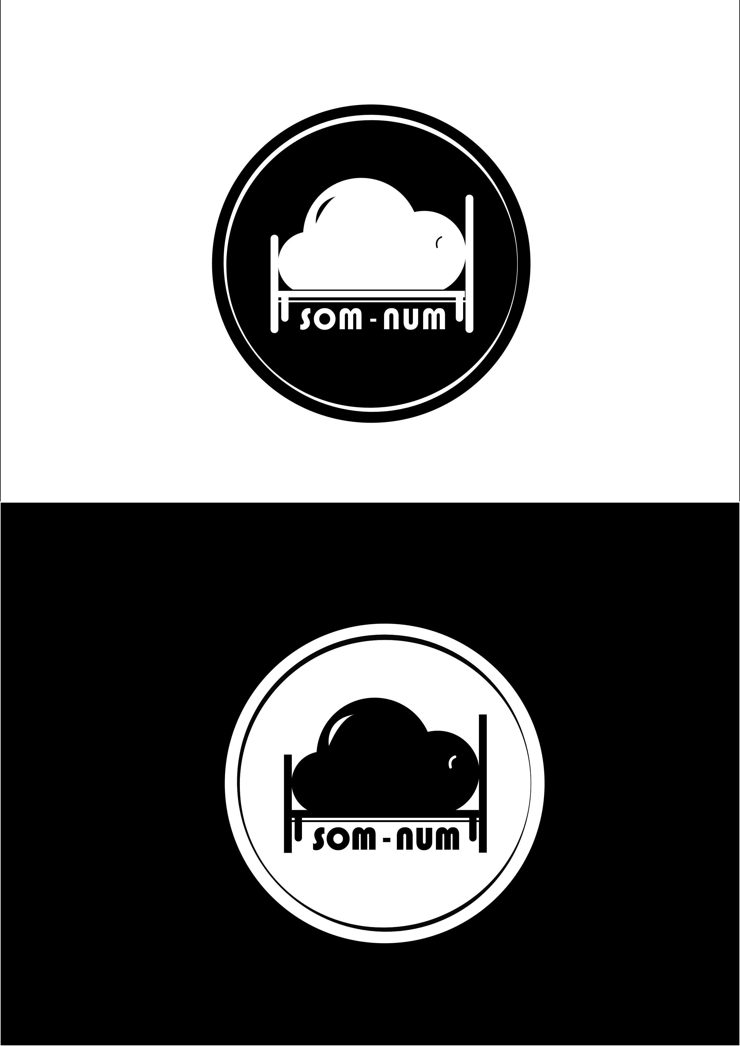
I'm fairly new to design, so I decided to have a crack at this prompt. Wanted something with a little character, yet simplistic and elegant. I tried merging the liked logos, taking a few elements from each and adding it to the final design. Happened across this design on accident, and just went with it. I believe it came out all right, but what do you think?
Hi!
We are an up-and-coming startup based in Seattle that develops smart mattresses, called �Som-Num� (from the Latin word somnum, meaning sleep). Our business is still very young as we have just finished the Kickstarter campaign for our Bluetooth-enabled mattress. We don�t have a good logo yet and we actually need one before the end of this week because the pre-ordered mattresses are going into production next week.
We would like to have a simple, but recognisable icon for our logo. The logo should be able to be easily embroidered on the mattresses, so no complex designs. We are already developing an app to go with it so it should work on smaller screens and in an app store. The icon should appear fun and not too serious.
Below, we have listed some of our competitors with logos that we like:
Casper
Helix Sleep
Tuft & Needle
Can you help us out?
Erica Perez
Founder and CEO of Som-Num
I'm fairly new to design, so I decided to have a crack at this prompt. Wanted something with a little character, yet simplistic and elegant. I tried merging the liked logos, taking a few elements from each and adding it to the final design. Happened across this design on accident, and just went with it. I believe it came out all right, but what do you think?
Som-Numlogo
 5 Likes
 0
0