Macarena
Posts
2
Likes
2
Liked Posts
4
Given Feedback
2
Feedback
I like more the second as I can distinguish both "m"

2 years ago by Macarena
Love the palette
2 years ago by Macarena
Posts
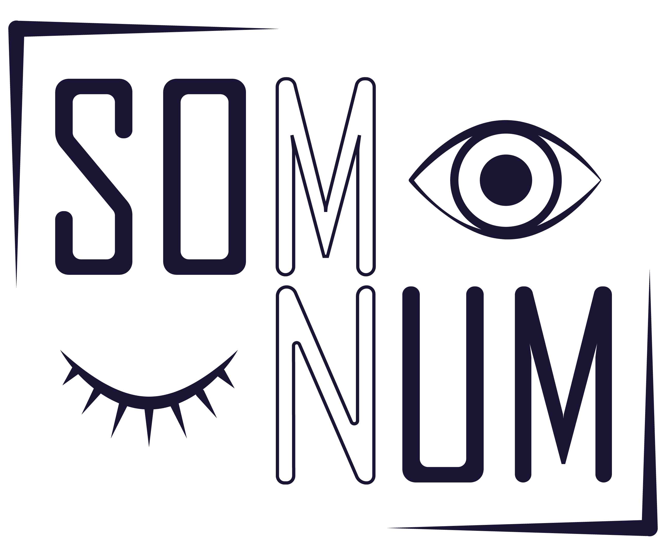
Logo design for Som-Num
- Report
2 years ago by Macarena
I decided on something simple as they wanted to do embroidery.
Som-Numlogo
 1 Like
 1
1
looks great !
2 years ago by Azraël - Reply
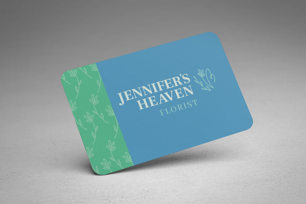
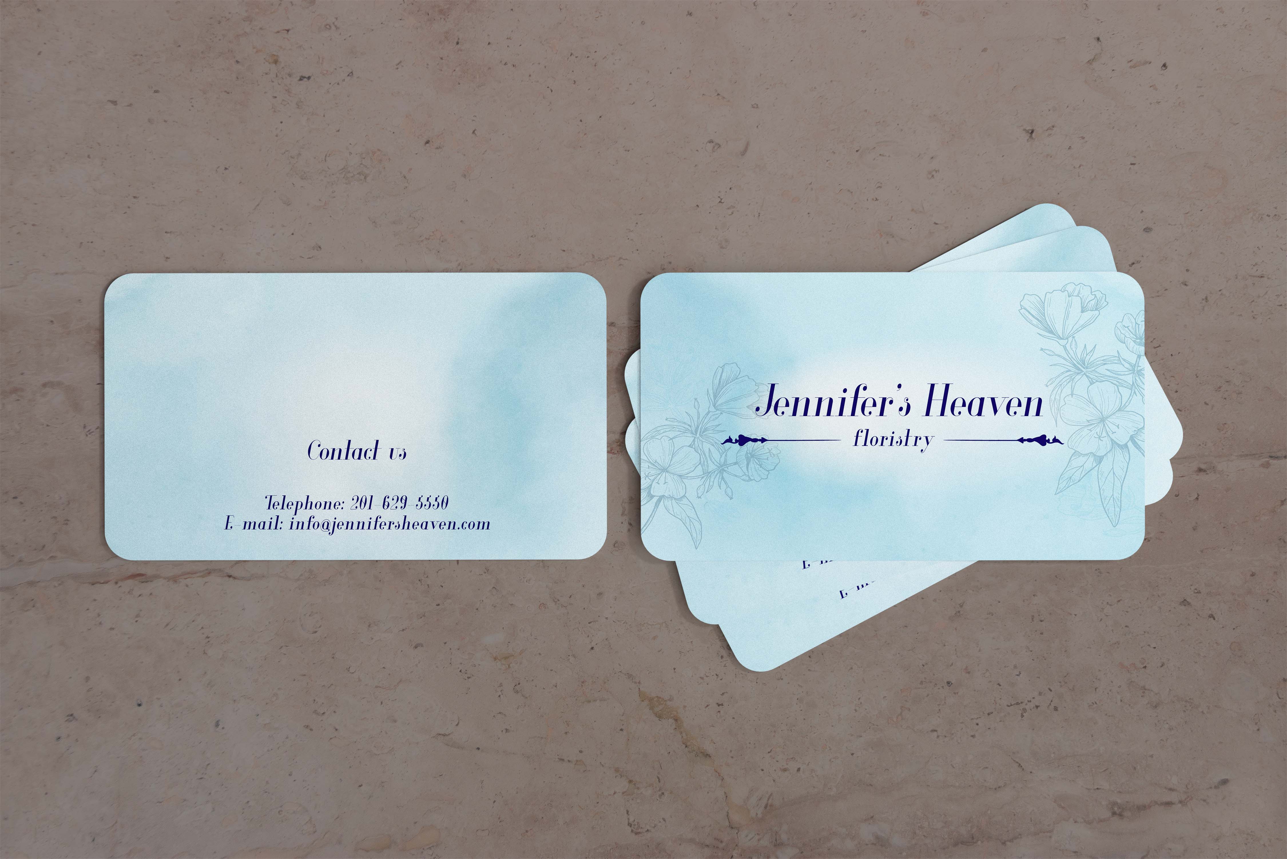
Jennifer´s Heaven
- Report
2 years ago by Macarena
I decided to work with a monochromatic palette and keep it simple and professional-looking. I opted for a watercolor background to have that "heavenly" appearance. For the font, I used Serif italic which has rounded ends to give it a feminine look.
Jennifer's Heavengraphic
 1 Like
1
1 Like
1
Great work on the color palette. I feel like the choice of font works very well with entire design
5 months ago by Ryland Oakes - Reply