Lauryn N May
Posts
2
Likes
5
Liked Posts
3
Given Feedback
2
Feedback
I like the second one!! It's more clear that it's supposed to be a barbell, and it's also simple which allows you to use it with more color palettes.
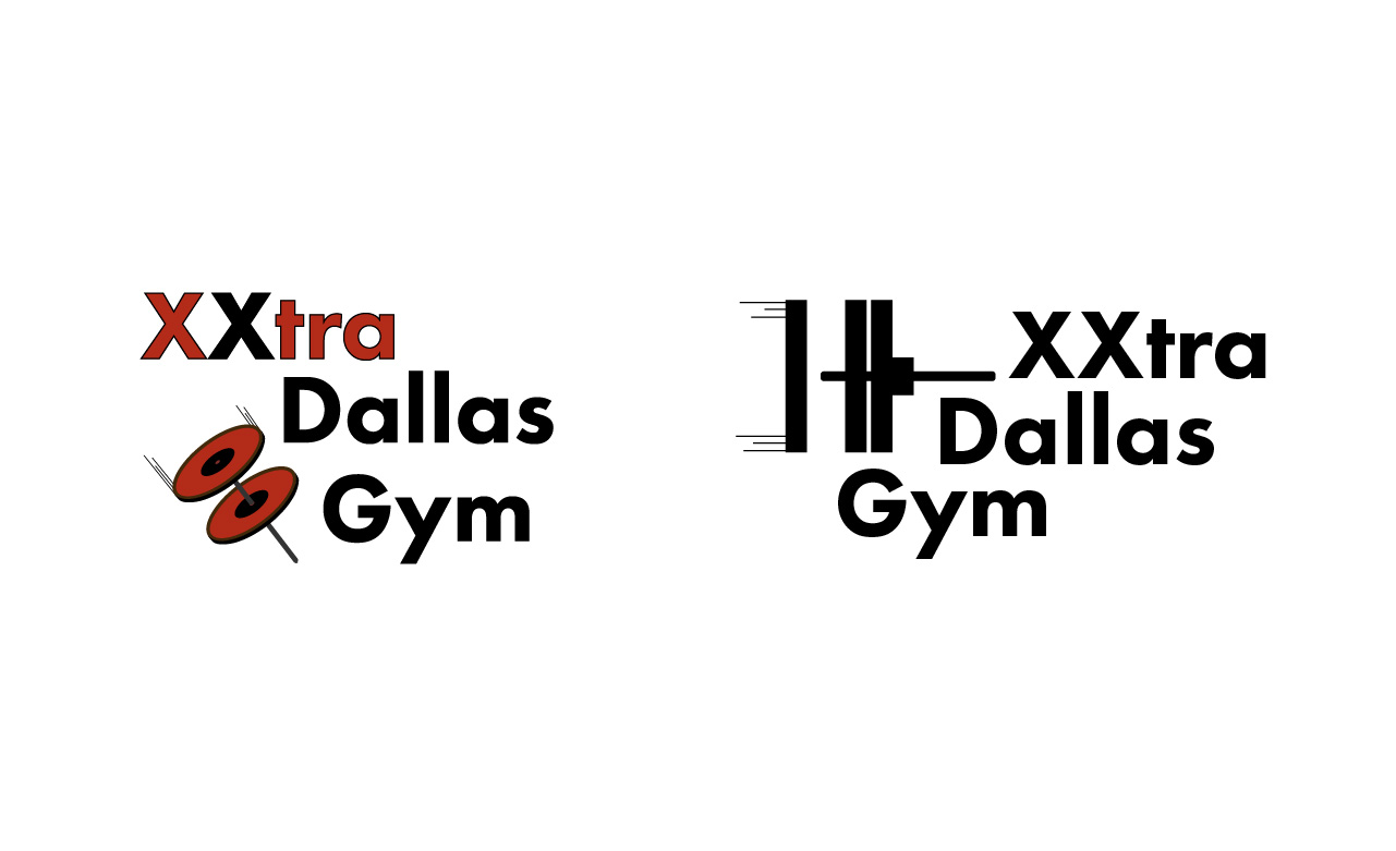
2 years ago by Lauryn N May
I love the palette! The style of the flowers gives it a nice retro vibe, which in my opinion also speaks experience!
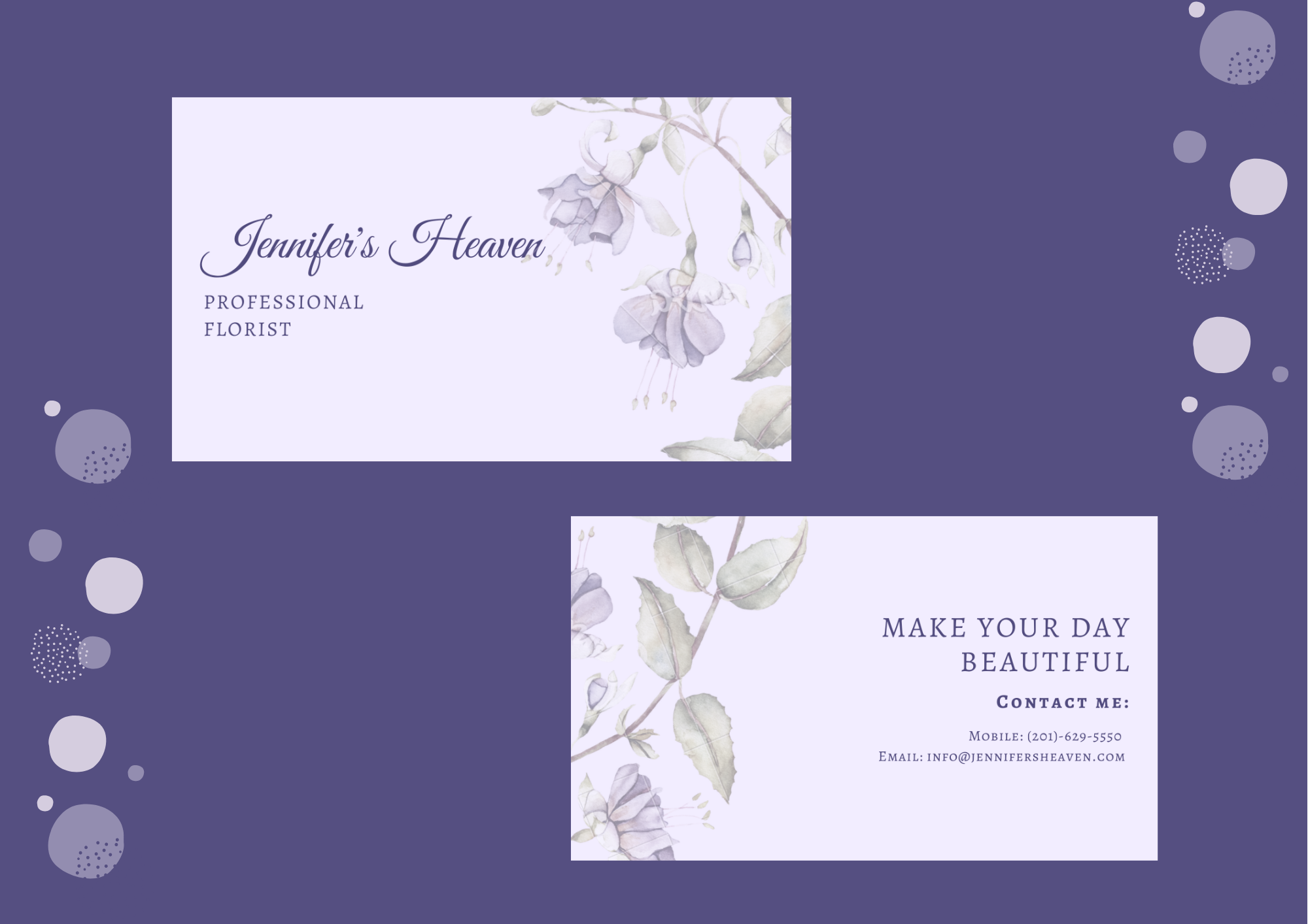
2 years ago by Lauryn N May
Posts
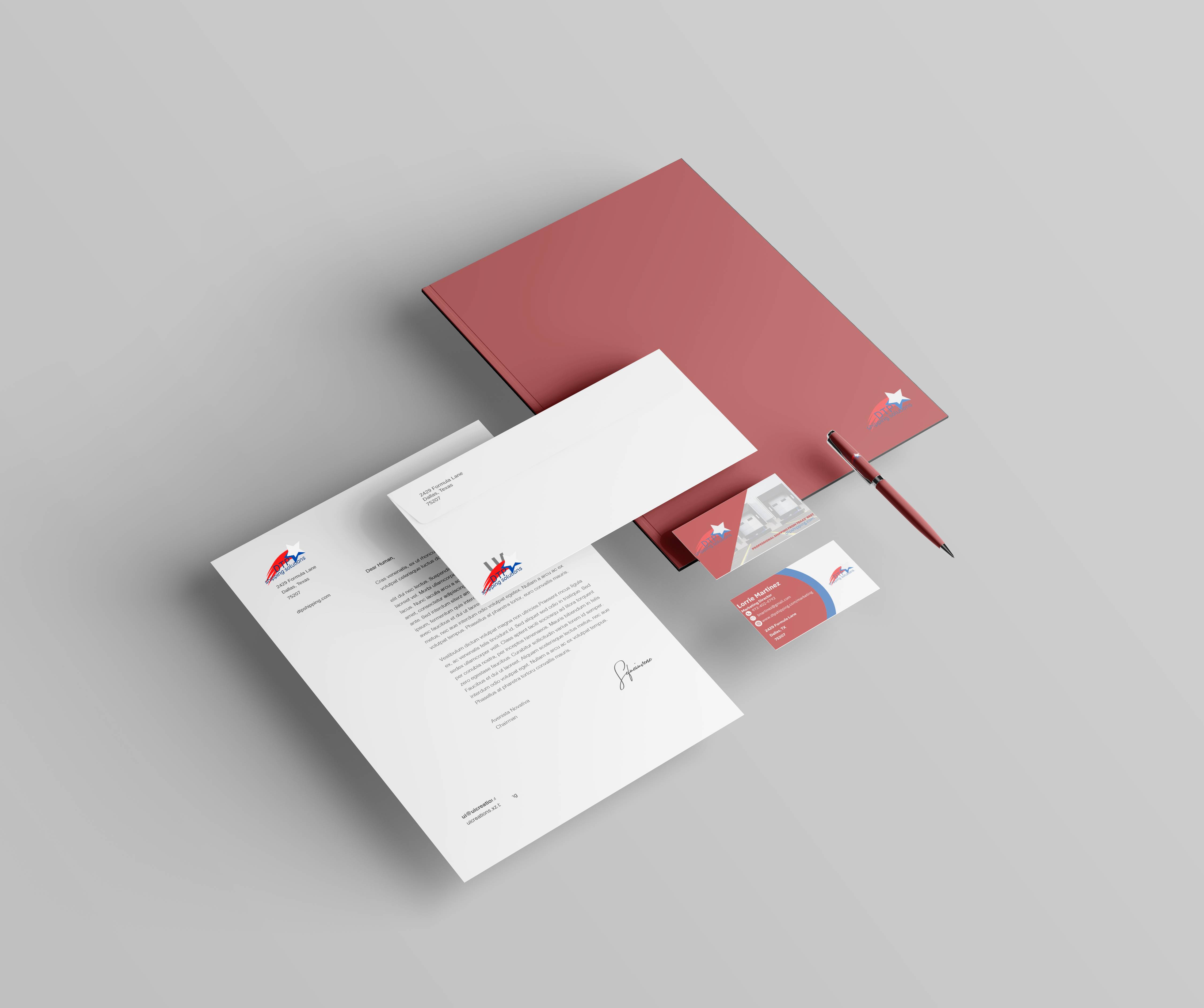
DTP Shipping Mockup
- Report
2 years ago by Lauryn N May
Decided to do a mockup instead of just a logo to see how it all fit together, especially for the office supplies. The color scheme and logo are based on the Texan flag. Thanks for checking this out, feedback is super appreciated!
 3 Likes
 1
1
too god dude
4 months ago by noori fatma - Reply
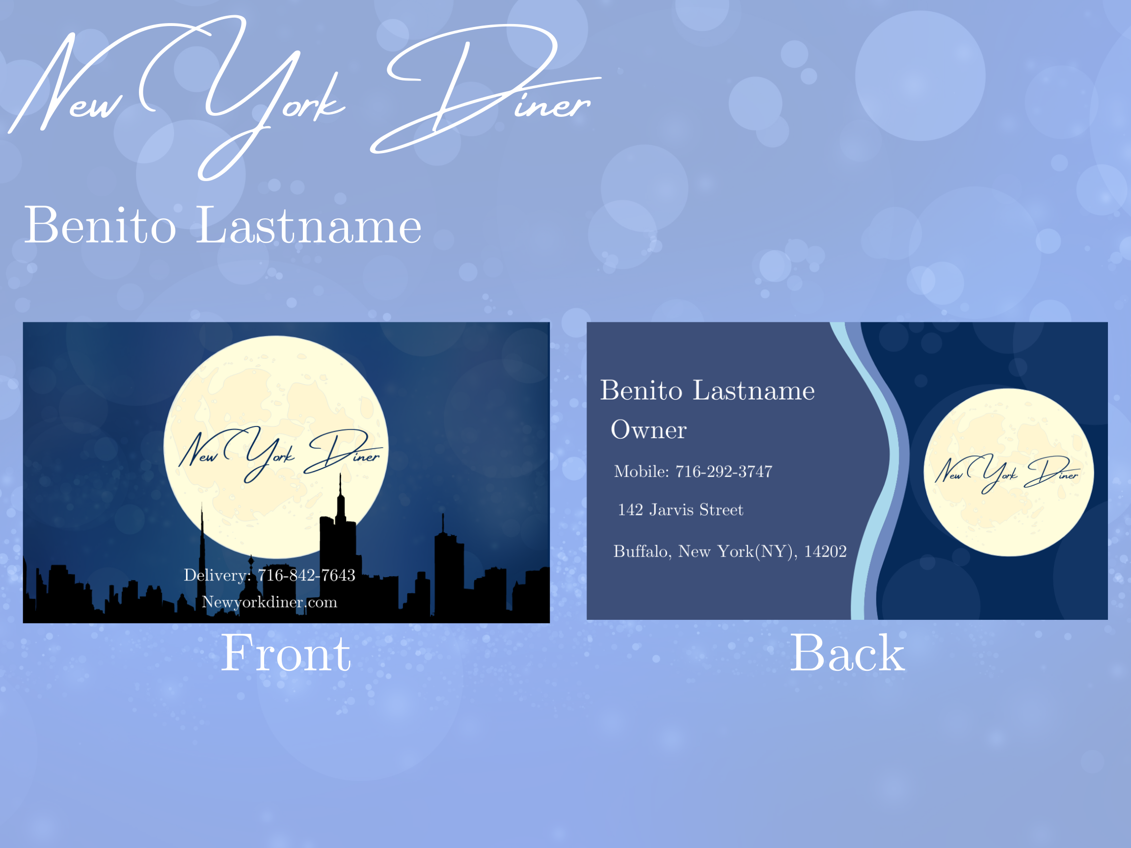
New York Diner Business Card
- Report
2 years ago by Lauryn N May
Since the prompt had to do with New York, I immediately thought of a cityscape, cool blues, and bright lights. I had to replicate the bokeh effect from the front to the back from scratch, but I think it still adds some depth and makes it look better. Any thoughts?
Hello!
I'm Benito, owner of New York Diner. For a while now, I've been looking for a good designer for my Diner. I want to have a business card for myself. Can you help us out?
I'm Benito, owner of New York Diner. For a while now, I've been looking for a good designer for my Diner. I want to have a business card for myself. Can you help us out?
 2 Likes
1
2 Likes
1
Perfect
2 years ago by Claraossi - Reply