Andrej
Posts
4
Likes
8
Liked Posts
9
Given Feedback
3
Feedback
Thank you for comment!
2 years ago by Andrej
Nice work! -)

2 years ago by Andrej
Simple and strict, I would add some simple geometric element in my taste. Nice job!)

2 years ago by Andrej
Posts
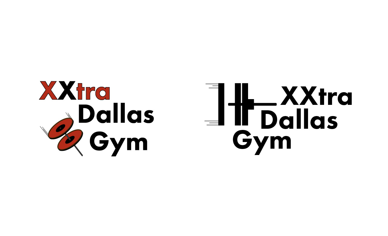
XXtra Dallas Gym
- Report
2 years ago by Andrej
Thank you for attention!
 1 Like
 2
2
Thank you for comment!
2 years ago by Andrej - Reply
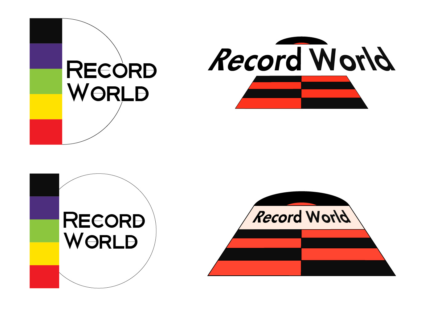
I like the second one!! It's more clear that it's supposed to be a barbell, and it's also simple which allows you to use it with more color palettes.
2 years ago by Lauryn N May - Reply
Record World
- Report
2 years ago by Andrej
 2 Likes
1
2 Likes
1
interesting composition
2 years ago by Alex Kokkotas - Reply
Som-Num Logo
- Report
2 years ago by Andrej
Som-Numlogo
 3 Likes
1
3 Likes
1
I like more the second as I can distinguish both "m"
2 years ago by Macarena - Reply
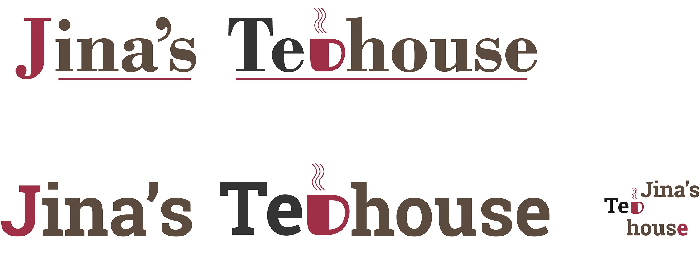
Logo Design for "Jina's Teahouse"
- Report
2 years ago by Andrej
Hi! My first experience in logo design.
Primary customers in the teahouse are elderly people and the logo was preferred to designed in vintage style (larger and smaller version of it).
I'll be glad to any criticism, thank you!
Primary customers in the teahouse are elderly people and the logo was preferred to designed in vintage style (larger and smaller version of it).
I'll be glad to any criticism, thank you!
 2 Likes
1
2 Likes
1
Creative
2 years ago by Claraossi - Reply