Activity Feed


Feedback Leaderboard (Past 30 days)
- Shimaa Saad16
- Mansi16
- Ashleigh8
- VANSHIKA 8
- mays ibrahim7
Remove Ads: Upgrade to Pro
Get feedback on your work
Give feedback to other users!
Give FeedbackShoptacle
- Report
2 years ago by Rebecca Woodland
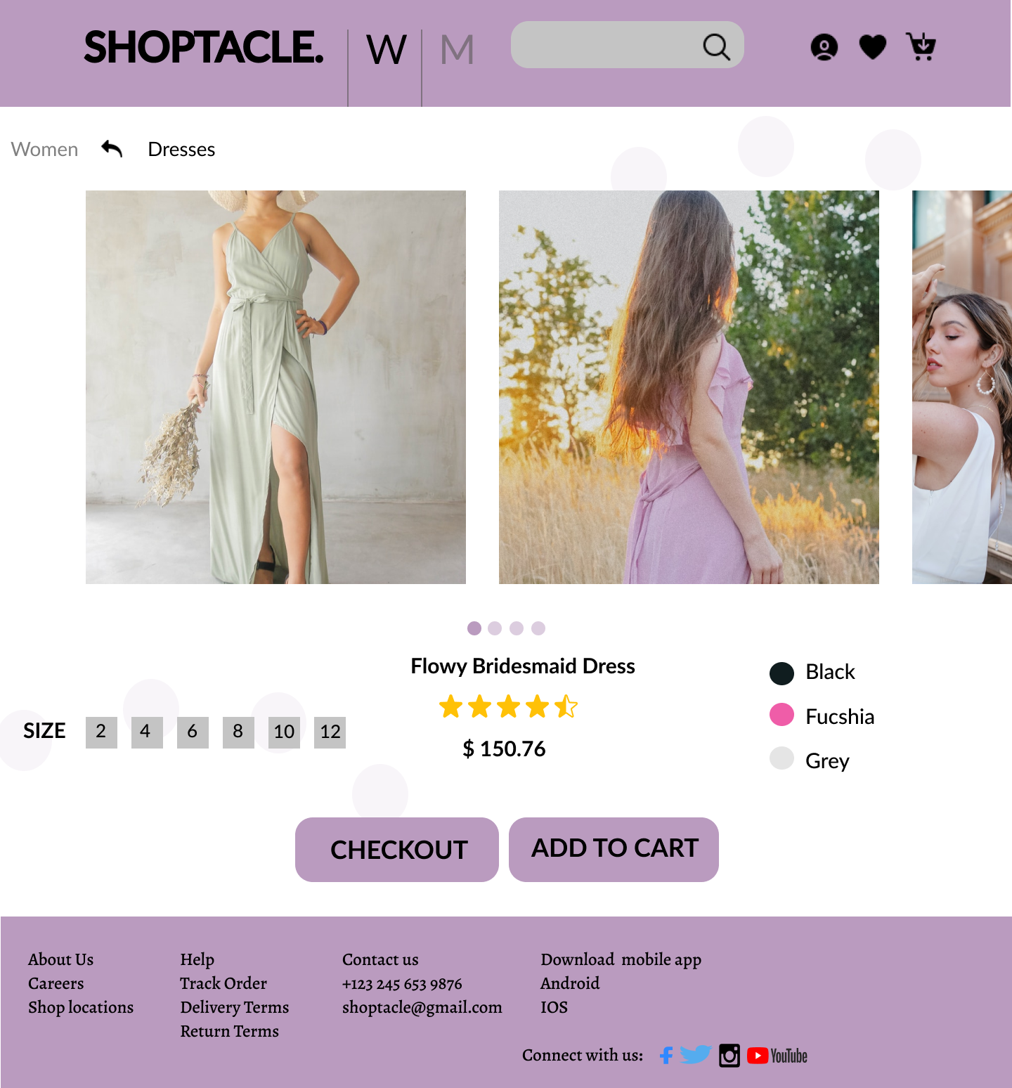
Not a HUGE fan of the name as it doesn't really scream luxury, however as a designer you may not always agree with names. I started off looking at other luxury brands websites, most department stores use a typeface as opposed to a logo so i decided to opt for a serif font with a -10 tracking applied. Dark purples speak luxury so i created a palette adapting the 60-10-30 rule. With the logo being in a serif font, it could be quite hard to read it so i thought a sans serif font could compliment it well. Referring back to the brief i wanted to make sure that the website hit its core values - luxurious, honest and efficient which i think it does.

 33 Likes
 4
4
nice one
1 year ago by dojin - Reply
Beautiful
1 year ago by pamela eyidou - Reply
Nice work
2 years ago by swati - Reply
All Comments
Shoptacle
- Report
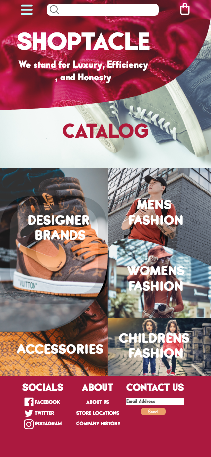
1 year ago by Jennivah delos Santos
I'm trying to create ux for the 1st time. Hopefully to get some feedback.
 28 Likes
5
28 Likes
5
wow, this look like the real luxury web
1 year ago by dojin - Reply
this is a very lovely design.
1 year ago by MOFOLUWASO OPEYEMI ATOLAGBE - Reply
I love this so much
1 year ago by Anita Petrovic - Reply
All Comments
Website design for Shoptacle
- Report
2 years ago by Nabila Yorda
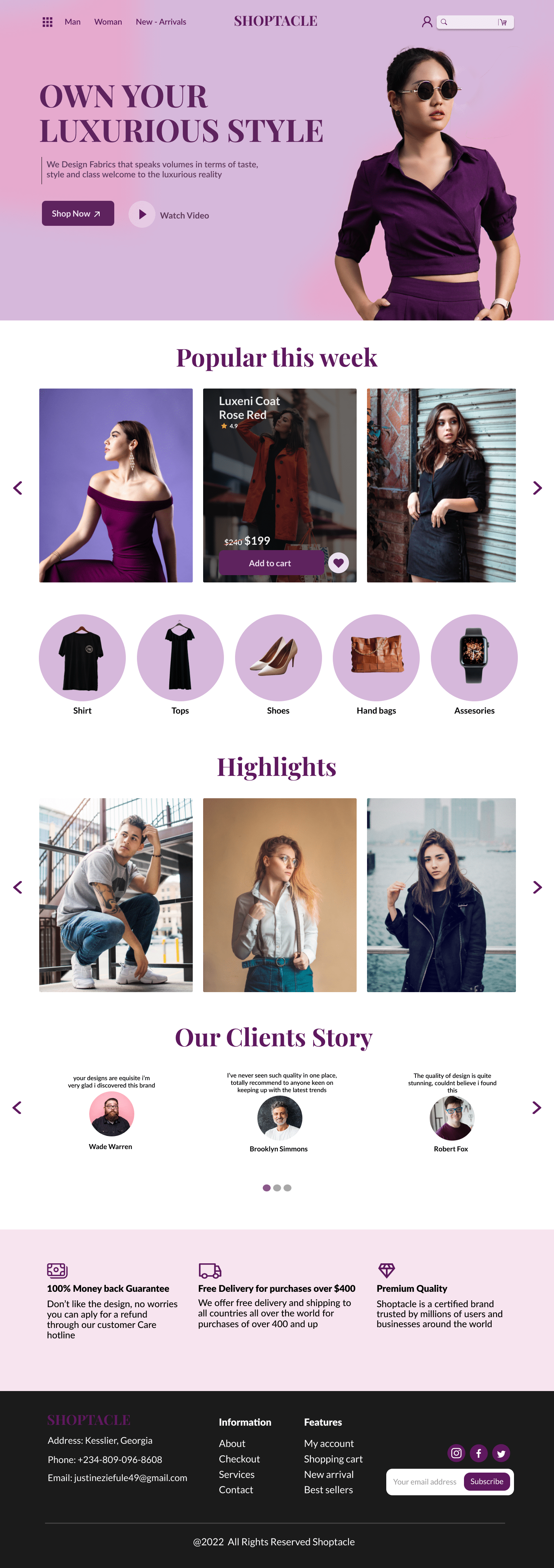
I chose the color purple because it represents royalty.But I made it lighter so that it will be easy for users to read.I made the design clean and less cluttered to increase ease of navigation.
 22 Likes
2
22 Likes
2
Very much impressive keep it
2 years ago by Vaishnavi Choudhary - Reply
Thanks Vaishnavi
2 years ago by Nabila Yorda - Reply
Shoptacle Web Application
- Report
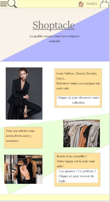
2 years ago by Tristan Jara
 11 Likes
1
11 Likes
1
Nice work!, You can add overlay to make the text more visible
1 year ago by Pelumi - Reply
Shoptacle
- Report
1 year ago by Justin
When starting this project I had to think of the colors to compliment the key terms luxury, efficiency, and honesty. Still, I mainly focused on luxury as I started looking at competition like Gucci, Macy's, and Dolce x Gabbana. after mapping out the content I focused on a font that screams minimalistic and luxury at the same time so I stuck to the basics Playfair Display and Lato, an intriguing combination but it worked. I really liked how the brand "Shoptacle" blended with the color pallet I formed. it brought out the luxury theme I was hoping for
 6 Likes
5
6 Likes
5
i am very impressive this color are great
1 year ago by abhishek rajput - Reply
Thanks for the comment.
1 year ago by Justin - Reply
Thank you very much for the comment I really appreciate it.
1 year ago by Justin - Reply
All Comments
Load more
