Activity Feed

Feedback Leaderboard (Past 30 days)
- Mansi16
- mays ibrahim12
- Martyna11
- VANSHIKA 9
- THOMAS 7
Remove Ads: Upgrade to Pro
Get feedback on your work
Give feedback to other users!
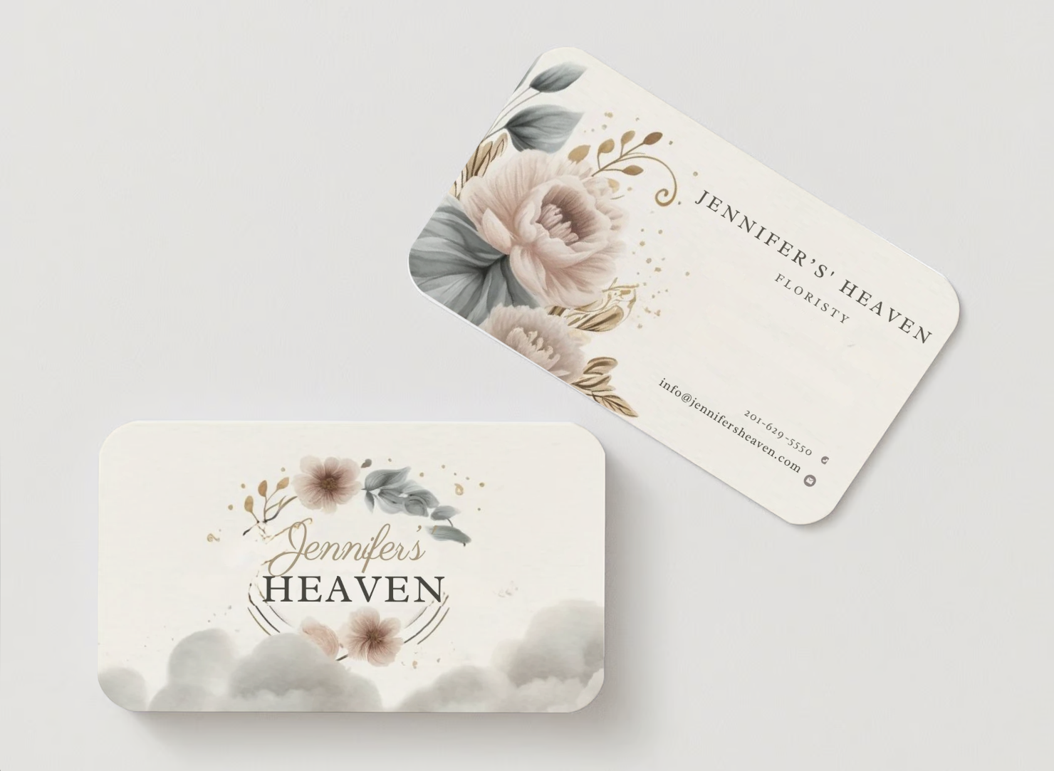
Give FeedbackJennifers Heaven Businesscard
- Report
10 hours ago by Esther
Final design I made for Jennifer's Heaven.
Help me by giving your feedback, I would love to hear it from you ☺️
Help me by giving your feedback, I would love to hear it from you ☺️
Jennifer's Heavengraphic
 1 Like
 0
0
Red Wing International Logo
- Report
15 hours ago by Hamid Ullah
we are company that develops new ways to communicate by combining open sources software with beautiful design. our main product is an app that can use at home and implements our cloud technology. our target audience is married couples we want to convey essence of power while at the same time being agreeable
Job description
you must create a logo using in the information given in this brief theorem prepare on emblem logo that use the colour yellow the logo will be used on the company website take into account the company,s values and preferences, and make sure it will work the planned use cases.
Job description
you must create a logo using in the information given in this brief theorem prepare on emblem logo that use the colour yellow the logo will be used on the company website take into account the company,s values and preferences, and make sure it will work the planned use cases.
 Like
0
Like
0
Jennifer's Heaven Business card
- Report
1 day ago by Anu
Jennifer's Heavengraphic
3 Likes
1
beautiful and gentle design! I think it's better to make the background darker
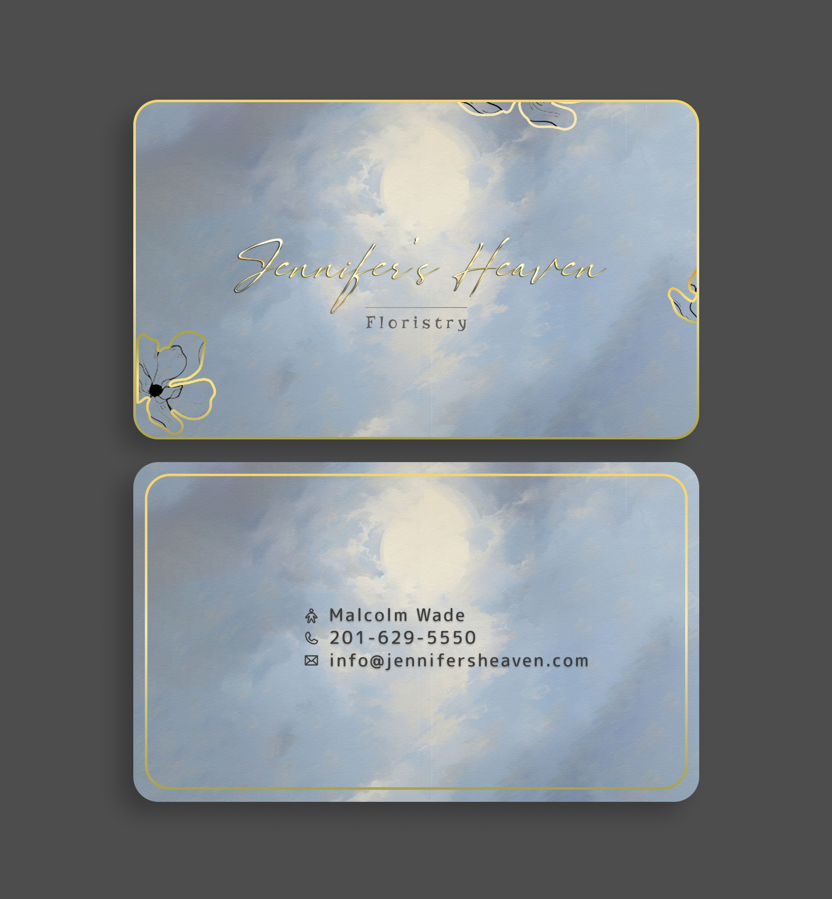
1 day ago by Kira - Reply
logo
- Report
2 days ago by Acila nour elislam
logo
 1 Like
2
1 Like
2
Great
15 hours ago by Hamid Ullah - Reply
it`s look good
1 day ago by Kira - Reply
Jene's Ice Cream Logo
- Report
2 days ago by Hamid Ullah
I am Jene, creator of Jene's Ice creams. I'm looking for someone that can create a simple logo for my business. I like Pictorial marks.
 1 Like
1
1 Like
1
good job pro
2 days ago by Acila nour elislam - Reply
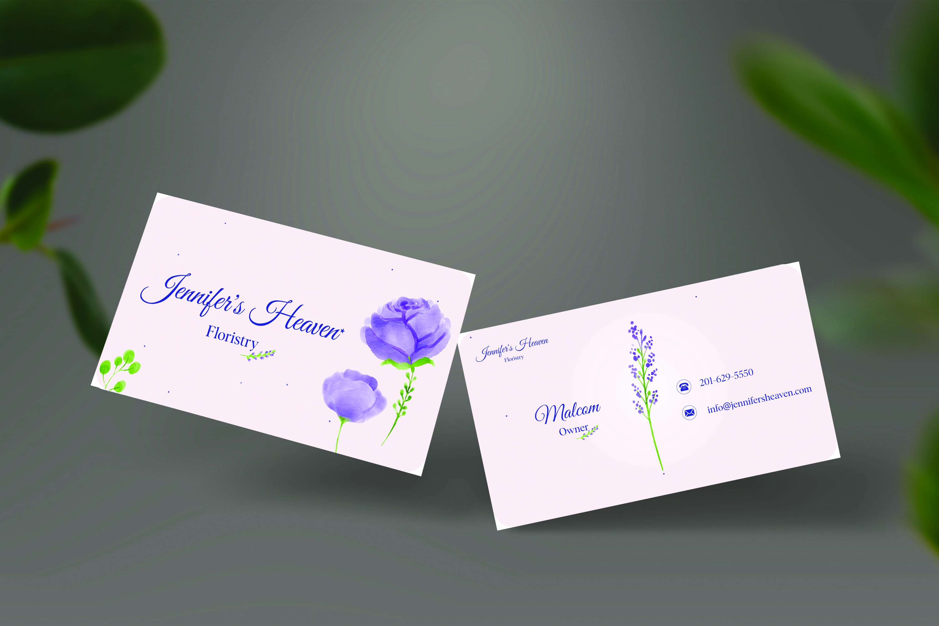
Business Card Design . This is my first design so i need your valuable feedback .
- Report
2 days ago by Mansi
A flouriest business card design with minimal theme
 2 Likes
1
2 Likes
1
i like this color
1 day ago by Kira - Reply
Load more
