logo for toy company
- Report
4 years ago by khizar
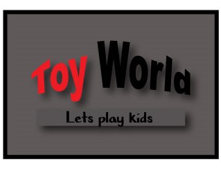
hi guys, i am a beginner in logo design field and i have made a logo for ficticious company of toys
called TOY WORLD please have a look on that and give me some suggestions
called TOY WORLD please have a look on that and give me some suggestions
 Like
Like
 2
2
I'd agree with the comment about maybe using a font with more curves. To be honest, I didn't read it all so excuse me if I repeat anything, but I think you should pick out brighter colors like bright yellows or blues.
4 years ago by Alisha - Reply
Hi! Awesome to hear that you're getting into designing. I get the concept, but there's a few things you could change to make it even better.
It doesn't feel like it's for kids (tbh it's giving me slightly pedophilia vibes - i think it's the tag line combined with the dark colors), so changing the colors to brighter, 'happy' colors could work. You could even make the letters in "TOY WORLD" all different colors, and keep the tagline dark.
Because of the curved effect on the "TOY WORLD", I would make the letters all caps to create a nice even line (the Y breaks the line). Then I would remove the box around "let's play kids" and move that text up, closer to the title.
Lastly, when displaying the logo, I would disply it on a lighter background (preferably white), since the letters are dark.
I am looking forward to seeing what you'll create in the future. Good luck on your graphic design journey.
4 years ago by Alex Strøm - Reply


