Taaj_Wordmark_Logo
- Report
4 years ago by Kyle Paligsa
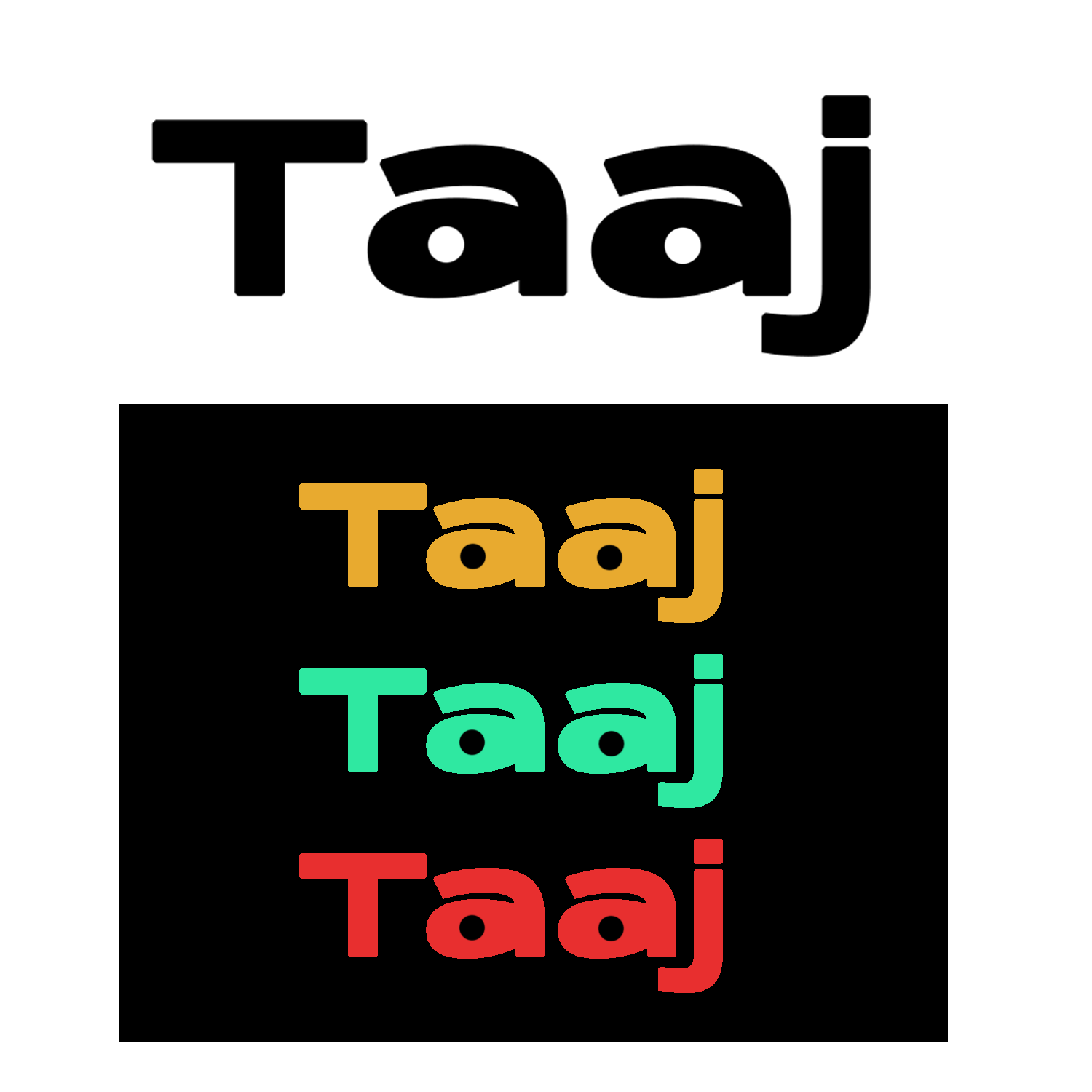
For this concept, having decided on a wordmark path for the logo. I tried to be minimalistic and added a little pop of something on the logo for it to become more rememberable. I think in this logo, less is better.
Hey!
I am Malcolm, owner of Taaj. We're looking for someone that can make a good logo for our business. I think a wordmark would look cool. Can you help me out?
I am Malcolm, owner of Taaj. We're looking for someone that can make a good logo for our business. I think a wordmark would look cool. Can you help me out?
 3 Likes
 1
1
I appreciate the minimalist and modern approach you took on this one! I feel like the kerning could be adjusted a bit, as the "T" and "a" are a bit too close together, compared to the rest of the letters. I also see what you did with the "a", sort of like eyes looking off to the sides. Overall, good job with this design!
4 years ago by pndmx - Reply


