Jina's Teahouse
- Report
4 years ago by Duncan Hammett
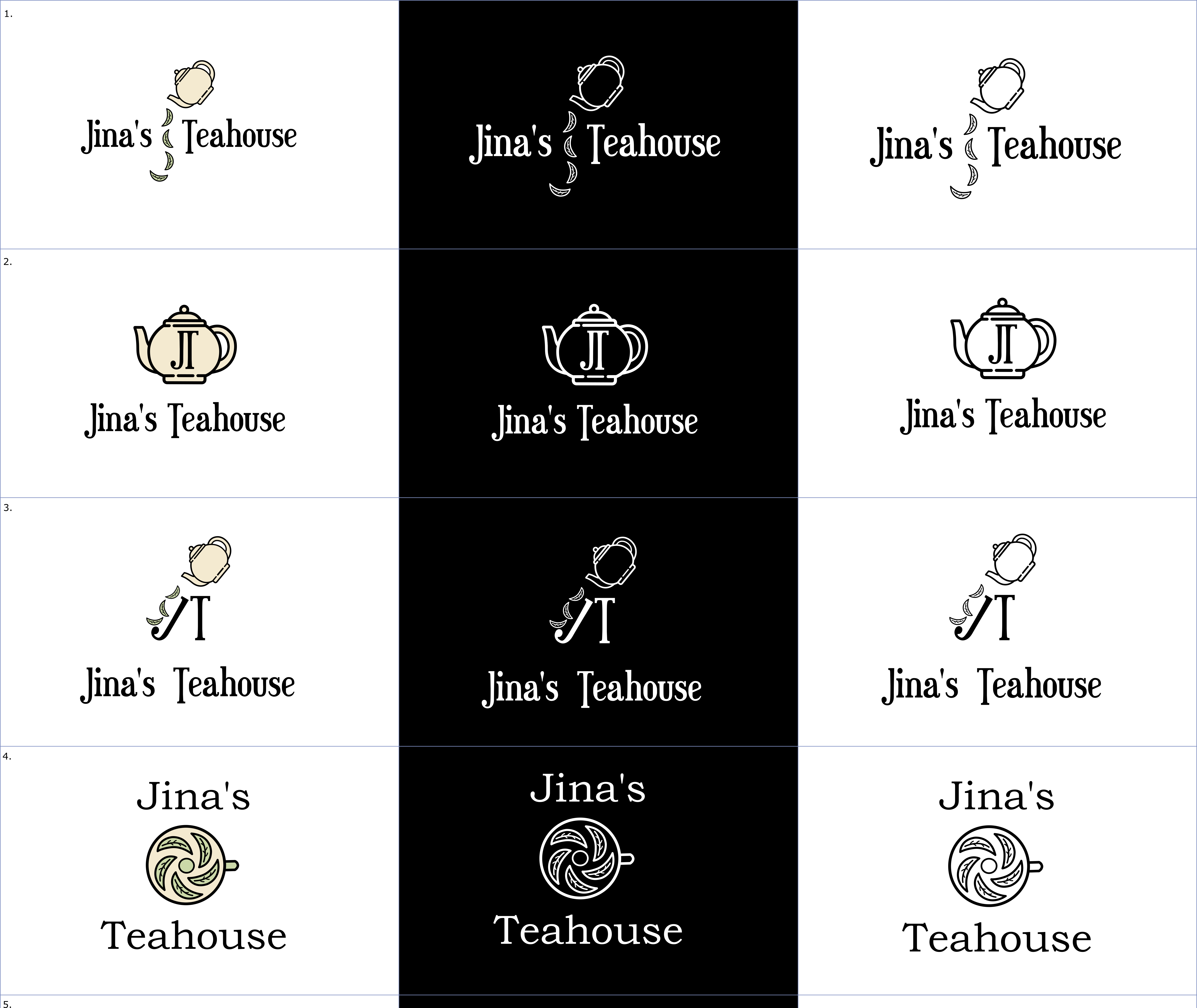
My logo designs for Jina's Teahouse. I really like the typeface I have used, it reminds me of a vintage steam fair. The teapot matches the vintage vibe, as does the cream colour. I think the first two designs are the best.
 1 Like
 2
2
I really like N� 1 and 2. As you said, the typeface works great for the vintage style and the whole design looks very classy. For the color version, i think the colors are too similar, a little more contrast could help. Great Work! Keep it coming!
4 years ago by Elena - Reply
These are really great. Tho I think you could have used more earthy colours like green, brown, etc. Black and white is classy too though?
4 years ago by Leye Abiola - Reply


