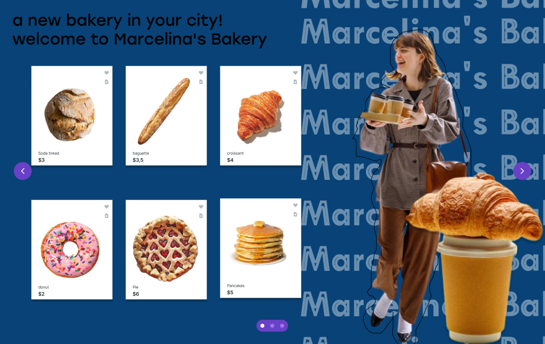
website for bakery
- Report
1 year ago by veta
 2 Likes
 4
4
As people have said, black on dark blue is bad legibility.
If this is a website, it may be good but from the picture I'm looking at the text may be a bit small, and it seems like you are accentuating the price of the food instead of the name, which ma be a good idea but honestly it looks a bit pricy and it may make more sense to accentuate the name more and make the price small.
Capitalization in the black title too. I don't think the slogan is good as it won't last for long (when the shop is no longer new).
Font choice for the white text is a bit odd but I do like the stroke text (maybe make the stroke smaller or choose a different font that uses white space).
Finally (in my opinion this may be subjective) I don't completely understand the images on the right. They're overlapping, no margins, and the woman doesn't seem to be related as she is carrying coffee but this is a bakery?
1 year ago by Endo - Reply
Nice design, Perhaps change the colour of the black text. Otherwise, this is is very good
1 year ago by Luke - Reply
Hello, Veta! This is good, actually. Maybe just the fonts and the color? But you did a great job putting some border in the woman, maybe just make it white so it would be visible. Over all, it might need some improvements but it couldn't change the fact that you did a great job. Keep going!🖤
1 year ago by Sabrina Walker - Reply
Black text does not work with a dark blue background; legibility must be considered in texts. It's good that you have a focal point in your design, however, I think that it can be emphasized and designed better.
1 year ago by Dafune Azusagawa - Reply