Dtp shipping solutions
- Report
1 year ago by Oni Taiwo
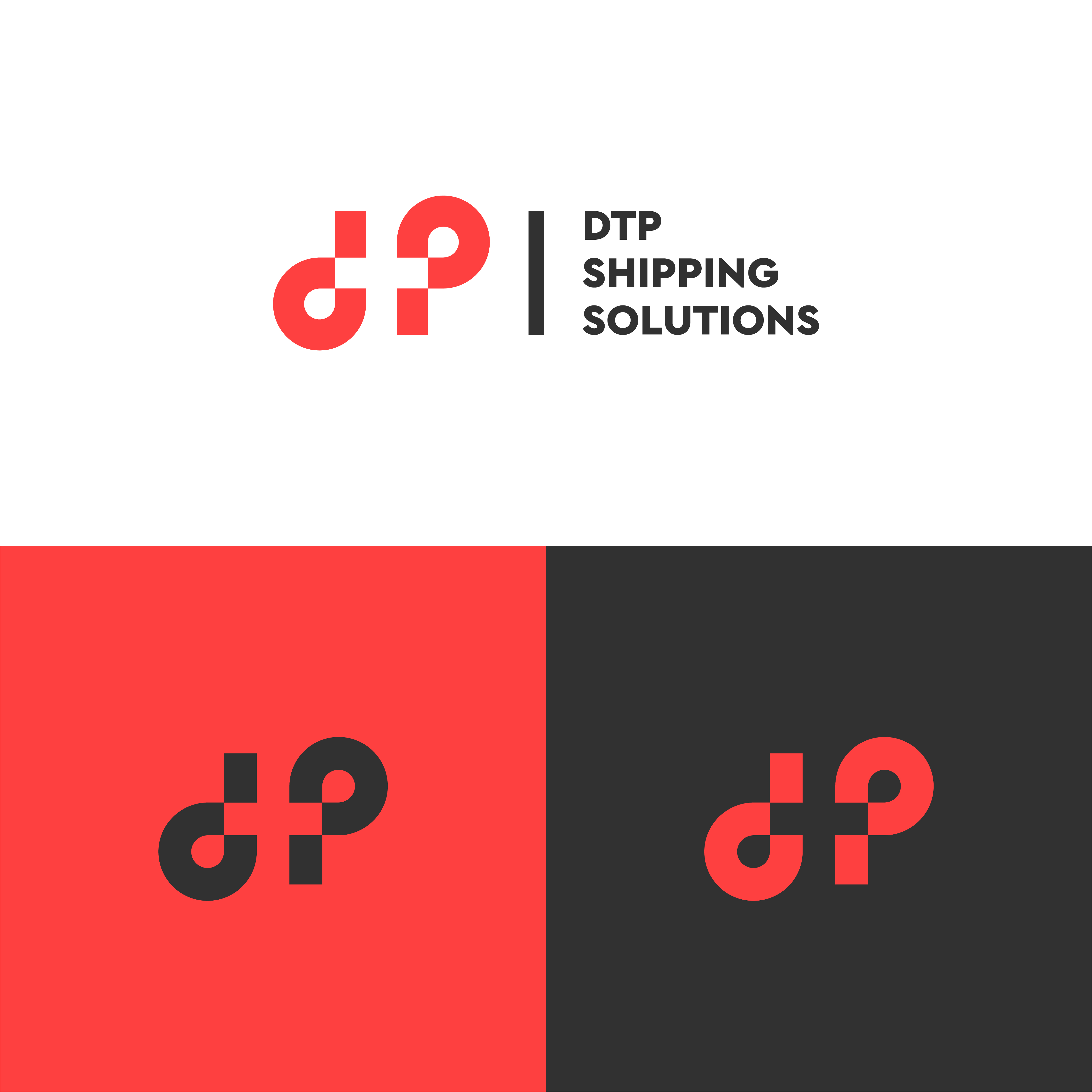
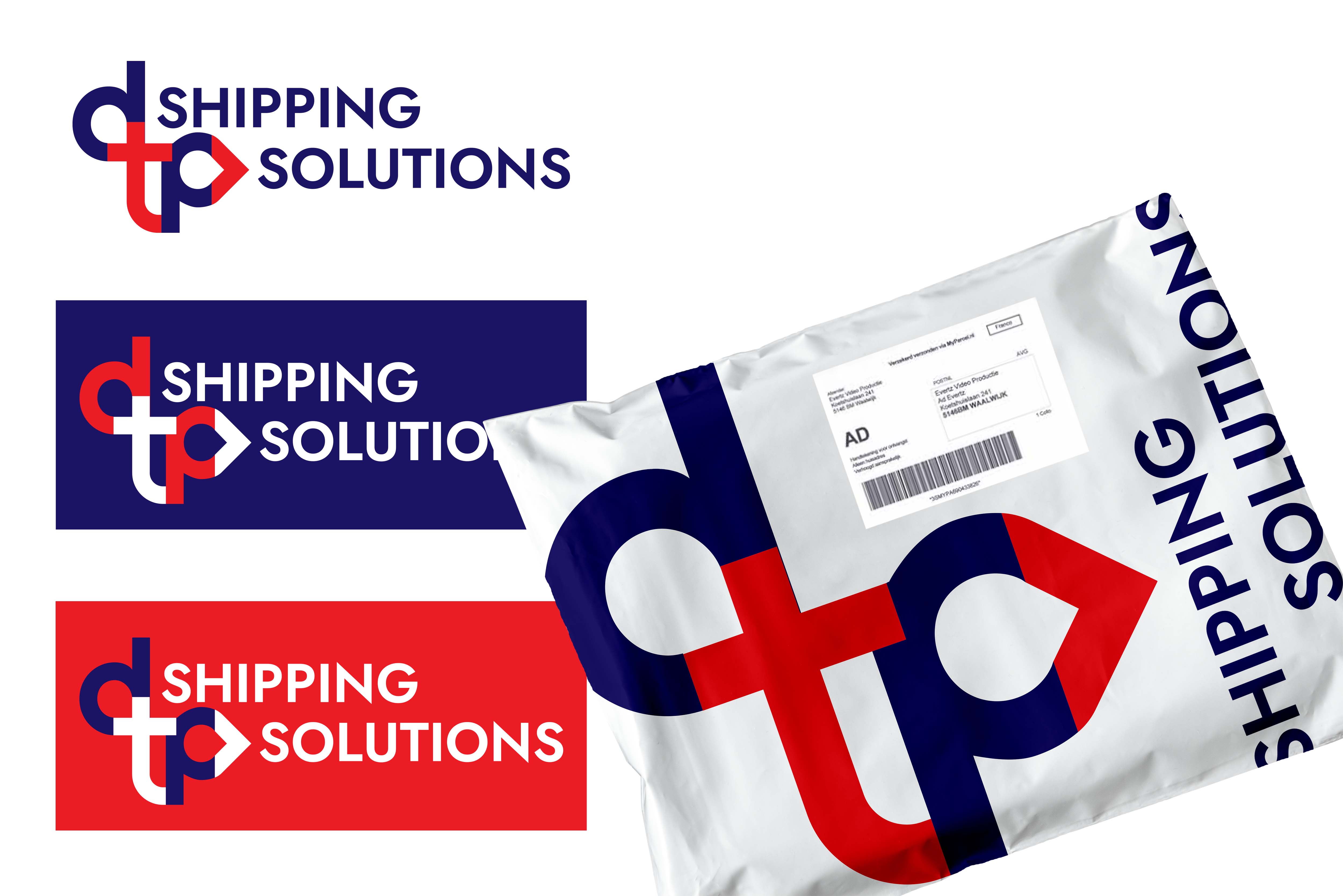
The logo mark is compromised of expansion arrows and the lone star of Dallas, Texas. The overall form of the icon was created to represent the expansion form the starting point of the brand with the colours chosen to reflect expansion and speed.

 3 Likes
 2
2
Nice! I like the thought behind the icon, the different meanings. I feel like the alignment next to the text is a little off, though. Maybe a bit more to the left or rotated? Or above the type? Anyway, great work.
1 year ago by Marlies - Reply
Thank you very much for the feedback
1 year ago by Oni Taiwo - Reply