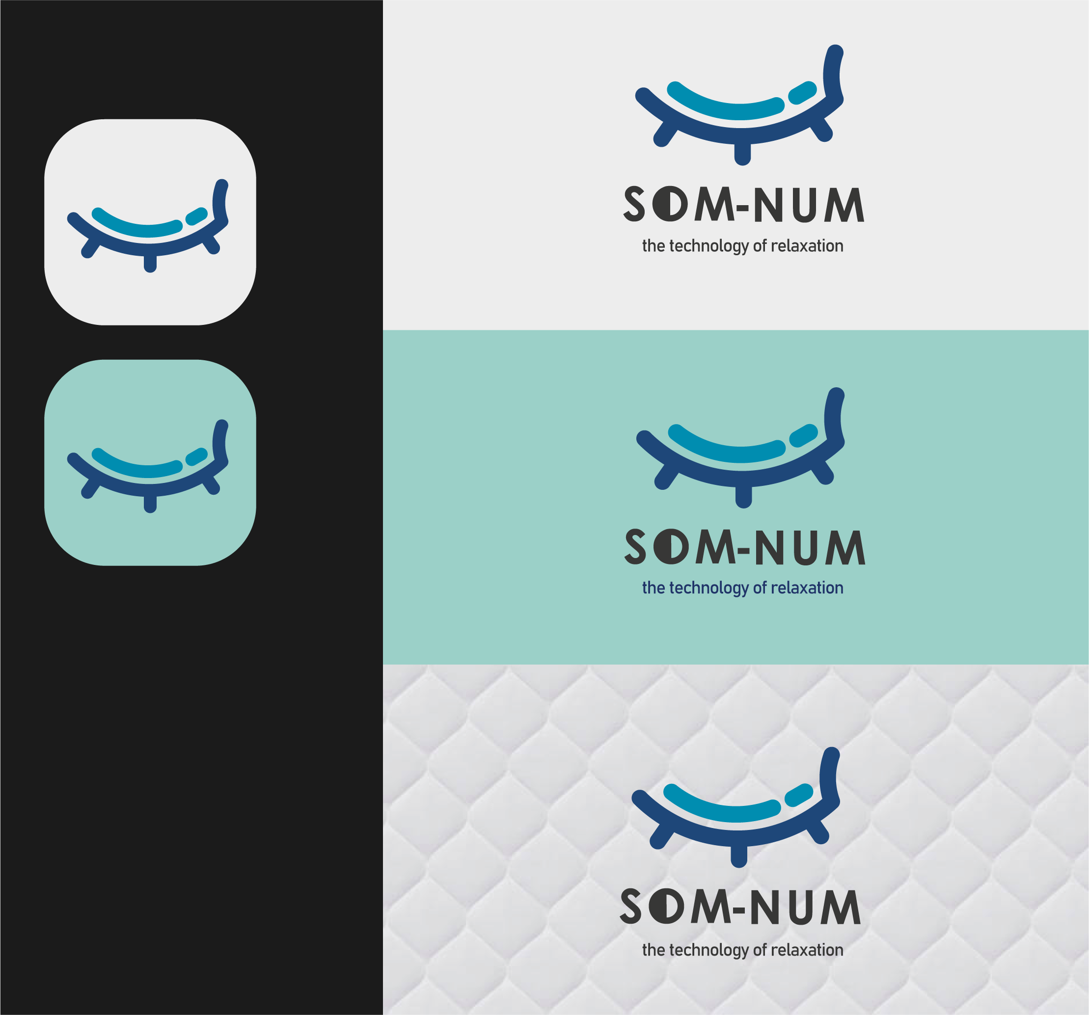
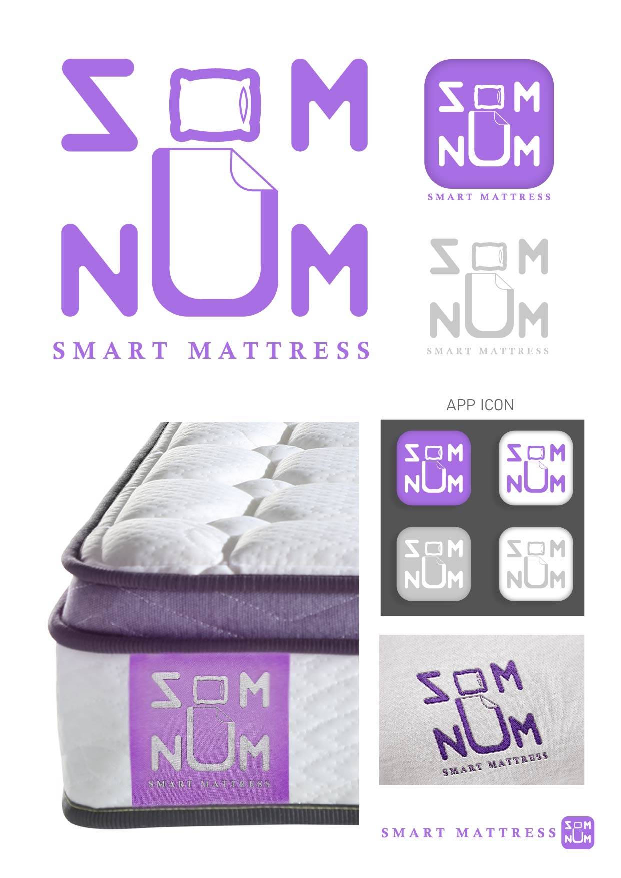
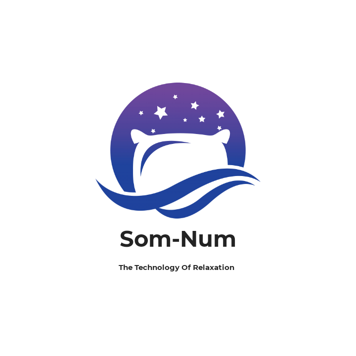
Som-Num mattress company logo
- Report
1 year ago by Anita Petrovic
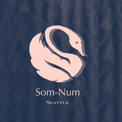
My logo design is inspired by the simplicity of the logos of the companies that were mentioned at the end of the brief, so I started from that aesthetic and created a symbol that can be read as S or N depending on the angle. I decided to add a feather-bodied swan on top of the symbol because feathers are traditionally associated with mattresses and luxurious sleeping experience. The same symbol I initially created can be repurposed by adding another layer so it represents a Bluetooth logo for sake of that products campaign (I’m up,landing only the basic version of the logo here because I can upload only one picture).
Apologies about the fonts and picture quality, this is a raster sketch made in Procreate in a couple of minutes
Apologies about the fonts and picture quality, this is a raster sketch made in Procreate in a couple of minutes
Som-Numlogo
 6 Likes
 2
2
this was executed well, the idea with the feather and swam merged is excellent, I think if the drop shadow were done away with it would look clearer
1 year ago by Sebastian - Reply
I love this! Smart play with shapes, and the colors you chose work very well
1 year ago by ANJA MIKOUIZA - Reply