teahouse logo
- Report
1 year ago by Sebastian
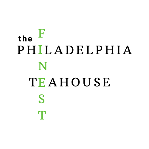
an all caps and sans typeface was used because it enforces the excellence and fine aspect of the name. the work, finest, is typed in all caps to enforce the quality of being fine
 Like
Like
 4
4
so sorry, i forgot to mention that the logo must be a wordmark
1 year ago by Sebastian - Reply
This has a lot of characters and if you’re going to go for a crossword kind of feel, you should do different fonts. The “the” looks very out of place. Maybe an easy piece of art for this one since it’s a TeaHouse? The font is just very clashy together in the crossword style.
1 year ago by Aubrey - Reply
Nice try, but the logo seems to have a lot of characters. Maybe you should explore using symbols and abbreviations.
1 year ago by Adeyemi Testimony - Reply
need improvement
1 year ago by Ritika Kapoor - Reply


